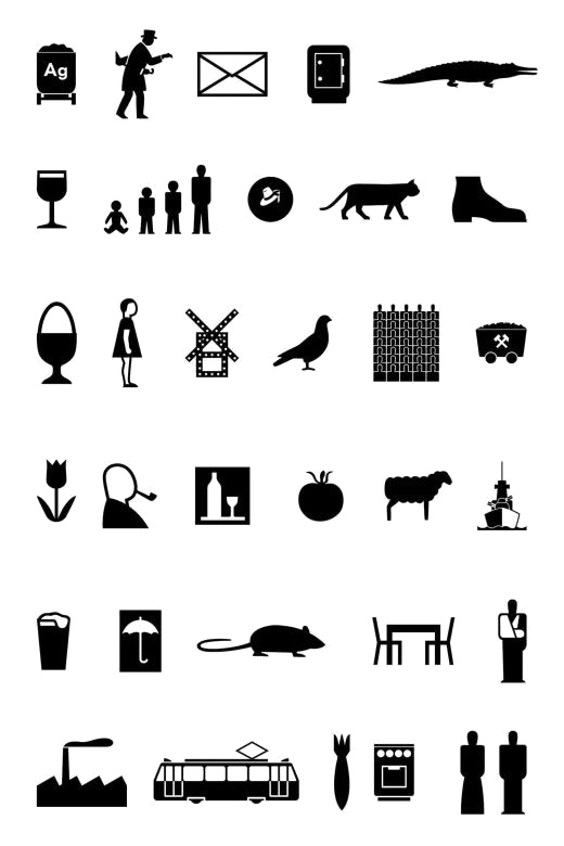
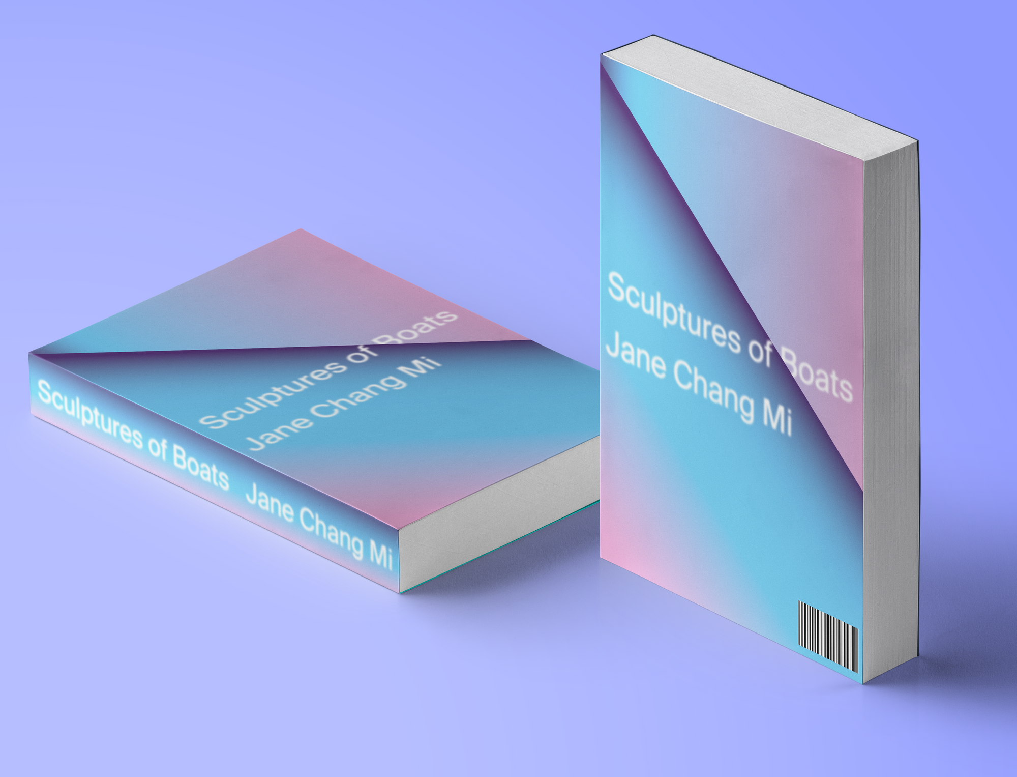
Parentheses Asterisk Ellipses
MFA Thesis
For Emily,
For being my ❤️ and my 🙂.
Presented in partial fulfillment of the requirements for the degree Master of Fine Arts in Graphic Design in the Department of Graphic Design of Rhode Island School of Design in Providence, Rhode Island, 2021.
Bethany Johns
Professor, Department of Graphic Design
Graduate Program Director
John Caserta
Associate Professor,
Department of Graphic Design
Primary Advisor
Anther Kiley
Critic, Graphic Design
Secondary Advisor
Cem Eskinazi
Critic, Graphic Design
Tertiary Advisor
Alicia Cheng
Head of Design, Metropolitan Museum of Art
Partner, MGMT. design
External Thesis Critic
Abstract
Textual punctuation — those common marks that pace a text — are rarely static. They allow a message to flow, providing space and also emphasis. While words hold the stage, humble commas and periods coax the message.
This thesis urges another orientation to these tools, with the graphic designer assuming the role of one who principally punctuates. In Parentheses Asterisk Ellipses, punctuation becomes the primary driver of meaning — a perfect technology for rich associative networks of history, type, and for understanding the social. Tracing the grain of text, this graphic designer offers a close reading of the three punctuation marks in the title: parentheses, asterisk, and ellipses. He exposes the marginal operations of graphic design and proposes interrogative devices to reckon with larger media structures. A parenthesis, for example, may begin as a glyph but soon becomes something else: a smile in an emoticon, an abbreviated JavaScript function, a metaphor.
Table of Contents
Chapter 1:
Introduction
Radiant Machines
Medium Design would be something like playing pool, where knowing about one fixed sequence of shots is of little use. But being able to see branching networks of possibilities allows you to add more information to the table and make the game more robust. In pool, you don't know the answer, but with great precision, you know something about what to do next. The balls are sometimes attached to known forms or rules of play, but the
art of pool involves assessing their collisions....Medium design, like pool, is indeterminate in order to be practical.
— Keller Easterling
Hello, World!
The sentence you’re reading is designed. The typeface, the letterforms, the pixel — all these assemble, like Keller Easterling’s billard balls, into meaning. But the action, that kinetic spark that keeps you reading, lies between: a sinuous, near translucent, thread that hangs the assemblage together like a mobile.
I could trace my journey to graphic design from many directions, but I keep returning to punctuation.
When I taught high school literature, I fixated on the English
language’s spatiality; the fact that meaning emerges from
proximity—from where adjunctives
slot together. It’s these components that allow complexity
to unfold from simplicity. I spoke.
becomes
Despite being tongue-tied, I spoke with considerable effort.
becomes
Despite being tongue-tied, I spoke with considerable effort,
which made being quiet again all the more difficult.
A story branches outwards across the page, bifurcating into tributaries of meaning. It’s this behavior that rhymes with my emerging practice as a designer: an awkward gangly progression towards form-making. For this reason, I want to begin my thesis, here, at these forks, where we situate punctuation.
A Minor Language
Punctuation marks share their DNA with alphabetic forms. They are typographic, so we can print them. They are constrained by context, so we look to the surroundings. They act as tools to convey voice, so we considerately use them.
But we cannot pronounce punctuation because punctuation controls
pronunciation.
Our voice skips over the ellipse, the parenthesis, the asterisk—hungrily searching for the next letterform, for a foothold. Or perhaps, we pronounce their ambiguity, registering the marks’ meanings as pliant, but not speakable. It’s a hitch, a stutter, a moment where the textblock itself briefly flutters into focus—if only for a second.
In
Dialogues, Gilles Deleuze describes style as
an assemblage of enunciation
that asks one to
stammer in one’s own language
(4). He elaborates,
claiming that style is a hidden feature of a language, what he
calls the minor language inside our language
(4).
In this slippage, in the negative space, our voice finds
expression. I’d contend that this stammer
resembles
punctuation, and that punctuation ultimately resembles design.
Perhaps because I came to this MFA program obliquely, I see a kinship with these grammatical marks, with punctuation’s ancillary status. Or perhaps its how their flatness approximates depth, an appeal akin to Ellsworth Kelly's work[→], which similarly telescopes between the foreground and background.
Whatever the case, I feel like many designers and theorists
gravitate towards these overlooked marks. In a 1979 essay, Jacques
Derrida (re)introduced a Kantian term to capture the character of
the ancillary: the
parergon
. The parergon is
neither work (ergon) nor outside work.
We could imagine it
as a prosthetic for form, something secondary, or even Deleuze's minor language.
Fittingly, Derrida uses this term to catalog a diverse range of
things. A frame, silverware, scaffolding, drapery, an ellipses —
these all feel alike: only making sense in conjunction with a
visual system. An asterisk, after all, is only additive if there’s
something to add.
Yet, the parergon also enters these systems with a purpose; the asterisk may require a system, but it’s meaning—it’s function—feels neatly built into its form. The mark, in other words, acts as a perfect technology for meaning, a vehicle for a rich associative network.
I don’t fixate on these forms to be tedious or trivial, but
because I genuinely believe that, by noticing them, we gain a
richer understanding of our aesthetics relationship to our public
(be it a classroom or a visual system or a website).
Chris Messina
did not invent the hashtag,
but rather he adopted the mark
as a metaphor to contain, what Mindy Seucalls, a virtual townsquare.
It is a metaphor worth
attention: an object that disambiguates even as it remains
ambiguous. This tension
appeals to me, and I hope to direct my practice towards these
marks and their potential.
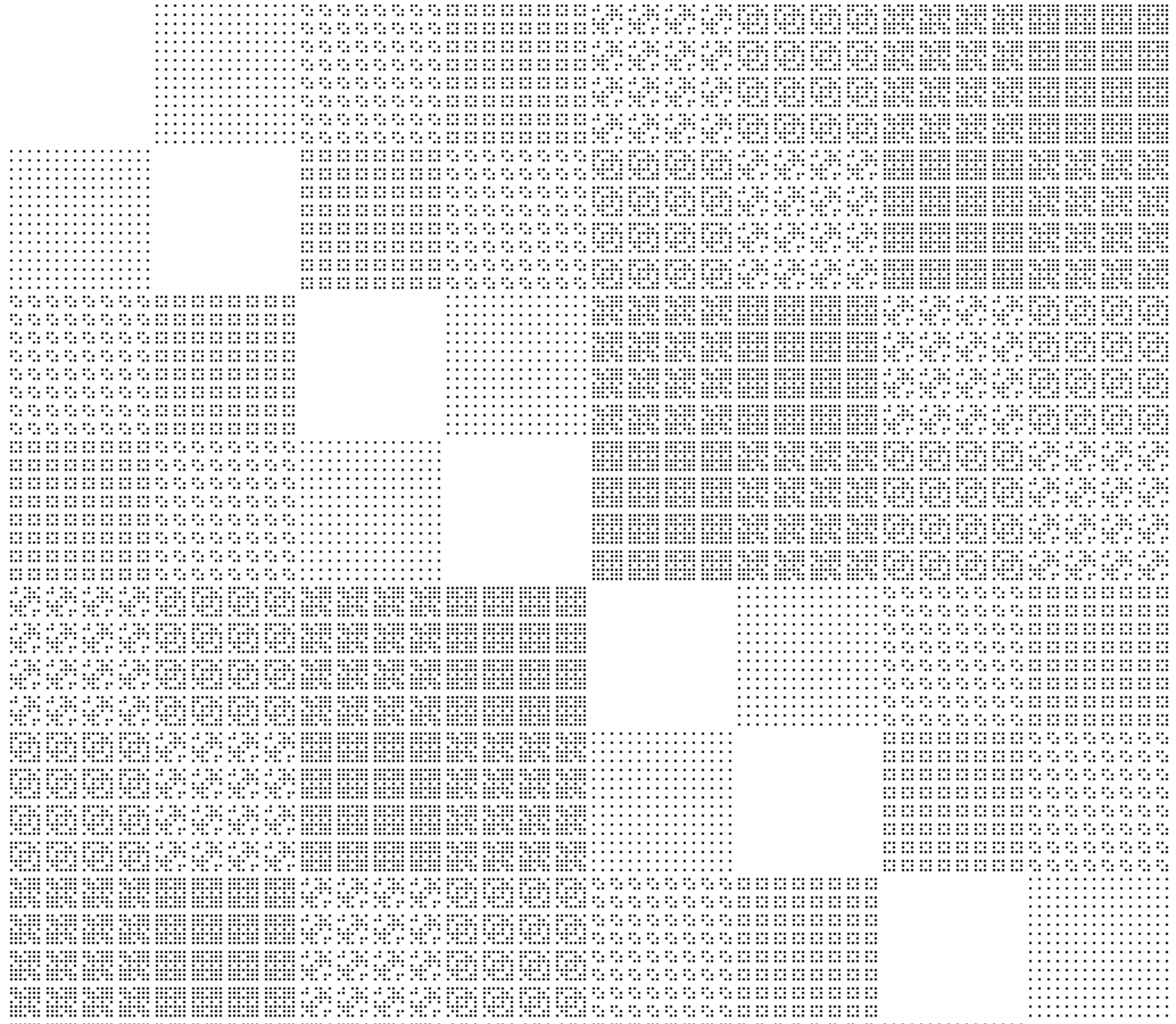
Methodologies
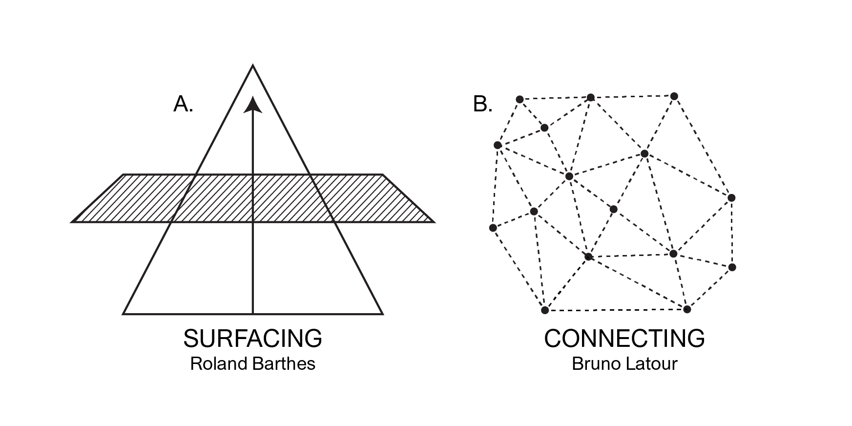
From my perspective, the punctuation mark suggest two avenues of
criticality. The first is an ideological analysis
(fig. A), in which the designer might
turn to these metaphors as a way to surface
dormant truths
that lie behind or beneath our reality. Roland Barthes’
Mythologies articulates this approach most clearly: he
looks at ideological rich texts
as portals to deconstruct the unspoken (or unspeakable) truths.
The second approach is derived from
Actor-Network Theory (or ANT). This mode of criticality
(fig. B) posits the punctuation mark as
a box
to contain a vast tangle of connections. The glyphs
window feels like an appropriate symbol. The grid
frames florets, geometries, and (my favorite) starbursts. Here,
they wait patiently, their meaning contorted (and confined) by
Bezier Points.
An ANT critic might concieve of these points as akin to reality
itself; a rich network of constellated shapes all bound together,
their meaning richly entangled.
There is nothing buried
or hidden
in this model,
rather, one is more concerned with understanding how all of the
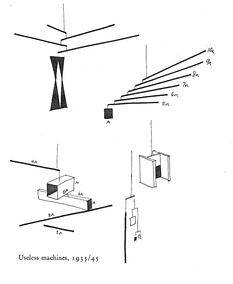
historical actors and events slot together. Like Bruno Munari's
useless
machines animated by a breeze, the ANT approach
connects not uncovers.
Perhaps I've already shown my hand, but the ANT approach feels
more relevant to me than the depth-plumbing of Barthes. Cozying up
to this space of associations and disjunctions invites a study of
not only the parergons
of language, but the
parergons
of punctuation as well. This space—one as
evocative as a pool table—requires analysis beyond pronunciation.
It requires an audit.
That said, the methodology Barthes advances is worth noting because it offers a way to adapt the ANT methodology—to add an asterisk to our model. Reckoning with the lattice of mark-making requires reckoning with their situation in Power. The often abstract character of punctuation makes it easy to treat them as immaterial, as a given. Yet, as my interview with Kris Sowersby points out, all typographic form belongs to a present moment, even as it gestures to a comprehensive, associative web. You cannot simply overlook a parergon’s placement in extractive capitalism; the material base determines the way you’re encountering this text. They deserve a level of scrutinity within a design practice, and I will devote a chapter to this discourse.
Still, the ANT stance has an undeniable allure. Keller Easterling,
whose writing draws heavily from ANT, describes design as
something anyone in any discipline already knows how to do.
(9). She claims that
Designing is entangling—the simple act of encouraging
interdependence.
(13). In other words, an ANT designer (what Easterling might call
a
Medium Designer
) has a fluency with punctuation, with the
distinctive tensilities
of meaning these marks might afford a thinker. For this reason, my
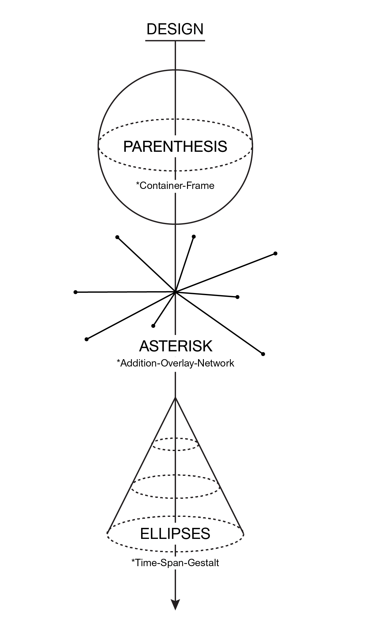
audit will approach design through three distinctive marks:
(1) a parentheses, (2) an asterisk, and (3) an ellipses.
These glyphs help organize histories, conversations, and
(ultimately) visual design under different conceptual umbrellas.
The parenthesis captures practices of containment, enclosure, framing. This section examines constructions of the interior. The asterisk radiates outwards and inwards, dramatizing network and addition. This space can also point to the dimensional addition: the overlay. Finally, the ellipses engages with time spans, memes, and gestalt—that is, the way in which we convert divergent elements into a coherent whole.
While this thesis traces the grain of these glyphs; I hope to introduce characters—Medium Designers—to help humanize punctuation. I want these figures, both living and dead, to be in dialogue with each other as they frame these practices. I recognize, however, that there is no one correct way to activate these metaphors. I'm rather progressing, through these voices, towards a practice that speaks to my work. I also hope that this dialogical approach reminds us that humans ultimately are the actors who punctuate.
Interview with Andrew LeClair
There’s a great quote from Irma Boom. She said whenever she goes to a book store she’s depressed by all the books that could have been PDFs. If you actually think about what she’s saying, it makes you question what about a book couldn’t be replicated in a PDF. There are a lot of advantages to a PDF. You can search, you can carry it with you and it doesn’t weigh anything, and it doesn’t take up any space in your apartment. [Irma Boom’s quote] forces you to think about what makes a book better as a book. What types of books are better as books and what types of books are better as PDFs?
— Andrew LeClair
EE:
By way of introducing your practice, I wanted to start off by posing
some of the questions you asked your students in your
Reading Without Pages
class. So, first, how does one convey
authority and rigor in an ephemeral online medium? And secondly, how
can we reproduce the best parts of the print-based reading
experience online?
AL:
They're good questions! So first, just to give a little context, I
think, during the time that I’ve been working as a designer, I think
there’s been kind of transition that I’ve observed with my clients.
Whereas in the past, I think certain projects would be obviously
books, clients are now starting to think,
Oh, this could be something else; this could be a digital
publication.
But one of the biggest hesitancies around publishing digitally is
concerns about the lack of potential
academic life
of something that’s published digitally. So
there are a lot of problems around citation, longevity, and creating
a sense of authority.
► I think we naturally assume that anything that’s in book-form
has had a certain level of editorial care and investment—to make
sure that it’s worth reading. It’s not always true, but that’s
the feeling that naturally comes with holding a book.
So when you’re investing a lot of time into the content that you’re
trying to publish, you want to put it into a frame that is going to
convey that there’s been a lot of care and effort put into it. It’s
all about attention to all of the different decisions that can make;
if a book is printed on really well chosen paper, or the way it’s
bound, or the way it’s printed—that says something that translates
to the editorial content.
With digital publications, I
think of things like footnotes, how those are handled, or how the
site treats smaller interactions throughout the publication. Imbuing
those details with some kind of specificity speaks to the broader
publication...It shows that someone thought through those things and
made intelligent decisions. As you spend time with a digital
publication, the sum total of all those small details and
interactions start to tell you something about like the level of
effort that went into it.
We can all recognize something
that was made based on a template, right? Like you land on a
particular website, and oftentimes you can immediately tell what is
the CMS or underlying platform because those platforms tend to have
certain default decisions about organization about presentation. So
I think that the more that something is designed in a way that is
very legible to readers... creates a sense of [that] authority.
EE: That’s interesting that you mentioned CMSs. Do you have an impression of what clients are looking for, or perhaps what this current aesthetic landscape in online spaces resembles?
AL:
I feel like we’ve moved away from a world where everyone is trying
to find the one CMS that is going to solve all of your problems.
There was definitely a period where it felt like every website was
built on WordPress, and people were spending a lot of time trying to
adapt [to this platform].
There’s a lot more options now. When I think about the
projects that I’ve worked on, I've completely run the gamut. In
terms of CMSs, [I've worked with] really simple flat file-based CMSs
that work really well for small websites, and then [I've worked] all
the way up to completely custom systems with completely custom
content architectures, and back end editorial interfaces that are
designed specifically for that publication.... The level of detail
of an interface that you need for a five page website is really
different from a complete publishing platform, and I think it works
better when it’s not all trying to live on the same [thing]. So, in
that sense, I feel like the conversation has sort of moved past the
CMS. There’s a lot of CMS that work very well for particular use
cases, and you just work with whatever is appropriate for the given
context.
It’s interesting to think about it from like a
less functional perspective. Could you think of a CMS as like a
typeface? A typeface serves a particular function, right? And it has
certain characteristics that make it work really well for particular
design problems, but at the same time, sometimes it’s fun to choose
a typeface that’s a little awkward for a particular use case.
EE: I really admire how your work is considerate of systems. How do you conceive of your practice related to the module, grid, and scalability? What does a non-scalable project look like?
AL:
So when I was working on getting ready to go to grad school, I just
read a lot of books. My primary design education came through books.
I had a lot of access to Swiss graphic design
fundamentals—[specifically,] Emil Ruder Typographie describes
graphic design in a particular, systematic way. To some extent, I
think I’ll always be somewhat informed by like that early
understanding of design. I also remember vividly seeing the Norm
Sign Generator, when I was learning about design and was just
really interested in the poetic quality of the system. It wasn’t a
system that was trying to solve a particular problem.
I’m realizing that [because] I didn’t study graphic design as an
undergrad, I came in from a perspective of having read a lot and
being interested in fiction and thinking about things not through a
design lens. So for me, I think approach projects just naturally
interested in the content. And [for that reason],
► I try to work with clients who have interesting content or
content that I don’t mind spending a lot of time with. Maybe
that also informs a slightly lighter, lighter touch, if the
content is really good, sometimes it's satisfying to just let it
speak for itself and have minimal intervention. That makes it
the focus: it’s less about me, it’s more about the words or
images.
[Finally,] the elegance of programming [speaks to an
effort to] get a program to a place where you fully understand the
problem, and you’ve come up with a really concise solution. A set of
simple rules can generate this kind of complexity, and I’ve always
just fovund that very aesthetically satisfying.
EE: I find it interesting how your practice has been shaped around collaborations—with E Roon Kang, or Adam Lucas, or Project Projects. How do you approach collaboration, and also, how does the scale of a project dictate different forms of collaboration?
AL:
It’s funny because fundamentally design has value socially, right?
Like, the things that you design are always for other people....So
with every project, you’re collaborating with your clients, and I
find working with other designers interesting, because eventually
design kind of goes in a direction that you don’t expect. And I
actually enjoy the process of introducing some unexpected variables
to a design problem, and then trying to kind of resolve that. It
reminds me of a quote from Mevis & van Deursen, [where they mention]
introducing restrictions in their process and adding artificial
decisions that were not motivated by solving the problem. Then, the
whole project becomes a way of working around those decisions.
[That's part of] what a collaboration brings to design.
Someone else has an idea, and then it becomes a game to integrate
their idea into what is interesting to you. Then, [you can] build
something completely different from what you will have done on your
own, or what they would have done on their own. It’s just very
satisfying. when I was working on Project Projects, I would
primarily work with one of the partners, so I did projects with all
three partners at different points in my time in the studio, and
that’s a really enjoyable way to work. It makes you a much better
designer, and it’s also a practice that’s really common in
programming, where two people will sit and work on the same program
at the same time. That's been a great way to learn, and also just
clarify your thinking.
EE: I wonder if there's a larger lesson that can be derived from this model. Like can a programmer or a graphic designer offer something specific to organizing or protest spaces. It occurred to me that there’s a real consideration of the public space in your work? Do you find, any resonances here?
AL:
It’s tricky because the kind of rhetoric in technology has been very
much about democratization and empowering
users. But at the
end of the day, it’s led to a huge amount of centralization of
authority and power. There’s a book
From Counterculture to Cyberculture that talks about the
history of the counterculture movement in the 60s and 70s, and a lot
of the spirit of Silicon Valley is actually really a purchase from
that [movement]. You can see a lot of echoes of that culture in
contemporary tech culture.
So, I think there’s some
tricky issues to untangle around the effects of technology, which I
pointed to when I was working on my thesis. I was referencing the
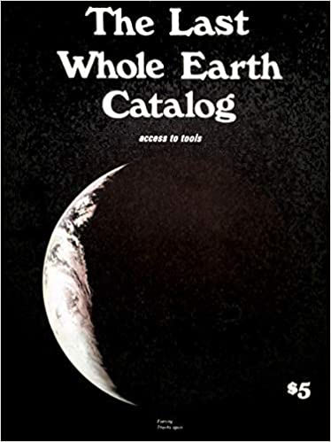
Whole Earth Catalog, but ...[I] asked whether the tagline of
the Whole Earth Catalog that is access to tools
had
really been borne out by the development of the tech industry. We
can certainly find a lot to be critical about [there].
If you’re trying to have a direct effect, I’m not sure that design
is going to be the most direct way to do that. Design can serve a
lot of important functions, certainly. [For example,] with my Occupy
project, I was thinking about archiving [as having] a real value.
There’s a value in [design that is] supportive... [and/or]
circumvents some of the restrictions of large tech platforms. But, I
think we should be like a little skeptical of people who say that
design is going to be this [force] that
changes
things.
My work is trying to trying to
find opportunities to make projects that, through their presence,
are somewhat thoughtful or critical about some of these issues, and
that hopefully through seeing them—maybe that has some small
positive effect. But ultimately, design is in a supporting role to
new technologies that are being developed or political struggles
that are taking place.
EE:
Yeah! That's especially resonant for me. For this thesis, I'm being
deliberate around not using Adobe products. That said, I’m not like,
I can never use InDesign or Photoshop.
I see the tools as immensely powerful, but I don't love the idea of
having an entire design practice channeled through the Adobe
Creative Cloud—this centralized authority. So I guess I’m wondering
if you see LaTeX, or Kirby, or (for that matter) Bindery as possibly
emancipatory? Or does that thinking unfairly elevates programming?
AL:
I don’t think there’s a simple answer to that. In the case of
Kirby, I feel good supporting
Bastian [Allgeier], and I think, he probably has become popular
enough that he has a small team that he’s supporting through his
work on that CMS, which I also feel comfortable supporting
financially through licensing that software.
► I think we should be wary of trying to have some kind of
purity about the tools that we use—because I think that’s really
difficult. How far do you go? You’re using a Mac, right? And you
are using Bindery, but it’s in a Google Chrome browser, right? I
mean, how do you draw the line there? I guess, I would think
about what the kind of choices you make achieve [instead of] a
pure sort of practice.
For example, I’ve been working on this project for
Pioneer Works, which is an
art institution in Brooklyn. [For their] Art's Journal, instead of
choosing just one typeface, we tried to build a system that would
allow us to use about 50 typefaces on the site. It’s fun, because
the way it works is that every typeface is mapped to particular
editorial structures within this publication. So instead of becoming
random, it’s an identity where you can actually figure out which
series or discipline it’s part of. It’s intentional and it’s very
consistent, but at the same time, the visual aesthetic is kind of
wild and feels a little feels reminiscent of independent publishing
with a lot of photo typeset headlines and things like that.
[Also] if you think about that project on a material level—we just
just gave font licenses to a whole bunch of independent and small
typeface designers. So, from that perspective, I feel like maybe
that’s better than using a typeface from the Adobe type library or
something.
EE: How do you think about your work collectively? Which projects do you wish you had the opportunity to talk about more?
AL: I haven't really taken the time, or have felt that it was really important to me, to look at all of my work since grad school.... But that’s something I’ve been thinking about a lot lately; I think that the luxury of being in grad school is that you have a lot of time for that kind of reflection, and shaping that process in a very conscious way. When you start practicing, certain other constraints become more salient, and you just focus on focus on those. So I don’t know, I guess you could tell me?
EE: Yeah, I feel like your work has a real appreciation of the printed reading experience in a digital context, as we discussed. But I especially appreciate how purposeful your gestures are. Like there’s one or two weird (or disruptive) moves in your websites, but it's tempered—anything more would make the project buckle. The grammar of your work doesn’t get in the way of my ability to read through this, which is a wonderful feature of a design practice; it feels very considerate of a reader. It's bookish in a delightful way.
AL: That’s nice of you to say what you just said, it’s nice to hear. I mean, I pretty much exclusively read online these days. I have a lot of books, but they’re mostly books that that makes sense to have as books. So I read like a lot of PDFs, e-pubs, and things like that. I seem to end up reading a lot of like design books in print, and then everything else I read on on the screen....
If I’m thinking about it, it’s easy to kind of be very focused on
what you can do what’s new, and not to recognize, the things—and
this sounds very conservative—that have been solved previously.
Certainly we’ve seen the way that typesetting right now is worse
than it used to be right? I don’t know if you’ve ever read a book on
a Kindle, but the typesetting is horrendous. Certain things get lost
[in the pursuit of] technology's forward progress. A lot of times,
we lose things. [In my work]
► I’ve always wanted to to balance doing things that are new and
that haven’t been done before, while hanging on to the things
that have worked well in the past and that continue to work. If
there was any bookish quality that I would want to come through
my work, it's that incredible investment.
That care is something that I would hope one can bring to like an
online experience, [such that] you feel like someone has spent as
much time thinking about that experience as someone who thinks about
like the binding for a book or something like that.
There’s this defunct blog that I read a couple of years ago called
Skeleton Forums.
Essentially, [the post] was a table...
comparing a series of books that were released by this publishers
nai010 in the Netherlands with another series that was released by
New Directions in the US. [The table] was just going through every
single decision that was made: showing the cover system, showing the
interior page layout, showing the decisions about paper and binding.
Just comparing each one and saying why one was better than the
other. How the sum total of all of those decisions made one book
just so much better than the other one....I think it’s [that level
of finesse] worth it’s worth striving for [online].
EE:
That description of books sort of rhymes with Kris Sowersby’s
language around type design. His independent research build endless
progressive process of reproduction and refinement. This maybe
speaks to your idea of programming as almost somewhat
prosaic.
Kris pointed out that the amount of research or
ethical fidelity that he does on a typeface doesn’t necessarily make
for a good typeface. Being grounded in history is sort of a
necessity to elevate these things, but it’s also not a guarantee for
a satisfying design.
AL:
Yeah, that’s really interesting to hear. I think that’s true. How
can we understand history and understand what’s valuable, while not
being completely governed by that, right, or trying to sort
slavishly follow what has happened in the past?
There
was a talk that
David Reinfurt gave a
long time ago. I remember watching as he described this idea of
seeing a designer in the past and understanding the questions that
they were asking, and the issues that they were thinking about, and
the way that they were working. He was describing this in the
context of Muriel Cooper. The work that she was trying to do, and
the direction that she was going were, to some extent, a thread that
no one had necessarily followed up on. So, there was a opportunity
to take the questions that she was asking, and then ask them again
in a contemporary context, which will lead to completely different
answers.
That underlying spirit is one way of thinking about the past, right? To look at designer—or [design object]—that existed before and understand what was it trying? What were they trying to do? Then, you can look at what’s available now and sort of re-animate that idea in a new context. I think that helps you avoid ideas that have already been done many times.
Chapter 2:
Unicode
A Painting of Marks
I had to get to the point where I said, All painting has been an illusion, like Renaissance painting. It’s all on one canvas. It's like a window that you're looking out of. That led me to think that [condition] lasted until Mr. Cezanne and Monet, [who] begin to upset the surface. So the content, really, in Cezanne was how your eye goes to how he did it on the surface. And he wasn't a mirror of a landscape
....he was doing a painting of marks.
— Ellsworth Kelly
Speaking in Tongues
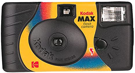
Ellsworth Kelly's Color Panels for a Large Wall were installed in 1996 at the National Gallery in Washington D.C. 18 paintings, arranged arbitrarily according to a 3 x 6 grid. I would have encountered them around 2000 on a school trip, but the memory has a cloudiness, a haze that tints the colors themselves. Even now, I remember Kelly through a kind of filter, as if taken on a old Kodak Single-Use Camera. Still, there’s a resonant aura that hangs around these paintings—I remember the pieces as enormous, confident, and flatly graphic.
Looking at Color Panels for a Large Wall on the flat surface of my laptop, I cannot help square the colors in my memory with those imperfectly rendered by RGB pixels. What was I supposed to have seen; what did I see? I cannot corroborate my own memory, and as such, I’ve entered a complicated space, where the mediating frame determines the nature of the work.
I don’t mean to simply rehearse
Walter Benjamin’s argument
here, but it feels undeniably strange to read, speak, and think
through a digital space.
I recognize that to argue for an alternative sounds like
Ludditism, yet accepting this mediation as inevitable feels
similarly irrational. There’s, after all, a very fine line
between mediation and gate-keeping, and if we don’t look at
these frames, at these parergon
we risk something far more
uncanny, seeing through someone else's eyes.
The Daisy Chain
In April 2020, I tried to download a new language, but the servers were down.
Since 1987, the Unicode Consortium has aimed “to unify the many hundreds of conflicting ways to encode characters, replacing them with a single, universal standard.” (4). This group of developers, designers, and programmers have steadily mapped a vast, linguistic expanse, building elaborate character codings to capture all known languages.
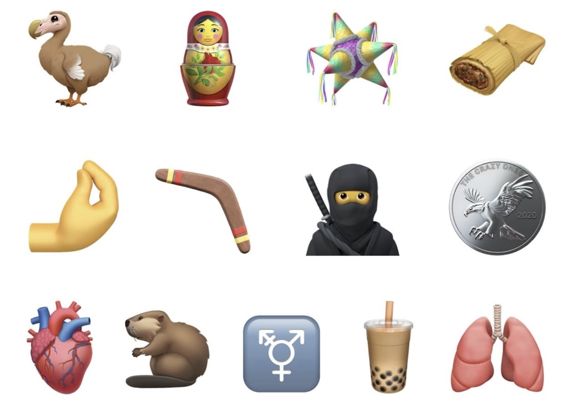
From Glagolitic to Tagalog to Chorasmian to Elymaic to Sogdian, Unicode’s extensive character sets act as the symbolic infrastructure for the web—a seed bank for a globalized internet. That said, people most likely encounter Unicode not through Cuneiform or Dominos but through emoji.
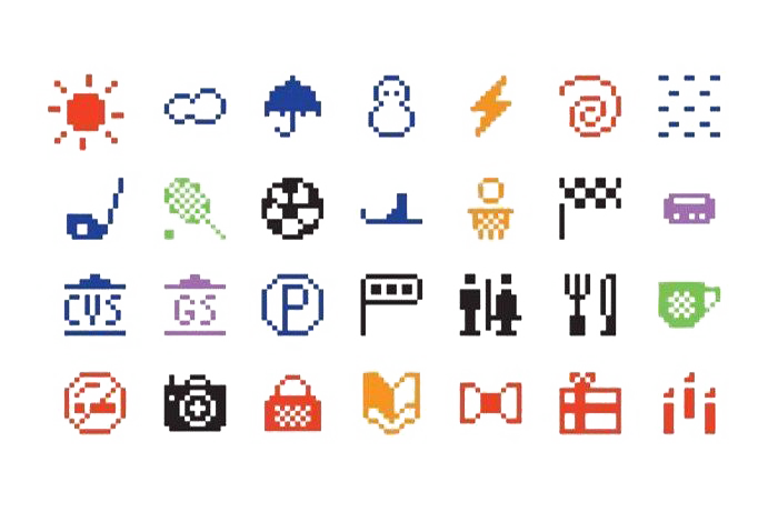
Like ARPANET , the precursor to the modern web, the emoji began with the weather. In 1999, the artist Shigetaka Kurita designed a set of 12- by 12-pixel images to show the weather for Japan’s main mobile carrier, DOCOMO. Beyond a sun, snowman, and umbrella, Kurita built a robust graphic vocabulary; he sneaked in a novel language to the internet. Not dissimilar to Isotype’s ideograms.
Kurita’s characters illustrated a familiar grammar; flatly 8-bit, these ur-emojis framed life in the late 90s: flip phones, playstation controllers, smiling cats, and Harry Potter glasses. These icons found an intuitive use: suddenly adding subtext to a message, adding voice, was as easy as a “heart” or a “frowning face.”
10 years later, a pair of Apple engineers, Yasuo Kida and Peter Edberg, submitted a proposal to Unicode, which adopted the first 625 emojis in 2010 including the 💩︎ By 2011, Apple operating systems integrated the emoji keyboard, allowing an efficient tool to proliferate novel usages of eggplants and broken hearts. Nearly every year since then, Unicode has added to their ever evolving image cache.
In 2020, Unicode 14.0 promised a set of 117 new emojis for the coming year. Knots, bell peppers, bubble tea, and potted plants—the Unicode blog laid out the symbolic terrain of 2021. I went to their site specifically looking for the teardrop smiley, a harbinger well-suited for a Biden/Trump debate, for another month of quarantine.
On April 8th, an announcement plastered across the Unicode site announced that in light of the Coronavirus, they would delay the release of Unicode 14.0 for 6 months. Then, 2 days later, their technical website experienced a catastrophic failure. Updates and downloads went dead.
It's strange for language to suffer an outage, but this blip felt fitting. Under quarantine, graphic designers stutter towards expression, wandering from livingroom to kitchen to bedroom, cycling through the familiar, unable to find the right words. Unable to punctuate.
I want to say something with a bell pepper, but all I had were eggplants.
A Farmer in the Desert
That digital bell pepper was grown in the Atacama Desert, where subcontracted faeneros mined the copper and lithium animating a globalized supply chain.
In Planetary Mine, the Chilean sociologist Martin Arboleda traces this extractive journey ⇢ from outside of Antofagasta ⇢ to the ports of Valaparíso ⇢ to the technopolis of Santiago ⇢ to the Apple factories of Shenzhen. By lubricating these channels, Chile has pursued “a new phase in the production of urban infrastructure” (131)—global capitalism’s dramatic expansion and emergent precarity. Chile’s aggressive push towards “port automatization” and “technological modernization” has dramatically destabilized the labor force,leaving an estimated 70% of the nation’s port workers under temporary contracts (131).
Out of these mineral supply chains emerges a “shadow economy of precarious laborers tasked with pumping dirty fuel out of tanks, collecting accumulated garbage and scrap, and cleaning used pipes.” (94). Many of those in this new precariat class used to belong to a “self-subsisting peasantry,” which the mining industry, bolstered by the state’s deregulatory practices, absorbed (97). The radical dispossession of a “global peasantry” fuels what Farshad Araghi calls a “planetary landgrab” (97), whereby subcontracted laborers gradually convert territory into minerals, products, commodities, and ultimately pixels.
You won’t find a “peasant” emoji on the Unicode keyboard. The closest you’ll get is a farmer (👨🌾) smiling blankly, a bushel of carrots poking into his frame. There’s no consequences to changing the farmer’s skin tone; he won’t have to contend with the colorism, death threats, or intimidation that indigeonous Chilieans now face as a result of the extractive industry (100).
For the foreseeable future, he’ll continue to resemble the agreed-on symbol a pluriversal supply chain reached. He’ll remain silent as programmers frantically reboot their Unicode servers, as the global economy contracts, as I wait patiently for the dodo emoji to describe the failed American state.
The Graphic Organ
An emoji is a public abstraction, a flat language that runs in parallel to alphabetic form.
This flatness asks us to bundle, silhouette, punctuate, actions that determine what puns land, which ironies glitter, what languages are used. There’s immense pleasure in this exchange; the same pleasure, I imagine, that Richard Rorty took in his philosophy, or Otto Neurath in his ideograms, or Unicode in their emojis. Reckoning with the agreements visual language asks of pluralities, of us, strikes me as a joyful practice: being part of (and designing for) a whole.
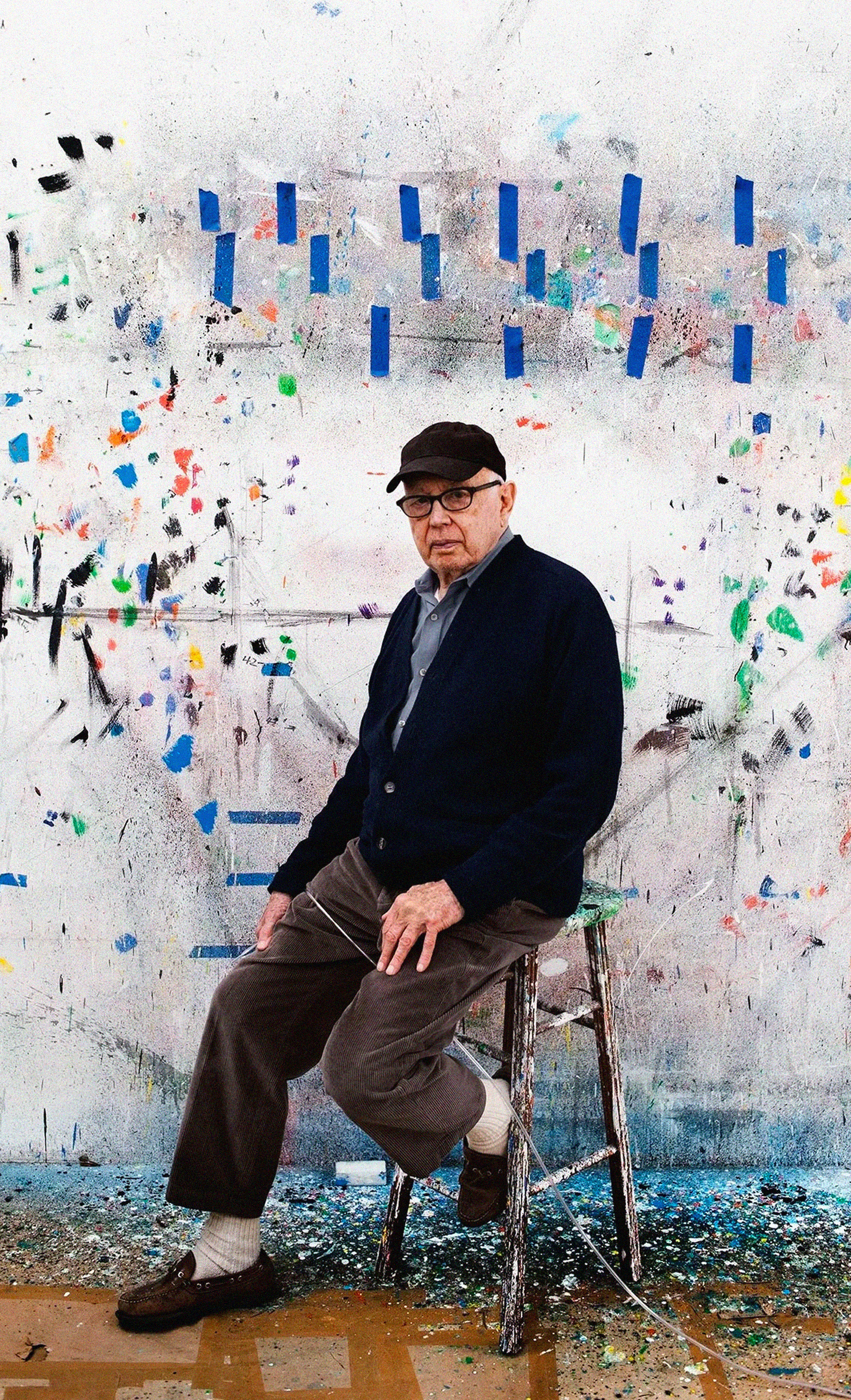
As my finger hovers over the emoji keyboard or slashes across a trackpad, I’ll think principally of Ellsworth Kelly. Kelly served in World War II as a member of the 23rd Headquarters Special Troops unit. In his division, Kelly helped to construct dummies: inflatable vehicles, fake airfields, and mannequin troop encampments. On a global scale, he dealt in silhouettes and contours; he had to think from 7 miles up in the air, imagining what the ground looked like to a Messerschmitt Me 262.
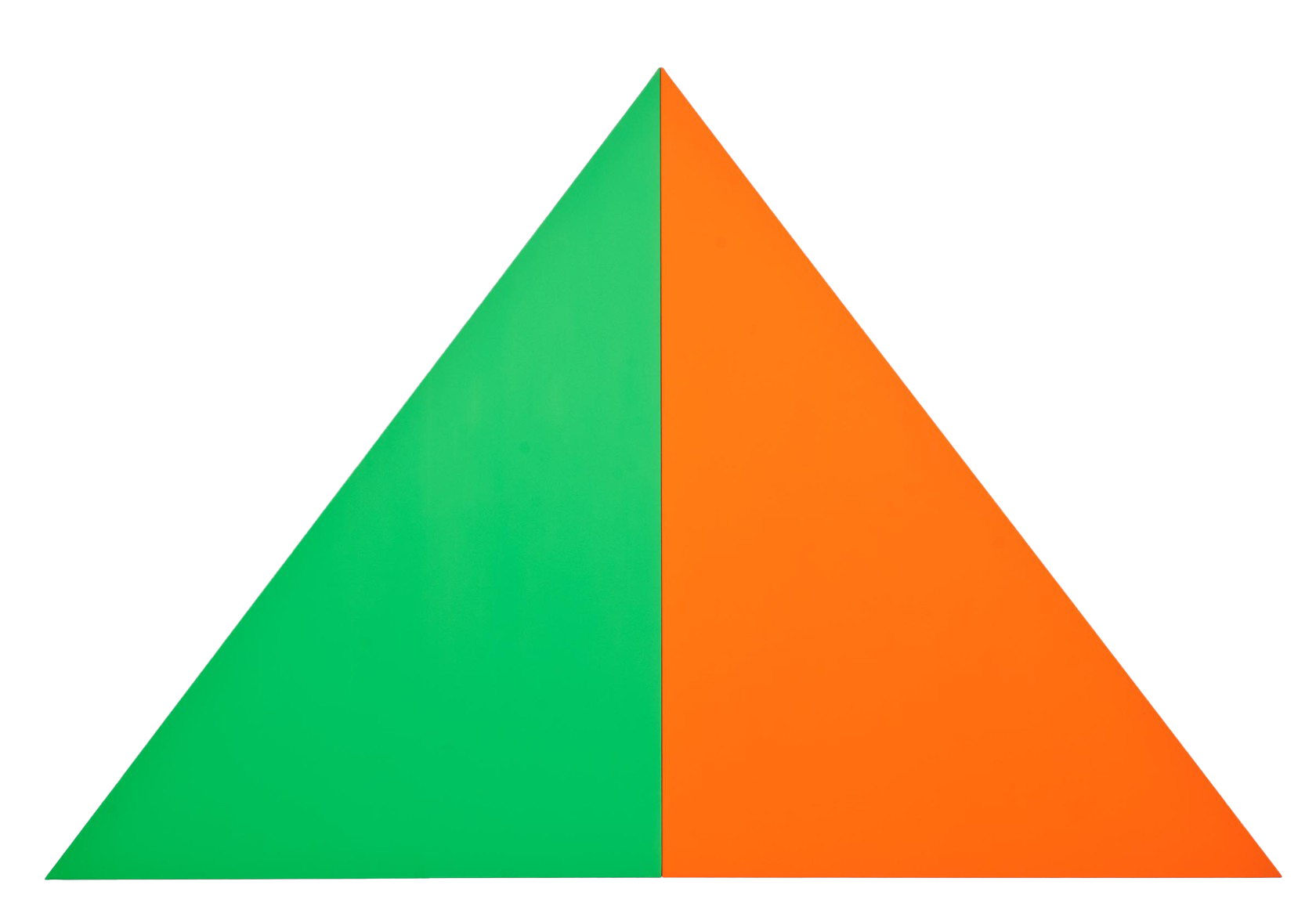
Kelly’s studio in Spencertown, NY—where he died at 92—is painted a cold grey. The color of the background in Adobe InDesign. This color. Architects from the city chip paint samples off Kelly’s fencing so that their second homes might imitate Kelly’s. When you see Spencertown from above, you’d recognize the grey rectangles: pixels across Upstate.
Over digital pastures, I’ll scroll past rectangles. I’ll pinch drop-shadowed boxes. I’ll double tap underlined words. I’ll imagine Ellsworth Kelly in 1945.

There’s an ease to this labor. Just as the 603rd Engineering Camouflage Battalion could lift inflatable tanks like pallbearers, designers shoulder virtual dummies. Type moves across my screen lightly, lassoed like balloons into new arrangements.
This is what we do: we tie these strings together, like a mobile. Forms and words and type—in conjunction, these arrangements publish a public.
But.
By being public, by being part of a social organism, we’ve hitched ourselves to an extractive industry. In Design as Art, Bruno Munari cautioned against challenging this order: “To neglect the rules is dangerous, because it fouls up the whole organism.”
But what if the organism is already “fouled up?”
Why Code A Book?
In his essay,
Postmodernism and Consumer Society
, Fredric Jameson characerizes the postmodern period as partly
defined by schizophrenia
. He, of course, does not mean this
clinically, but rather treats the term as figuratively capturing a
cultural truth. He notes that,
[We are put] in the position of grasping schizophrenia as the breakdown of the relationship between signifiers.... The experience of temporality, human time, past, present, memory, the persistence of personal identity over months and years - this existential or experiential feeling of time itself - is also an effect of language. It is because language has a past and a future, because the sentence moves in time, that we can have what seems to us a concrete or lived experience of time....[The schizophrenic] is condemned to live a perpetual present with which the various moments of his or her Past have little connection and for which there is no conceivable future on the horizon.
Our particular moment, according to Jameson, is defined by an
obscure relationship to language. The Unicode servers have gone
down; our punctuation slackens; specificity is muddied by the
perpetual present
.
What then are we left with? Jameson asks the question explicitly:
We have seen that there is a way in which postmodernism
replicates or reproduces — reinforces — the logic of consumer
capitalism; the more significant question is whether there is
also a way in which it resists that logic.
In other words, how can we defy a predatory system that design has
grafted itself too. At least, how do we not feed the tumor of
extractive capital, which in the age of computation,
has become even more capacious as it devours the Global South. I
don't have an answer, but in coversation with Andy Pressman, I
found myself circling a clearer position; the work itself cannot
challenge these systems, it will only replicate
or
reinforce
. We must turn elsewhere, to the periphery, to the
things just outside, to the parergons.
As I've expressed above, the silhouette is my aesthetic and political gesture. Ellsworth Kelly or Hans Haacke both strung together loose threads, and I've aimed to make this book an expression of this impulse.
What you're currently reading is entirely coded, built on the skeleton of bindery.js and glitch. I spent much of my semester writing these sentences in markup, designing outside Adobe. In this small refusal to work in Google and Adobe products, I'm angling towards a practice I delibrately pursued in my first year at RISD. The entire design industry seems fouled up; without the permission of Adobe, and its massive extended universe of tools, an entire practice dries up.
I identify my pursuit not as an end goal—it would be ill-concieved
to suggest that designing a book without Adobe frees us of
extractive capital. Rather, this small rebellion points towards a
more liberatory design praxis. I say this half cheekily/ half
sincerely: we must kill the Creative Cloud in our heads.
Interview with Andy Pressman
Pursue your interests; don't pursue
design. If you are invested in the world, pursue that. The work will frankly come from it; work comes out of the things that you're interested in that you're a part of....Design often is a self-serving, self-obsessed industry, but fundamentally design is an adjacent thing and it works with other things. It is on you as a designer to encourage a healthy symbiotic relationship.
— Andy Pressman
Everett Epstein: I wanted to start by asking about your last couple years as a designer and creative director, I’m thinking specifically about your transition from Rumors to Upstatement. Have you had a chance to look back at Rumors with a little bit of remove, and if so, what does rumors look like in your mind now?
Andy Pressman: That’s a really
interesting question. I think a lot of small studios and agencies
take on the character and characteristics of the person running them
(I don’t say founder because I think that comes from a different
sort of idea of like entrepreneurship). And I think Rumors, in that
way, reflected my interests, and for that reason, it was not a very
well run machine.
I have friends whose natural
inclination is towards business, broadly speaking, towards being
smart about the allocation of resources and the pursuit of certain
work and how to build a sustainable financial operation. And that’s
never been my skill set...or interest. Therefore, , I think I
projected an ambivalence towards those things. That’s partly why the
studio closed; I was running a profitable business, I was running a
somewhat self sustaining practice that just could not sustain—given
its model. You can do a lot if you don’t care about profit, if you
are not employing people, and if you’re not trying to work at a
larger scale. More challenging work is just more expensive, and you
have to think about ways of building a sustainable model that will
support that work.
So when I think about Rumors, I think that it was built for
everything else and did a good job of everything else. It enjoyed
itself, and I maintain a close camaraderie with people who came
through it, who are still in touch with one another and work
together in different ways. But it was not built to last or grow.
Moving to Upstatement has been a delight because there
are people whose natural inclination is towards a sustainable
practice, who are making decisions and who manage the organization
in a way that is thoughtful about that stuff. Frankly, not having to
think about it is great.
EE: For this book, I’ve spoken
to Drew Litowitz and Kris Sowersby, both of whom are invested in
craft even though, in Kris' case, he’s running a business. You’ve
talked in the 2018 talk for
Design Portland
about your slightly different relationship to a formal practice as a
creative director, and I wonder how you define your current craft.
AP: I’m very much of a
designer's editor. It’s my work to read, so to speak, the
information, context, meaning and needs [of the situation], and then
to articulate strategies and approaches. Sometimes good editors
write the headline, or sometimes it’s just to outline, at the start,
the ideas that we want a piece to focus on, and then leave it up to
the writer to argue those ideas.
► When I think of it, a creative director's role is maybe (and I
mean this sweetly) that of a con artist's. That is, a confidence
artist. It’s the person who’s most confident in putting out an
idea and then letting that idea sort of be batted about by
people.At this point in my work, I’m pretty confident in my assessment of
things and then articulating something and letting other people
argue against it. I think a lot about management now, in a way I
didn’t before. This relates back to this question of working with
other designers. I’m just not a creative. I don’t recognize that I
have modes of working that are stylistically similar. But [also] I’m
not a painterly designer. People don’t hire me because they want
work to look a certain way, and I don’t mean that dismissively. I
have great respect for my peers who are effectively painters and are
being hired in that way. But I’m not. And so I’ve never been a
creative director that leads towards certain visual outcomes. It’s
more of trying to figure out strategies of approach.
EE: I imagine that since you left Cooper Union in 2003, you’ve probably seen an elephant’s graveyard of CMSs, trends, and new forms of friction online. Do you get a sense of the zeitgeist of this particular moment online?
AP: I’ve been thinking about
that a lot lately because I’ve been trying to revisit that those
ideas in that talk for publication. It’s no longer the same moment;
Bootstrap is not the the thing you see—it’s not the immediate thing.
You see, I think there is a renewed emphasis on the designer
probably being involved higher up in the discussion to figure out an
approach. And the tools have evolved, [but] those frameworks that
were in place haven’t necessarily evolved....
I mean, the website matters less.
► The distributed life of a thing matters more. I think that the
art director has probably come a long way in the past five years
when we think about interactive work. For a while the art
director was directing images that fit within boxes, within a
bento system. Now, the act of art direction is taking place
higher up in the chain—upstream,
as they say in the
business.
I think that's changed. [There's a] need for a
different kind of framework; instead of having something that is
effectively filled in, flexible frameworks that can adapt to
different art direction seem to be the more prevalent mode. [Since]
that talk [at Design Portland], I think there has been more
attention paid to healthy friction.
A lot of those rules are
less prevalent now partly because I think their authority was
demonstrated to be false. You see enough things that don’t do the
right thing
that are totally successful, and therefore, this
[established] rule was a matter of chance or time or laziness in
many cases.
EE: Yeah! There's seems to have
been a wave of
Brutalist websites.
And then those started to die out, or rather it felt as if they were
sublimated by CMSs like Cargo Collective. Suddenly, you get a new
CMS that can kind of do the Brutalist thing. Then everyone starts
doing that, which kills its subversion. In some ways it feels
similar to the way in which theory gets fully digested by the
mainstream, and then once digested, new theorists ask what's outside
of this ideology. They refuse to just rehearse the same arguments.
I’m thinking a lot about this because I’m trying
subvert the tools of design by coding my whole book, by avoiding any
Adobe products. With bindery, HTML, and CSS, I'm trying to put
together something that can be evocative of the print-to-web
discussion that was once vital ca. 2016, but seems to have been
sublimated. You’ve said before that web spaces are often very
inflexible, even though we assume they’re flexible, whereas a print
space contains an often overlooked value. Does that still hold? How
do you think about the print publication and web space where the
printed web
is sort of mainstream?
AP: I’m not that literate in
proper theory; I have a very surface understanding of philosophical
theory—which I have mostly through my time at Verso—but I do
appreciate Marshall Berman’s argument in
All That Is Solid Melts into Air, which is about the idea of
modernism as a perpetual questioning state that once we entered into
it, we simply cannot escape from. Basically, it’s the argument that
post modernism is modernism
not from an aesthetic perspective, but just that modernism itself is
kind of questioning the contemporary. That questioning, that self
awareness, is the thing that we can’t escape from now.
So then the other question was, print versus web. I mean,
maybe it’s really a matter of resources. It takes far fewer
resources to fluidly create a new printed space than it does the
web. [A website] is just much more taxing to create new
arrangements— whether that’s interactivity, or layout or anything
that's built in code—than it does to design an entirely new magazine
every week. Both of those have underlying, structures that they sit
on top of; the magazine's is not about the design that much as the
editorial approach, which dictates the magazine and so forth.
[That said,] you can build a website that can
effectively do anything repeatedly—you can build a website that
every experience within it is going to be effectively nested. And it
could be a million different experiences. And each day, you could
have an entirely different website. Technically, it [would just be]
the same scaffolding sitting on top, but it would work with the
resources required to rebuild that thing every time. [On the other
hand,] the resources required to design entirely new issues of a
magazine are relatively insignificant.
EE: After listening to your talk at Portland State University, I was struck by your authenticity and honesty about the industry. I wonder, how do you have an anti-fraud compass, or even how do you see through the BS of a client, a profession, or even a particular trend?
AP: So here’s my answer: this only matters in as much as it exists outside of the design industry; it only matters within a world that the design industry sits within. Within the vacuum of the industry, it’s sort of irrelevant.... The reason that there is this ability to be a fraud is that there is an audience that will consume it, buy it., but, I think that comes back to design's idea of itself as having social currency. and wanting to acquire that social currency and sort of misunderstanding designs actual role in the world. [If] you actually care about its place and role in the world, then you’re able to determine its value or relative fraudulence, so long as it’s isolated in its own little thing. [This isolation allows it] to just feeding off itself. I’m curious as to your thesis, how does any of this get framed within what you’re working on?
EE: Yeah, so I’m starting with
with Keller Easterling, and trying to think through her most recent
book with an understanding of power. In short, saying that we
construct designed things from all these different components, one
of which is our placement in capital. I'm asking designers to
recognize that your computer—and everything that you make with
it—relies on an an extractive industry.
So part of what
I'm trying to figure out is how can I do something outside of a
larger system that is rebellious, but ultimately, is able to kind of
coexist within? How can I both be paid for these systems, but also
not sell myself out as a human, or as a designer?
AP: Sure. That’s a fair
question. I think the question of having to work ethically is the
most pressing and difficult thing for people coming out of school
now to a younger generation that has, that has fewer opportunities
to take up a trade. That just doesn’t exist anymore in that way.
All those questions to me happen outside of design— it
does not occur within it. I just do not on a fundamental level
really care about questions of style-copying,
or
posturing
within the design industry. It is solely about the
the matter of the thing itself and how it works, if it works, where
it works. We use the term political design,
but I don’t think
my work at Verso as political design. It was designing for books
about politics.
► Political design is actually engaged in a world outside of the
specifics of the market. Coming up with a system for
distribution of information to local organizations (or
distributed organizations) that’s much more of a political
design act than you know, designing a book cover.
I enjoy making things that get used or challenged, but I don’t, for
the most part, think design can have an impact on the world that act
outside of politics, outside of the space and sphere of politics
itself, outside actual action.... I just don’t have much faith in
design on its own at all. I tend to think most of what it does is
solidify existing power structures. When I joined Upstatement, at
some point, I made some jokes that fell very flat: that there is no
ethical design production under capitalism. You’re not necessarily
doing ethical work. You can do unethical work, for sure.
Without a doubt. I’m not saying that there’s not traps that one
could fall into or engage in, or that it’s impossible to
sell your soul.
That stuff is everywhere. It’s always
inviting, but there’s [a lot of] stuff that you can do that will at
least let you not look at the mirror and wonder who you become. But
the actual opportunities for you in the world exist outside of the
design industry.
EE: That’s so interesting. I was a high school English teacher before I was a designer for about five years, and I was teaching in Rhode Island. Part of what that means is contending with unions. That is, figuring out where’s my place within this union? And I going to join this union? Am I going to stand in actual defiance of it? How do I approach integration within an incredibly segregated school district? All of these questions mean partially contending with a union. So when I shifted into graphic design, it was surprising because there really isn’t a language to talk about unionization. I’m wondering if you’ve thought about this, or how you support workers within your particular position as management now.
AP: I’ve thought about that. I
mean because I'm management, I couldn’t be part of a union even if
if I wanted to. I’ve also never worked anywhere where there’s
reasonably enough people that a union would be actually on the
table. Well—that’s not necessarily true, but I haven’t really worked
anywhere where that’s been a topic of discussion.
► But I do think that unionizing your workplace is, I should
say, the most salient and best thing you can do as a designer,
if you really want to, contribute to something broader. That’s
exactly right. That’s exactly what I think I’m trying to get at.
The actual experience not of the work that you’re making and how
it’s received by a consumer, but how the work is made and under
what conditions, who shares the power, and so forth.
At my last company, where I worked very briefly in
between Rumors and Upstatement, That was the first time I’ve thought
about what it would be like to start a union. Because I hated
it...not the job, but just structurally. It was a very classic split
between a management layer and everyone else. But I quit the job
real soon. So I didn’t even stick around. And in that sense, I
talked about what I don’t preach, because I’m now here at my new job
at Upstatement, quietly salting, as they say, the channels with
union material. But I know people who are thinking about that a lot.
And I think that’s absolutely the more important question right now:
how is your workplace organized?
[The unionization
question]is gonna hit design. Already there’s gestures of it in
those tech spaces.
EE: Thinking about specificity and memory, which projects at Verso do you look back on fondly?
AP: Verso's interesting
because when I was designing covers, for the most part, it was
because there was a problem. [Either] the designer fell through or
the author was alive and would last minute kill a cover. That was
when I would come in and design. So, for the most part, that work
feels necessary and not as explorative as it could be. The
Radical Thinkers covers remain for me the most interesting: a
puzzle that I would burn out on and then get really interested in
and burn out on again. I mean, that’s as close as I’ve come to
trying to exhaust an idea ([or] direction) in terms of art
directing.
[At Verso] it was a matter of working with
smart people that I understood that I knew would have a sympathetic
approach. Verso was more about developing a brand not around a
visual system but around an approach, and that approach was
typographic, explorative, and loud. So, the most satisfying
experiences I had there were building good relationships.... Most of
it is about finding and cultivating relationships. There’s just
designers that I admire that working with them was a true delight.
My most satisfying work for Verso was getting Michael Oswell to do
work for [us]. That’s the best thing that I did at Verso. ....I was
just there to help him think through ideas. I was there to reframe
things as he comes up with them. I’ve had the luxury of having a
career that has me both doing the thing literally by myself from
cover to cover, and then just being somebody that offers big ideas,
then sits in a room, and has conversations with people until it goes
somewhere else. That’s the extent of my work. I enjoy a career that
lets me do both of those things.
Chapter 3:
Parentheses
The Edge of the Knife
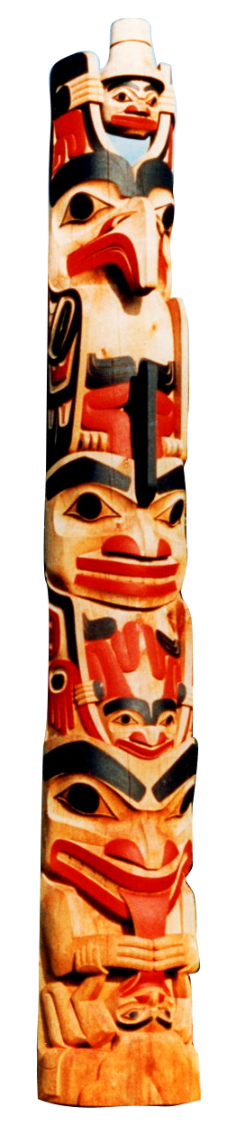
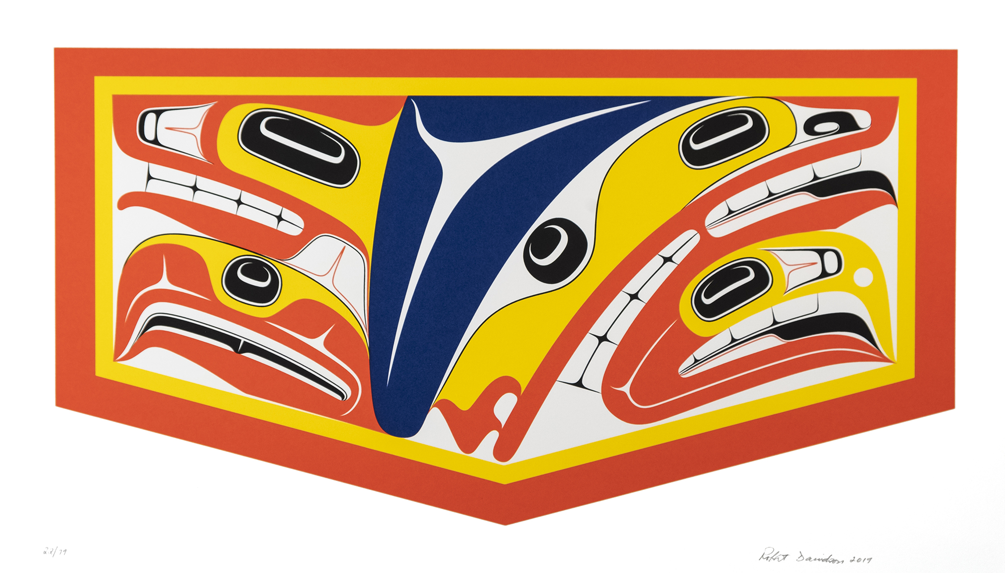
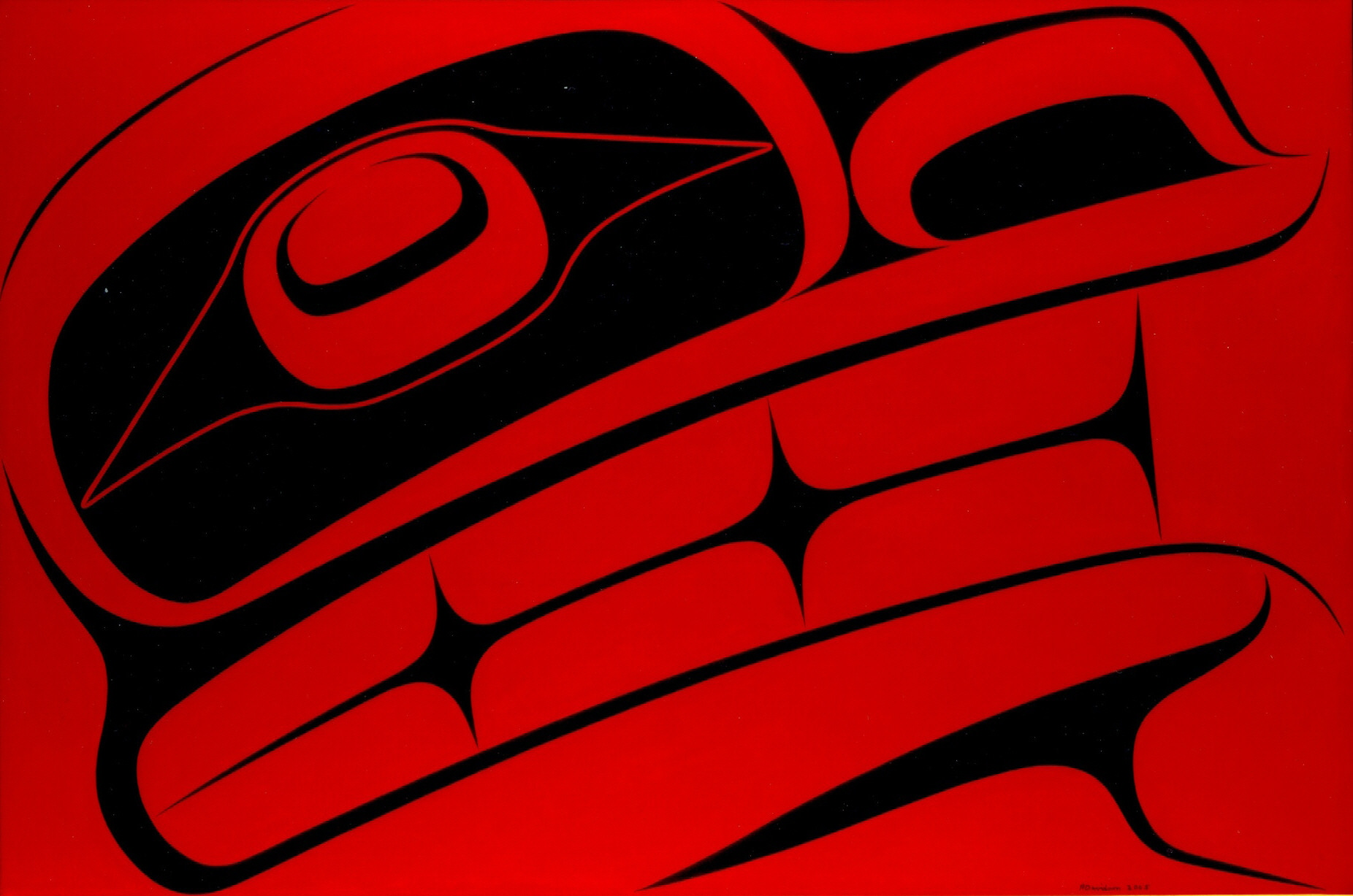
The word I use is(26)implied.There are a lot of things that are implied in the art, and it works the same way in speech making, and in the way we were brought up. There are certain things that are not said, but they're implied—they're unspoken, we're expected to know. The words to a Haida song are really one line, or two lines, and the rest is implied:Weep all you high ones, the steamboat is leaving.Those are the only words in the song, but there's a long story that goes with that statement. I think that's what abstraction is....I see the knife's edge as the present moment. The abstraction is the thin yellow circle: the edge of the knife. What's inside is the past—the knowlege and experience—what's outside is yet to be experienced.
— Robert Davidson
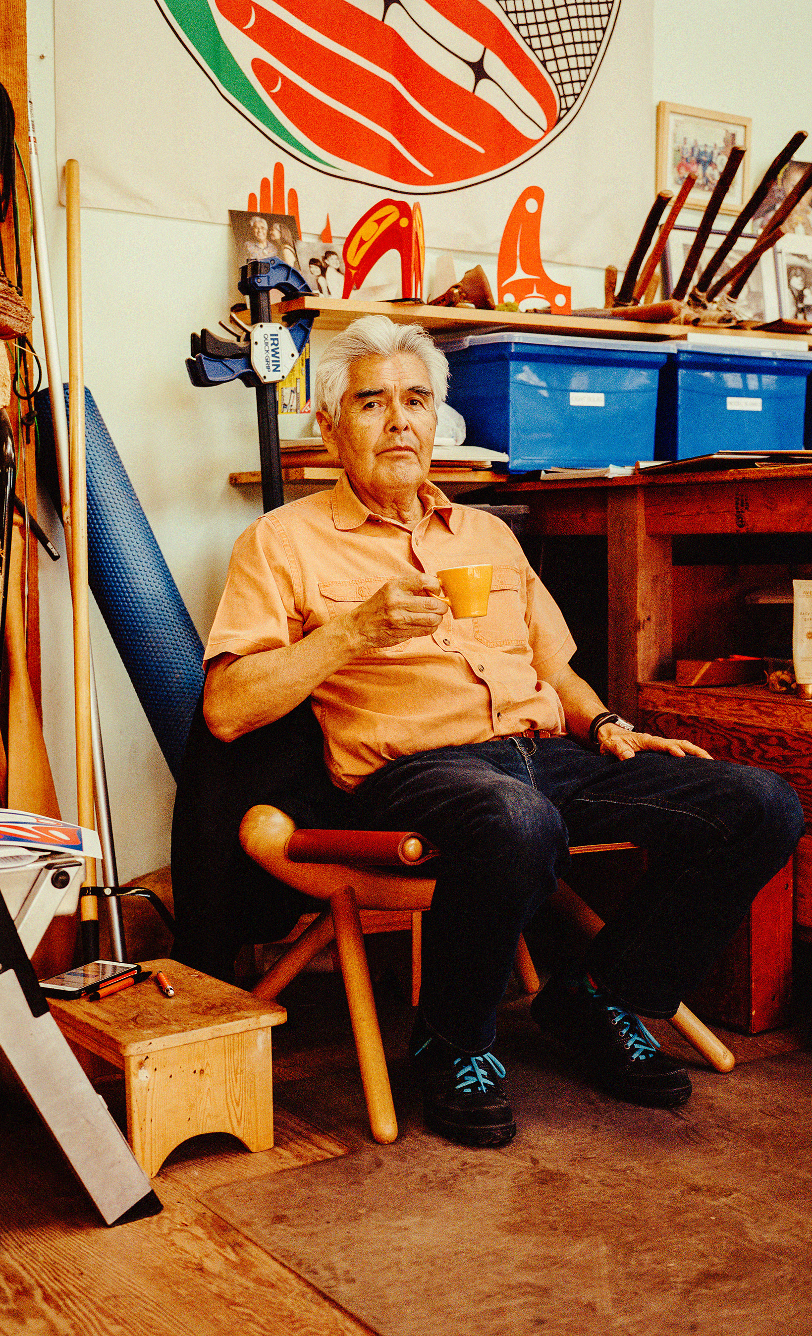
On August 22nd 1969, the Haida people of Old Massett raised the first totem pole in nearly a century.
Christian missions, colonial rule, and the 1876
Indian Act
had largely eradicated this tradition, gradually
erasing an indigenous art. By 1969, many of the original totem
poles had been burned or chopped down. You can see some of their
remnants in the 2019 documentary,
Now Is the Time, which chronicles this period. The film-makers captured in
conversation with the elders of the Haida community, the sadness
of this period: the debris of sculptures now riddled the Massett
hillsides, like a forest razed of its trees.
In 1969, the Haida artist, Robert Davidson was 22 years old, but
he understood the preciousness (and precarity) of the totem pole.
He came from a family of artists, so he grew up steeped in Haida tradition. After returning from
Vancouver School of Art, where he studied under the lineage of
Bill Reid, he knocked on every door in Masset looking to find traditional
carvings that survived what he called the dark period.
He
found one box.
That spring, Davidson and his brother Reg embarked on an effort to
make a new totem pole. They recognized that tradition needed a
container, a vessel, an abstraction to be raised. It's not wholly
inaccurate to say that if Davidson didn't make the effort in 1969
to preserve the totem pole, then an entire practice may have
slipped into the unspoken,
into memory. Instead, the
direction of David's adz carved a grammar nearly forgotten, one
that communicated in defiance of the void.
Years later, in conversation with Karen Duffek, Davidson would
described how the
[totem] pole filled a gap. The art became a vehicle for
cultural knowledge to become part of us.
(Duffek, 11). The totem pole was a gesture to heal as well as
contain, a tool for a new generation.
The Invention of the Parentheses
Nearly 600 years earlier, in 1420, Gasparinus de Bergamo looked out across the terracotta tiles of Padua and had a thought. Or rather, he added to someone else’s thought while studying the final letters of Cicero. For years Gasparinus had been feverishly chronicling a new Latin, one indebted to these texts spilling across his desk.
At the time of this thought, he would have been around 60 years old. Gasparinus would die 11 years later at 71, never seeing the thought become design. Instead, it would remain rhetorical before being loosely tucked into the Doctrina Punctandi—one of his many humanist texts on grammar published posthumously. The thought existed before publishing.
Today, Gasparinus is remembered as an asterisk, the probable teacher of Leon Battista Alberti, the great Renaissance architect. The author of the first printed book in France. A prophet of humanism. Beyond this collection of trivia, however, little remains of his legacy.
Yet, his thought lives on. You see, Gasparinus de Bergamo invented the parentheses.
Gasparinus’ parentheses were rounded and coy, two grins designed to be taught across elementary schools, wholly unlike the〈 〉of Cicero’s letters, from which he adapted his marks.
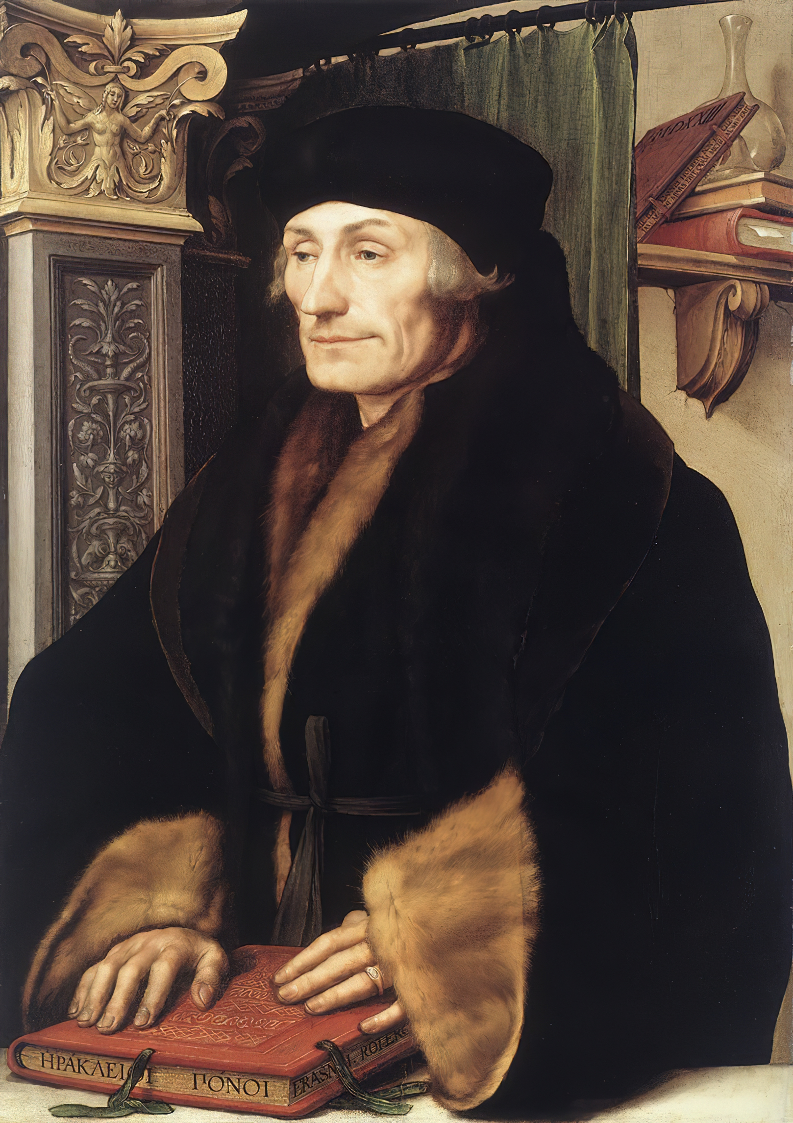
Nearly 100 years later, Erasmus of Rotterdam likened them to the slivers of a crescent moon. Lunula he called them.
I’d like to imagine Erasmus in the early 15th century, looking out over Leuven at the night sky. He found in the waning moon a symbol that so neatly captured the awkwardness of a present absence. Of a filled puncture. Of the parenthetical gesture.
When Gasparinus scribbled out his notes for Doctrina Punctandi, his handwriting a perpetual italics, he birthed a glyph artful enough to pronounce a new thought: the clarification, the ironic aside, the murmur just under the breath. In theater, the punctuation mark offered a crowbar to pry open the fourth wall. 450 years later, the parenthesis became essential for a line of code.
Graphic Design is impossibly, tediously, beautifully parenthetical. To reduce the discipline to commercial art feels a bit unfair; to claim it is “typography” feels incomplete; to say that Graphic Design is content to create messages feels so expansive that the definition is functionally meaningless.
I turn back to the glyph, to its captuousness. There’s resonance in an aging humanist sweating in the Padua summer as he translated Cicero’s final letters, desperately standardizing brackets. There’s resonance in Erasmus motioning to the sky for a metaphor, seeing the moon's bezier curves. There’s resonance in Hamlet lamenting the stars — “(O you Stars)” — and then carrying on with his soliloquy.
A parentheses defines both the capacity and limitation of Graphic Design, and I’d like to position my practice snugly between these brackets. A designer principally punctuates: they create the grammar of a system through type, form, or code. Their medium is fundamentally peripheral, and like Gasparinus, they might shape, but not author, a distant thought.
A Parenthetical Practice
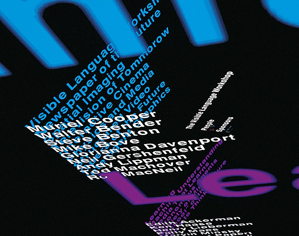
As an educator, Muriel Cooper worked parenthetically to the future, as if framing a glimpsable (but distant) form. Through the Visual Language Workshop (VLW), she carved a space outside but within MIT, a pedagogical oasis where technology might feed design and vice versa.
In a conversation with Janet Abrams (her final interview in 1994), Cooper laid out a parenthetical practice—one which cannot help but influence my practice even in writing this thesis. She noted,
Electronic is malleable. Print is rigid. I guess I’m never sure that print is truly linear….Designers know a lot about how to control perception, how to present information in some way that helps you find what you need, or what it is they think you need. Information is only useful when it can be understood.
In short, she reframes the parentheses of design—its capacity to contain complexity—as inherently flexible. I’d like to imagine her practice (and perhaps mine too) as a parentheses that wobbles, an elastic glyph. The resulting VLW research anticipated something stranger and more idyllic than the Adobe Creative Cloud. Still, one cannot help but recognize in Photoshop or InDesign the fruition of those early experiments, where VLW students cobbled together from monitors and tablets novel ways to draw.
After Muriel Cooper died in 1994, the diaspora of the VLW shaped graphic design departments and computer science programs across the United States. The thread is an easy one to trace: John Maeda, one of Cooper’s students ⇢ taught Casey Raes and Benjamin Frey, who together built Processing ⇢ which became p5.js ⇢ which serves as the entry point for most designers (including myself) to code.
Just as Gasparinus de Bergamo became a kind of prophet for humanism, ushering in a new thought for the Renaissance, Cooper predicted a future that by 2021 feels like a foregone conclusion.
Fittingingly, this hybrid practice realizes itself by turning once again to the parentheses. Along with Cicero’s bracket ( <> ), these glyphs become the foundational bricks of that “malleable” electronic world. Arrows and containers—the grammar of computation—have an easy abbreviation in these marks, a form running perhaps parallel to language.
Ironically, now, it feels like design requires us to work parenthetically to the tools Muriel Cooper's work predicted. People like Andrew LeClair and Drew Litowitz operate these tools obliquely pushing against a system that we know is tumorous. In short, they are either self-designing new tools (like Andrew), or strategically misusing the tool: itself a move that I'd call parenthetical.
Robert Davidson's
work, like Drew's or Andrew's, feels anxious even in its
conviction. I can't help but see Davidson's approach as similarly
parenthetical. His art pushes from outside against as stultifying
art world discourse, which dismisses Haida work as
curio
(11). But Davidson also operates from inside his
parentheses, fighting against cultural stagnation. Keep in mind,
he grew up in a community nearly destroyed by colonialism;
according to Davidson, the Haida population had dwindled to nearly
5 percent by the 1960s, and many Haida children had been forced to
assimilate at Canadian residential schools,
losing their
traditions in the process (11). In this context, he developed an
art that abuts typographic work—his practice, at points, resembles
the nuanced gestures of wood type—but its scale and form signals a confidence comparable to
Ellsworth Kelly's practice. Yet, Davidson's totem poles and
paintings revive a rich, human tradition far more precarious than
Kelly's silhouettes or shadows. He must delicately thread a
needle, parenthesizing the
recycled ideas of [his] teachers,
(16) while experimenting
to create a new vocabulary for [himself]
(16).
In essence, Davidson's practice pictures a parentheses that wobbles, that flexes.
Chapter 3:
Projects
Fill in the Blank
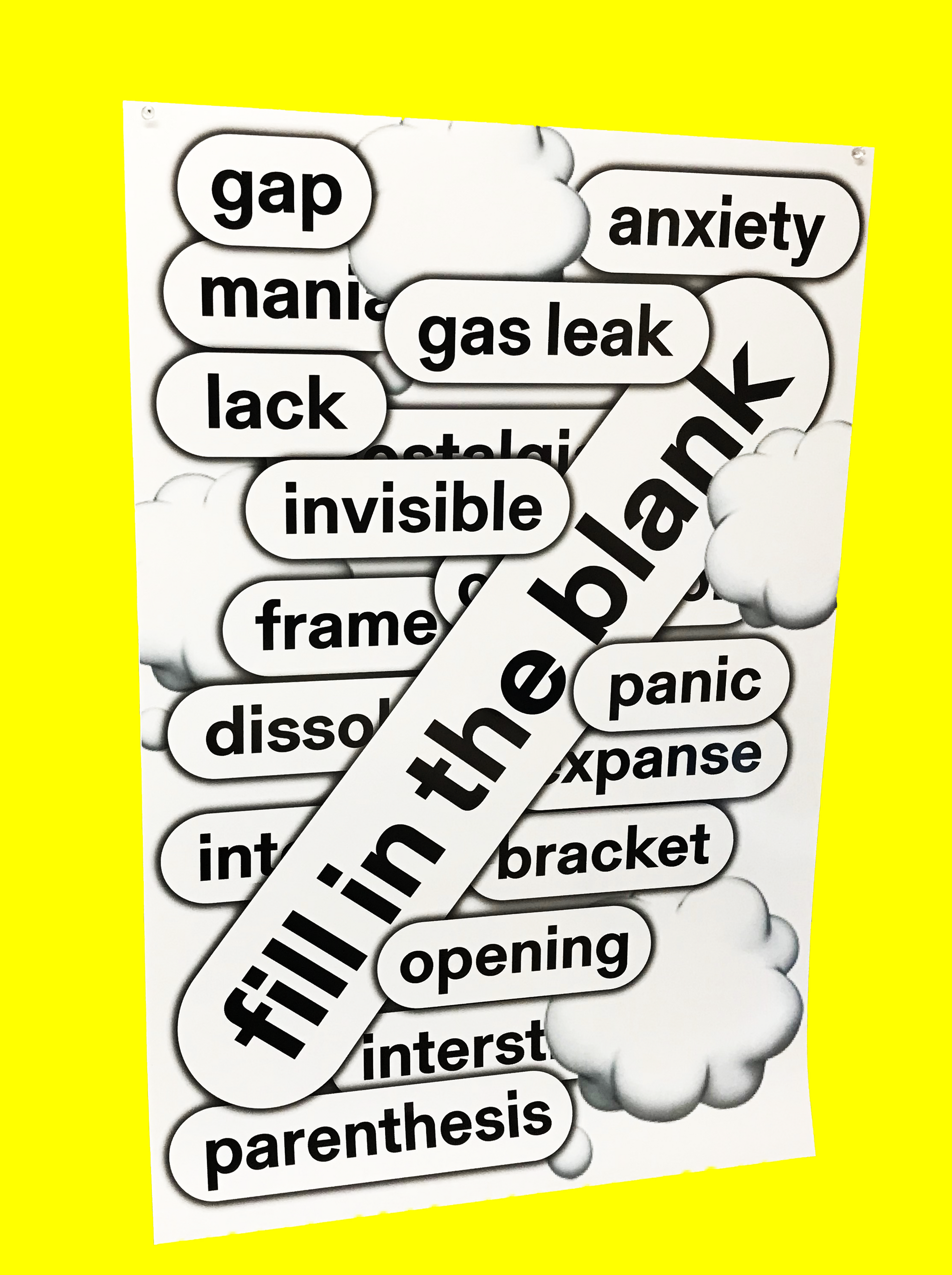
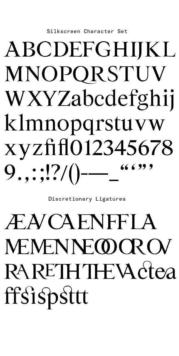
Silkscreen
This typeface builds on the references of stone-carved
tombstones in Newport, but places them in a digital medium. With
this in mind, I sharpened the serifs to what Kris Sowersby would
call impossibly sharp
points, and I started to draw
strange (or rare) ligatures.
I built out the initial character set in anticipation of a show at the RISD Museum on spider silk. For this reason, it felt like a fitting name: bringing silk to the digital screen.
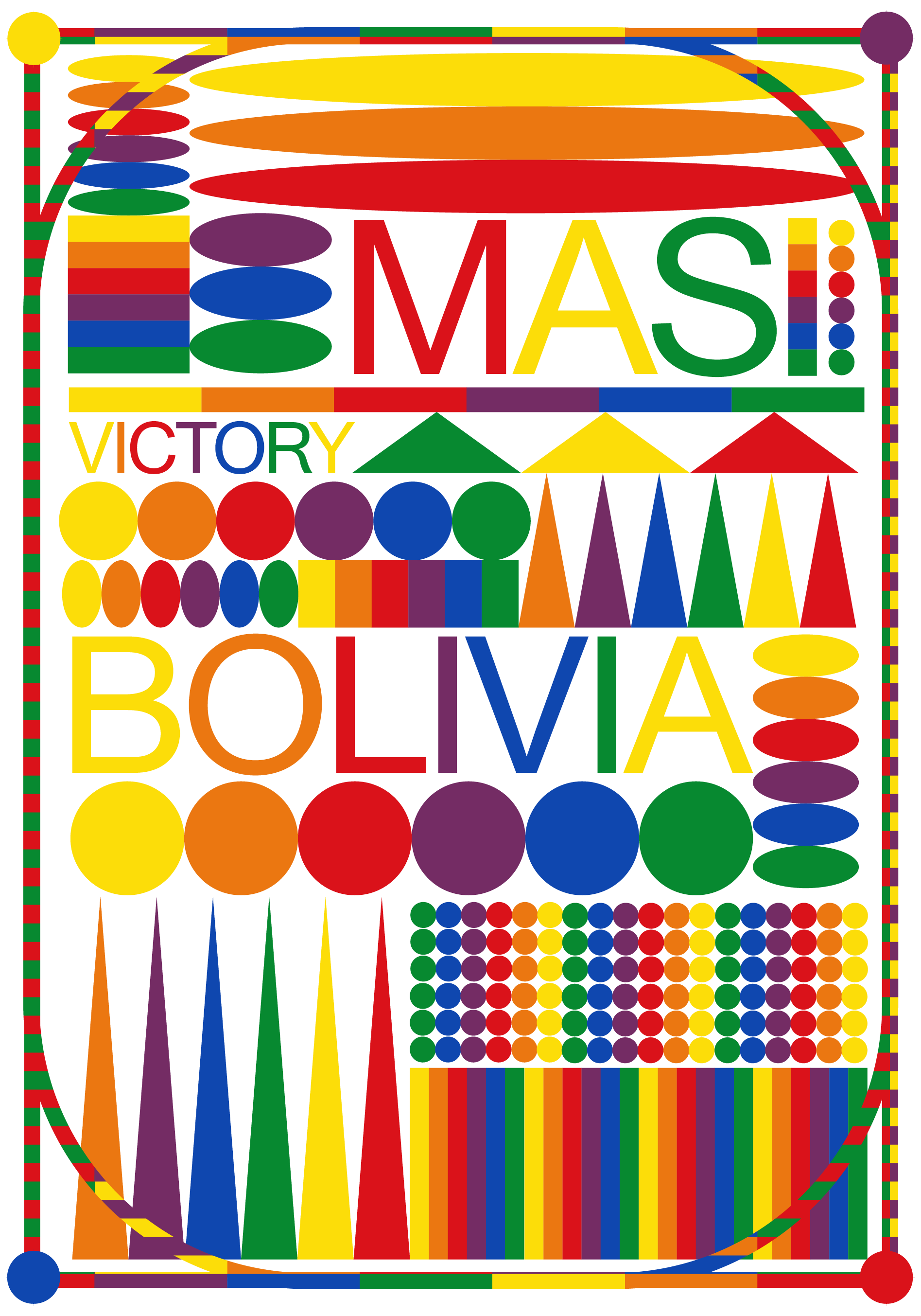
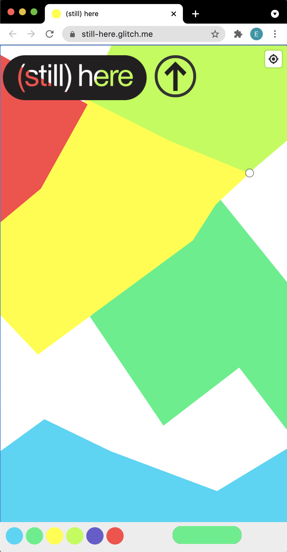
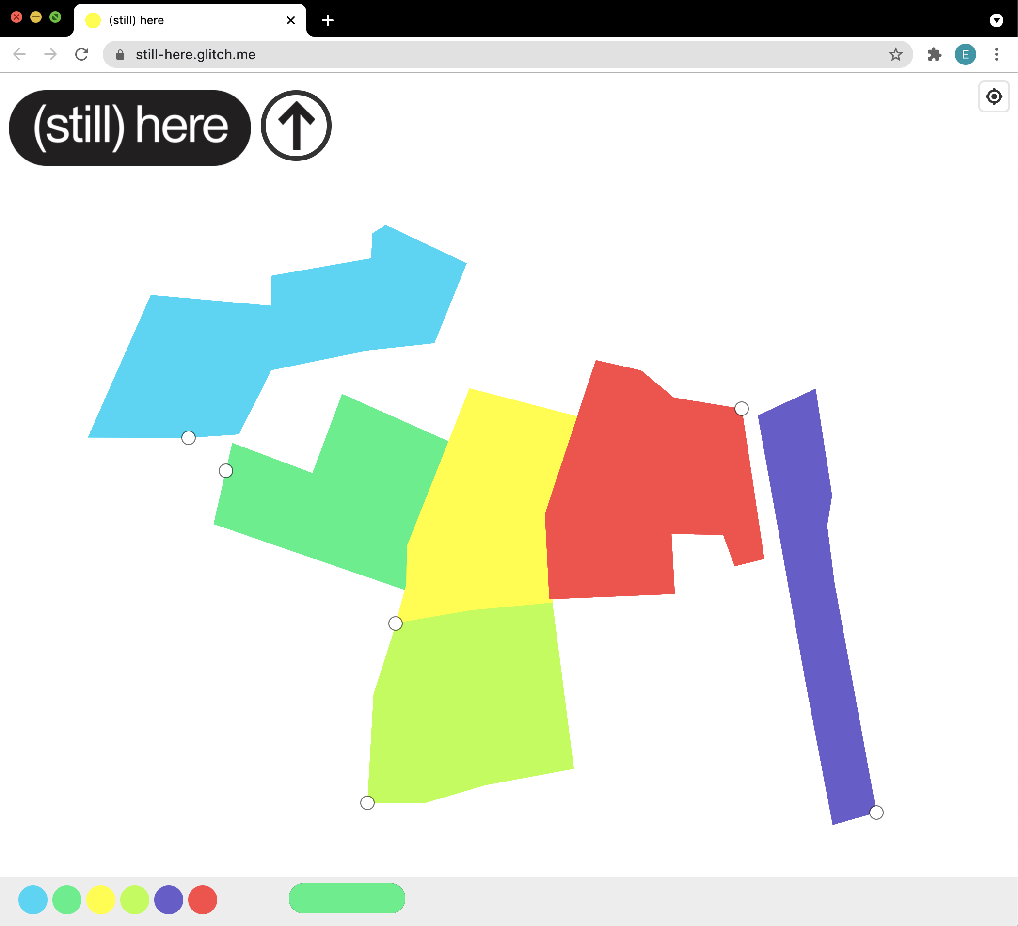
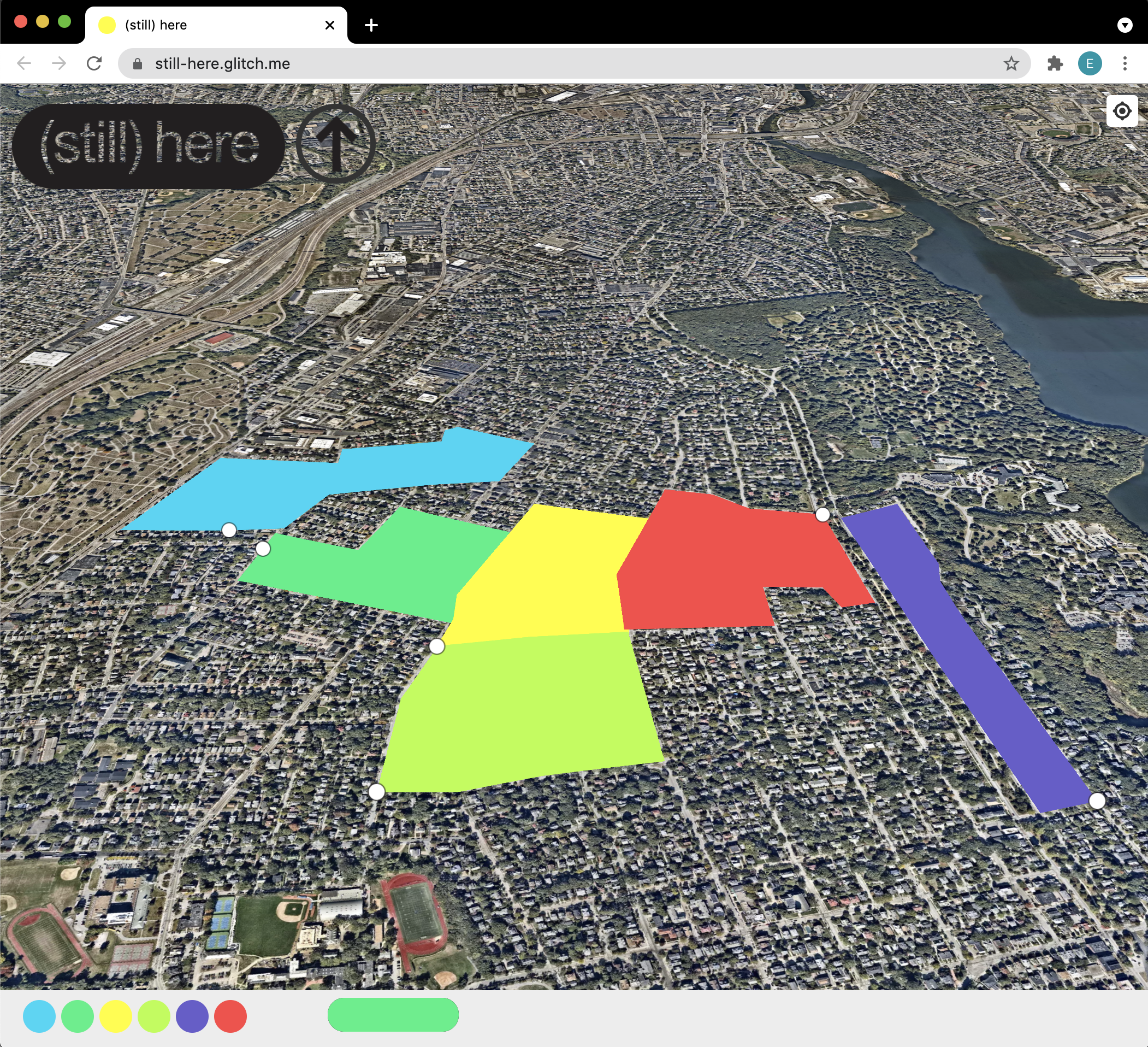
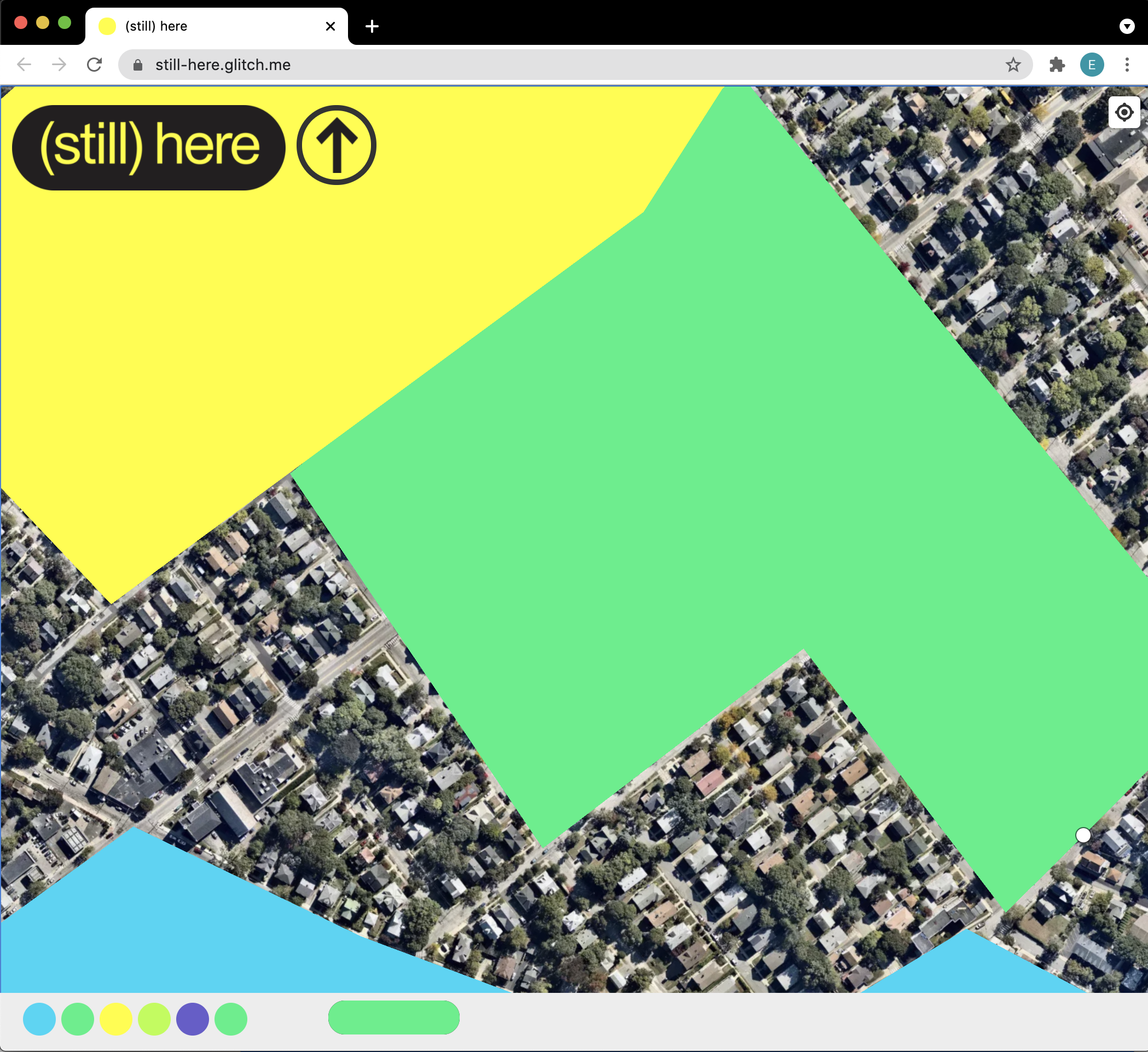
Parenthetical(s)

MAS Victory

(still) here
Punctu-type
Punctu-type constellates punctuation marks into letterforms. When looked at closely our eye begins to disassemble the glyphs, almost like a Seurat painting, but when observed from afar, these asterisks, commas, and hashtags blur together into a recognizeable letterform.


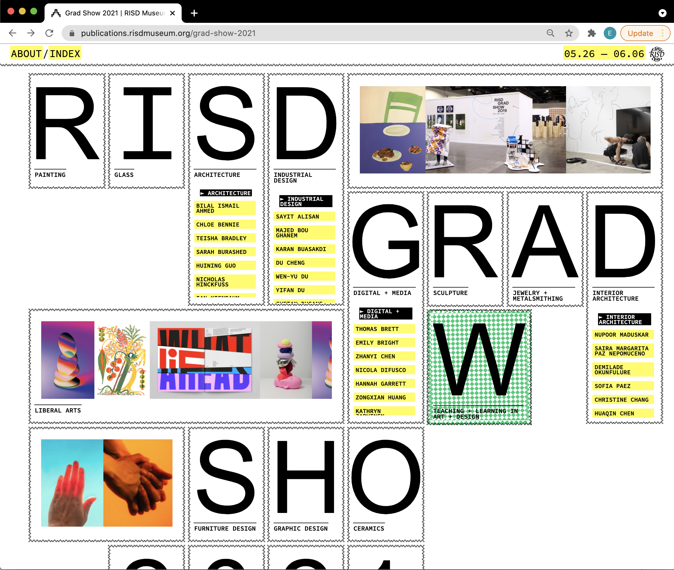
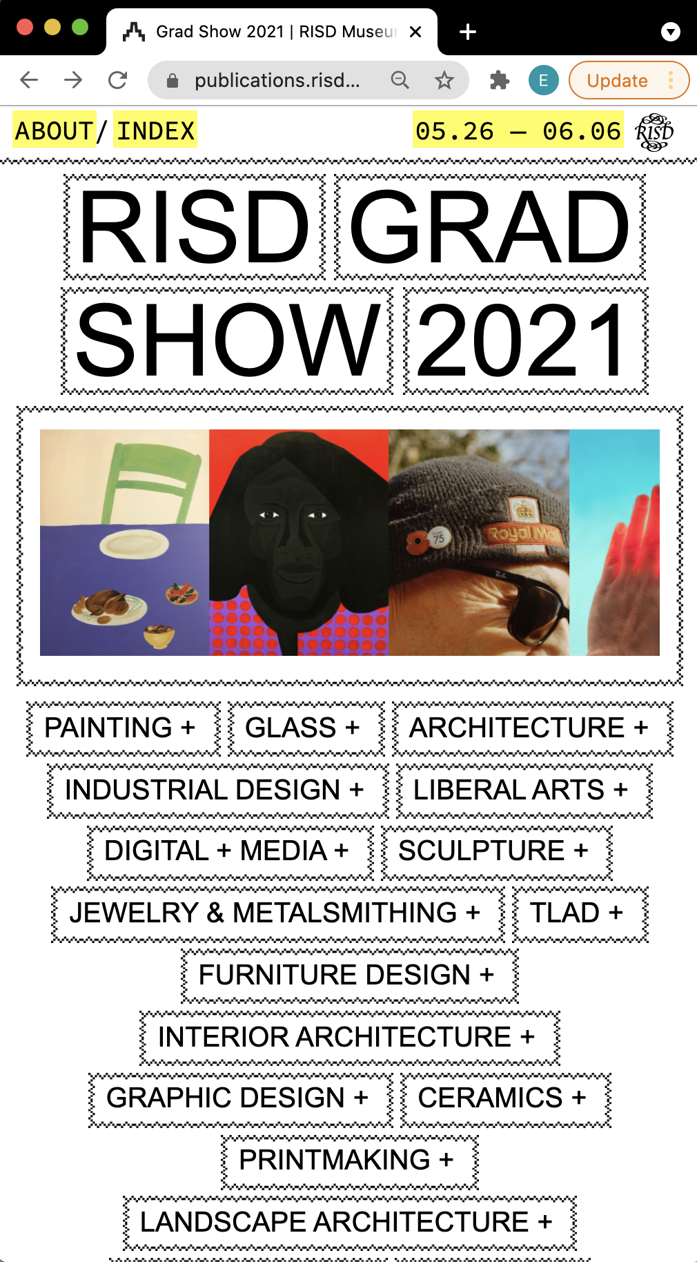
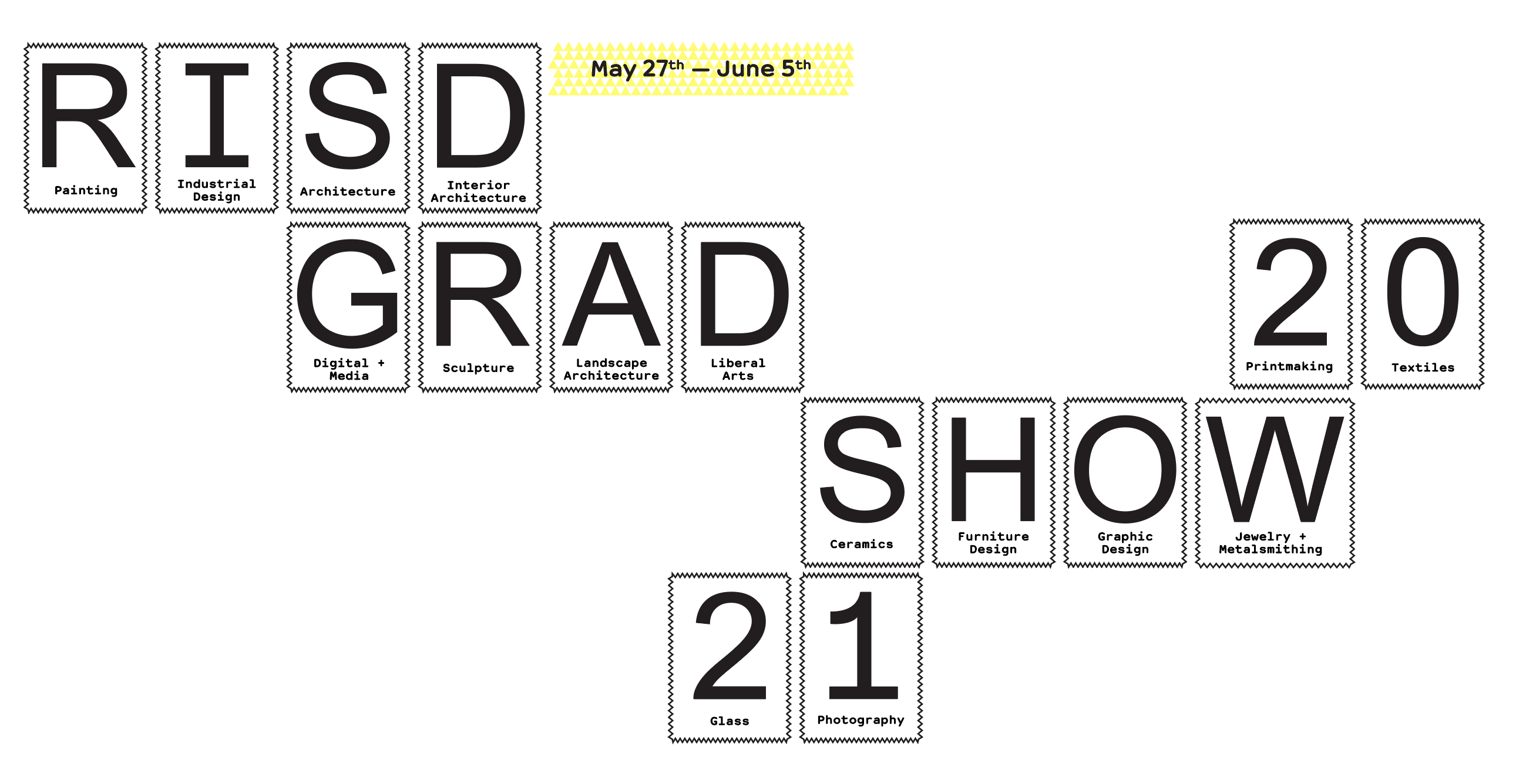
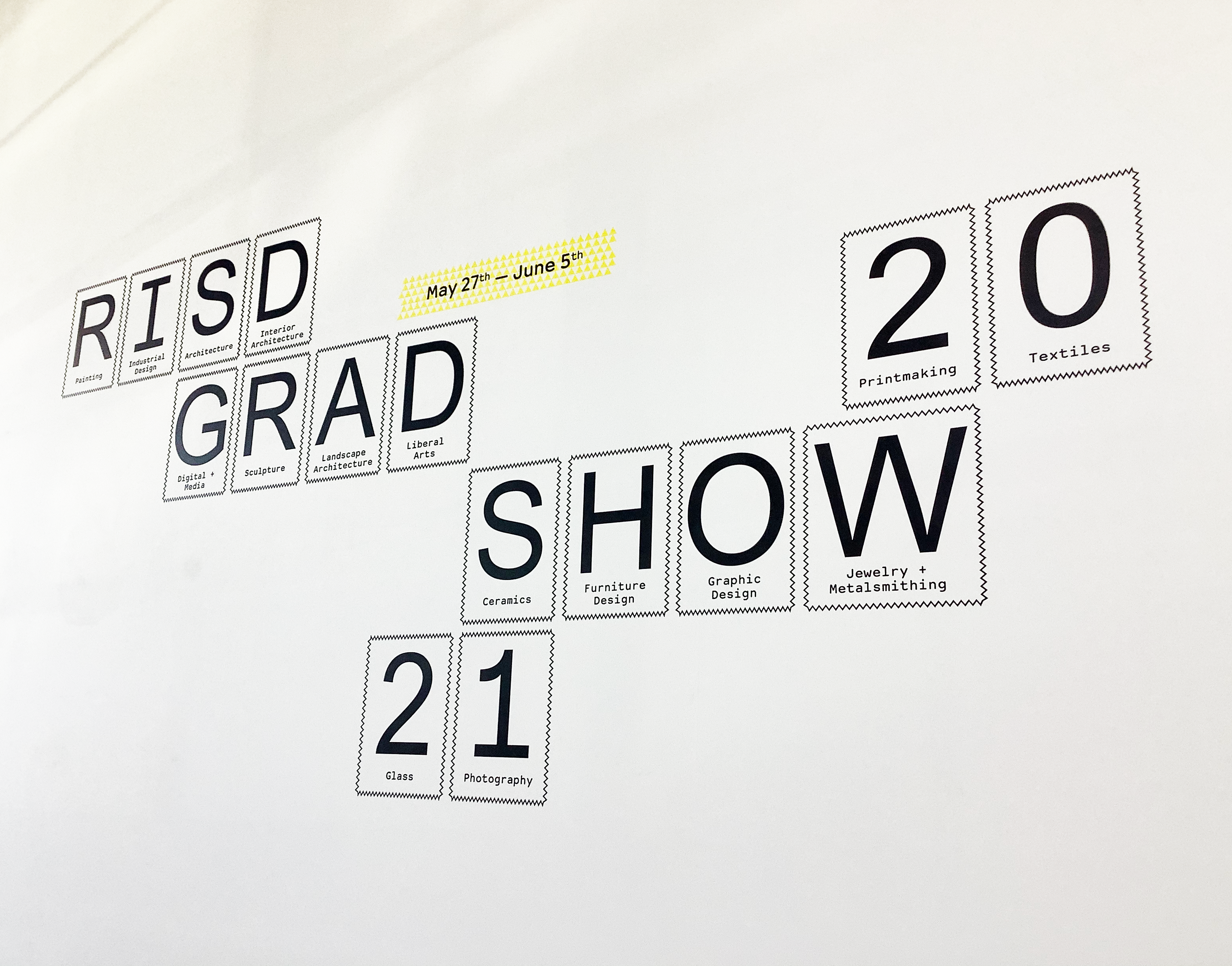
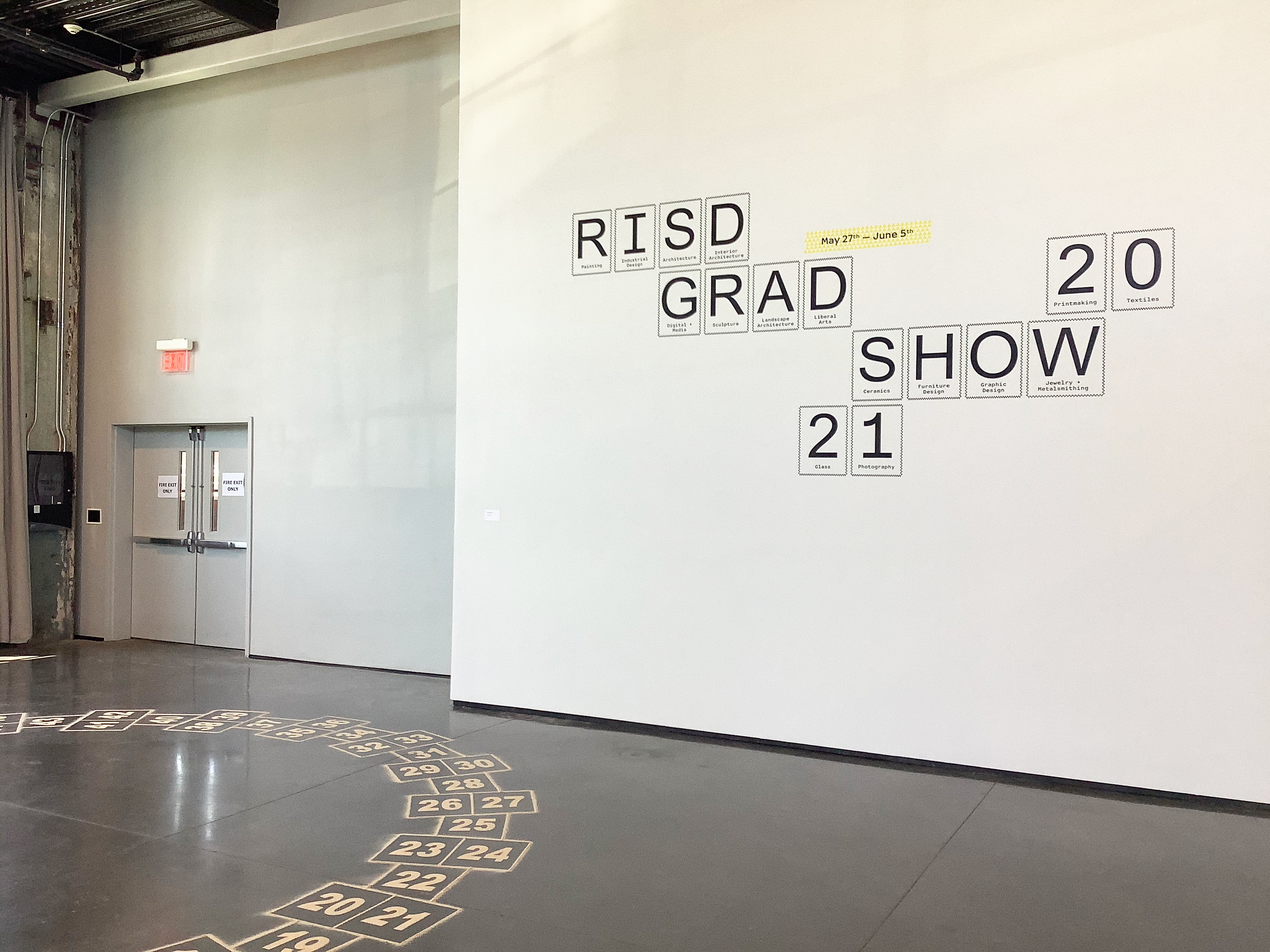
Grad Show 2021
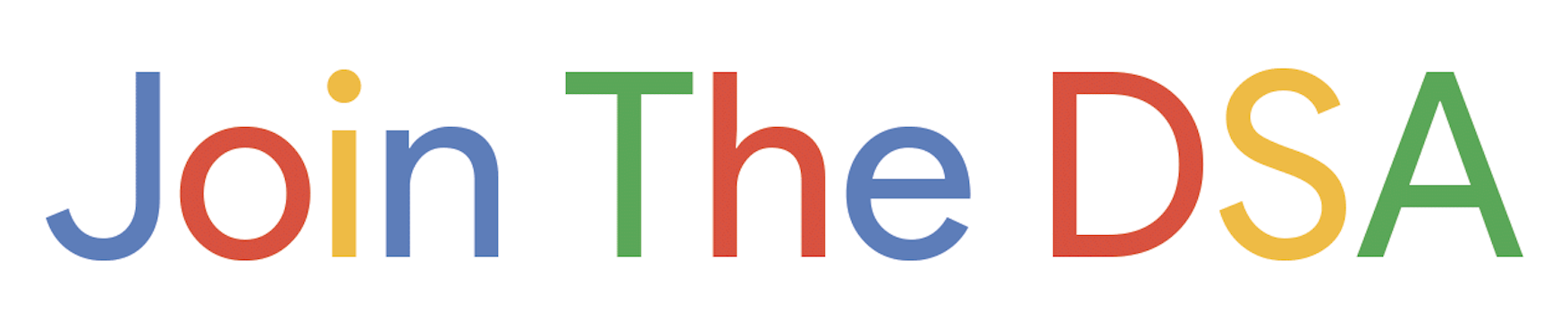
Join the DSA
Interview with Drew Litowitz
I love typography, and I’m passionate about it, but I do have a lot of insecurity about knowing the right way to set up a editorial file or knowing the right way to operate in those programs. [If you're not afraid to break things] I think you get a little bit more out of these tools, you can do lots of weird stuff. Break up a vector into six different vector, and then you can bring that into Photoshop and put a bevel on it. And then what happens if you’re painting with a bevel turned on, and there’s a drop shadow turned on that layer—a lot of what I do right now is sort of setting up parameters that don’t really make a whole lot of sense, and just seeing what happens with them.(26)
— Drew Litowitz
Everett Epstein: Your conversation with James Chae for your Graphic Design Support Group made me reconsider that Washington D.C., where we both grew up. I feel like in my head, it’s perpetually 2008 and I’m driving around in a swamp listening to Radiohead and Animal Collective. It was a space I was in for a long time—
Drew Litowitz: Yeah, me too.
EE: Yeah. It’s interesting because I feel like there’s a way in which everyone from the greater Beltway diaspora is kind of oppositional to the city. I wonder what is your relationship to that space now?
DL:
I mean, in my case, it’s really complicated for a variety of
reasons. But in particular, I think there’s this sort of
relationship to status quo or establishment, that when you’re near
DC, are sort of always , kind of, in close proximity to , the power
that the power that be the powers that be and who controls what’s
going on. And then you’re sort of indirectly, in conversation with
that at all times.
If people are going into DC, they will pass by monument; it’s
always in your face that you’re part of this, kind of bigger thing:
nationalism writ large, I guess. And I think that sort of prompted
me to and to have a lot of questions about how I fit in to that
because I never really cared that much about politics growing up,
and I never really understood that side of things. But I was always
curious how these big institutional ideas impacted me, but maybe in
a more day to day way.
It’s strange to me that I can take a car in 20 minutes and be
at the White House. What does that mean? I have no relationship with
this [symbol], but it’s supposed to mean a lot to me. So I think I
sort of have an antagonistic relationship with power
So I think in terms of my practice, I would say [I'm] always
reevaluating, the relationship that we have to these bigger
structures and how do we sort of distort perceptions about what they
mean and , kind of take them to task a little bit.
EE: Operating within these parenthetical spaces makes me think about your definition of framework as a way to understand exactly that space of what’s left out; what’s exterior; what’s what’s interior. I wonder how that definition has evolved since 2018?
DL:
Well, I definitely don’t think about it as much in those terms, but
I think it’s interesting, because for a while, I was designing
against whatever my context was: taking inspiration from music or
taking inspiration from punk or taking inspiration from [a] Do It
Yourself mentality.
Then [I entered] into this more academic,
prestigious
world, [where] I’m supposed to be haughty and
pretentious and all these things. But I don’t want to do that. I
just want to do my thing in this context—whatever that was—but also
was sort of a [reaction to] not being comfortable with that space. I
didn’t really know about academic graphic design. When I entered
into [RISD's program], I kind of came in cold. Now it’s sort of
taking those academic, more rigorous conceptual ideas that RISD was
able to give me, and using those in mainstream contexts.
► So , I’m working at Conde Nast, which is a big media company;
they own Pitchfork. And it’s almost the opposite of what was
going on before [at RISD]. I had wanted to bring the mainstream
to RISD a bit and do something a little bit more populist, a bit
more accessible. [At Pitchfork, I'm trying to] take [something
more critical to] a more mainstream place with an audience
that’s maybe established.
[That said,] I don’t really know who our audience is at
Pitchfork all the time. In my mind, it's either me: a 30-something,
40-something vinyl nerd, who doesn’t understand what’s going on, or
really young people who listen to trap or [new] hip hop that’s
coming out now. [But in my work]I'm trying to say that we don’t need
to answer to this
archetypal Pitchfork
persona anymore. We can bring in some
more deep-thinking in terms of the visual play. I’m always trying to
break out of whatever that perceived notion of Pitchfork is
I’m always trying to kind of make people think about the
process of creating the stuff as opposed to it just existing,...
trying to make work that when somebody looks at it, they see
somebody kind of interesting did this.
EE: It's interesting to see how the work you’re doing now feels aligned with the people you were interviewing for your thesis: specifically Richard Turley and Necj Prah. Do you see Pitchfork as part of the larger design trajectory of magazines like Bloomberg Businessweek that were doing this illustrative, experimental move on the margins?
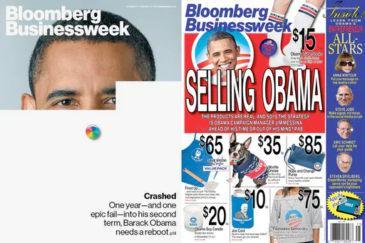
DL: Yeah, I mean, I just I’m still amazed that [Bloomberg Businessweek] ever happened, and that it still continues to happen [at Pitchfork]. I mean, you would think that dealing with people who write about music, that they’d be pretty open to lots of weird things, wouldn’t you not? Would you think that the people that paid for it would be open to sort of strange, unexpected kind of experimental ideas?
EE: No, I actually think that if you’re a critical person, you’re [unfortunately] critical of everything.
DL:
Yeah. I mean, I think that’s really what I’m coming to terms with.
It took me a long time to break the mold a bit. The history of
Pitchfork visually is really complicated, actually, because you had
the Chicago office, and you had a Chicago design department. And
those people were relatively isolated from the editorial. They
didn’t really get along super well—I don’t really know the
details—but I know that they were sort of out of reach. [But] these
design people... had these ideas and wanted to make something
special. And really Pitchfork were the first to do these sort of
covers digital cover stories. If you remember,
The New York Times Snowfall
piece
came after those Pitchfork ones.
It was such a big deal, but nobody really outside of the
Pitchfork world [cared]. Nobody was noticing, but I was like
Whoa, this is really bizarre and interesting. These images of XX
are moving! They’re not portraits, but they’re in motion.
There’s a lot of innovation in the past of Pitchfork, and then you
had
Nicole Ginelli, who was a brilliant designer who created the space and world for
Pitchfork that was deep and was thoughtful and was kind of
high-minded but still accessible.
[Then, they] sort of get rid of the Chicago department
[after] the Condé Nast purchase, and I actually ended up
inadvertently replacing that entire department because I’m the only
person designing at Pitchfork right now. I was brought on by my art
director, Rob Vargas, who used to be a Bloomberg Businessweek
person, who I met in my thesis process because I interviewed Richard
Turley, and then asked him if I could come by the Bloomberg
office.
I put it on myself as such a big fan of the publication to
sort of bridge that gap between what’s missing and what’s been
missing. What have I been wanting to see on here that I haven’t
seen? How do I bring it into a new space? I don’t always know if I’m
doing that well, or if I’m answering that call, and it’s hard day to
day.
I’m now trying to forge relationships with the editorial staff
[so that] they trust me, but it took a long time for them to really
get what I was doing. They thought I was sort of making a mockery of
Pitchfork, or they thought I was sort of trying to be sarcastic or
ironic about this thing that they hold dear. Which, to me, was sort
of funny, because I hold it dear [as well], and I really cherish
what it’s done for me, and how it’s sort of raised me in a sense to
be who I am, but I always find that things that don’t take
themselves seriously or have an ability to make fun of themselves
are actually the most interesting or easy to get behind.
Pitchfork needs to recognize that people have strong feelings
about the publication, and they need to recognize what that means
and what to do with that information. You can’t pretend that it’s
not something with a lot of baggage. Maybe it’s hyper-masculine,
maybe it’s super-pretentious, maybe it’s too high-minded or
self-indulgent—you have all that history to reckon with. You have to
do something with that. You can’t just ignore it. I think a lot of
what Pitchfork's trying to do editorially is still hang on to this
idea of what Pitchfork was. And it kind of doesn’t work...You either
have to start over, get rid of all that or just build off of it.
Someone like Richard Turley or
Tracy Ma–these people are
kind of able to cheekily [acknowledge] the absurdity of the
situation, but still make something beautiful and thoughtful.
[That's what] I’m going for, but I don’t know that I necessarily
have the tools or the way to visually articulate that.
There’s got to be something baked into me that just will sort
of happen on its own, if I just...
► follow my instincts. I think it will take us somewhere
interesting.
EE: Well, I really admire the amount of work because I’ve made a note as I read Pitchfork, and I almost read it daily,... that’s been just an instinct since high school, it’s just—
DL: The first thing I go to when I open my computer.
EE:
Exactly. And, you know, I think a big thing that’s so interesting is
just seeing your name over and over again, across this variety of
graphics. The amount of work that that must be is kind of seismic.
The Sophie graphic, specifically, is so beautiful.
As you're making these assets, I'm wondering what kind of
connection you have to your tools. Most designers have either a
codependent, if not traumatic, relationship with Adobe, and I’m
wondering how you feel about what you're making these things with?
.png?v=1618980316701)
DL:
It’s actually super interesting, because I never really thought
about it. I mean, I thought about it in terms of Photoshop being
this sort of thing that I other eyes, that was sort of...not for me,
that’s for photo editors and illustrators, and I’m a graphic
designer. [But at RISD, I started asking]
is there something wrong with me that I’m not obsessed with
InDesign?
I’m a mess in terms of process. I’ll be the first to admit it.
And I’ve always felt bad about that. Actually, I’ve worked in jobs
where people look at my InDesign files and are like
What the hell is this?
...[Something] kind of prevented me
from working in a very systematic way, which has always been super
traumatic because I sort of need to do things in an intuitive way
for them to turn out... okay. Otherwise, they look a little bit
constrained or choked, or I feel that way.
I love typography, and I’m passionate about it, but I do have
a lot of insecurity about knowing the right way to set up a
editorial file or knowing the right way to operate in those
programs. [If you're not afraid to break things] I think you get a
little bit more out of these tools, you can do lots of weird stuff.
Break up a vector into six different vector, and then you can bring
that into Photoshop and put a bevel on it. And then what happens if
you’re painting with a bevel turned on, and there’s a drop shadow
turned on that layer—a lot of what I do right now is sort of setting
up parameters that don’t really make a whole lot of sense, and just
seeing what happens with them.
I was reading an article on the
Creative Independent with Liz Harris, from Grouper,
who’s one of my favorite artists of all time, and I was so comforted
to hear her say she doesn’t do a whole lot of post production on her
stuff. It’s the same mentality: [just] set up a system where the
reverb sounds crazy, and maybe my guitar sounds like absolute shit,
[but] see how that feels. See how it feels to even write music in
that world that you created.... How do you create using the tension
that comes from misusing tools?
It’s because I think that explaining that idea sounds like
I’m a kid messing around with things and being stupid
about
it. I think that’s where the trauma might come from. Like, I don’t
think I would be able to work that way if I didn’t work completely
alone, because it’s not something that I think can be respected by
somebody, and if I needed to take that process and repeat it, I
might not be able to do it. [But] maybe the way that you figure out
how to do it consistently over time is actually, not the way that
you did it the first time, which is interesting to see constantly
feeding things through different processes.
EE: It’s comforting to hear your take on these tools as recipes that define your style. I'm kind of suspect of the cult around graphic designers, but there is security in knowing that I can use this tool to a degree that makes sense to me, and maybe only me—that it’s not necessarily reproducible. How protective are you of that process?
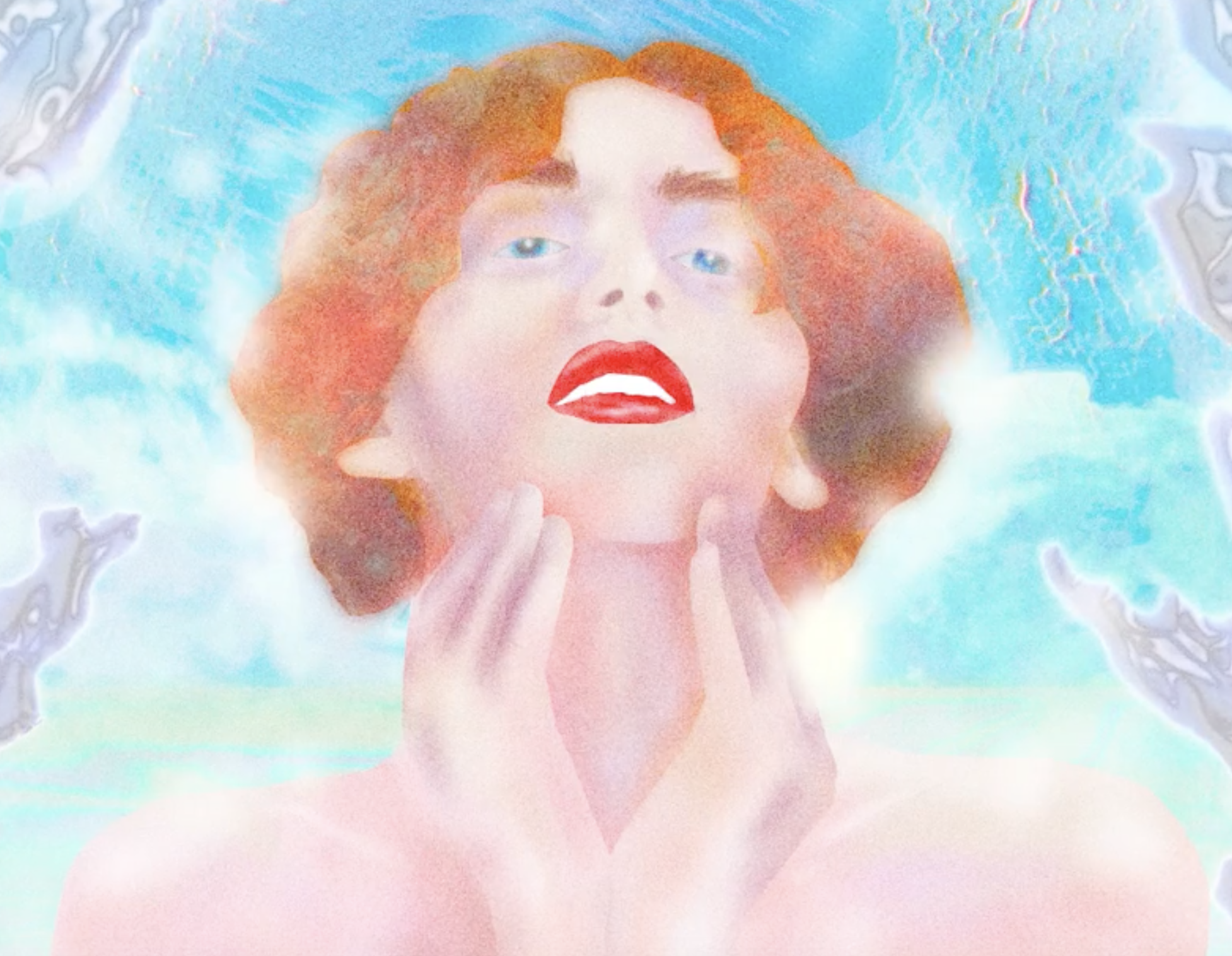
DL:
Yeah, that’s a really good question.... I find my way of working,
both exhilarating, if I’m actually in it, and incredibly
embarrassing. Super embarrassing, actually. There are times where
I’m like
This is so cool. I bet nobody’s even done that
But at the
same time, if [someone was] watching me, they’d be like this guy is
a lunatic. Why are you doing that wrong? I’ve even had people say
that! [On] this FKA Twigs cover [story], I was trying to get a
ribbon type, and I was drawing it with the pen tool in Illustrator,
tracing the outline of what would be a brush stroke, drawing that
brush manually. And then a coworker's was like
you know, you can just use the felt tip wide, the wide brush, I
could do that for you really quickly.
And I got really annoyed, I’m like Hey, I didn’t know that! I didn’t
know how to use that tool.... And now I use it all the time... So
thank you!
But then also: this is how I’m doing it.
► And how I’m doing it the wrong way is going to create a result
that is very different. And not to say that I think that I’m so
special or my hand is so important, [but] these little
subtleties... add up to a lot.
And if you remove each, if you remove all of the steps between
those, you get nothing.
I don’t want to be egotistical. I don’t want it to be about
me at all, but I have a sense of kind of autonomy in terms of how I
work.
EE: You seem to be constantly producing. I'm curious if you’ve had a chance to look back at it and say identify work that you're really proud of?
DL:
I’ve done some album covers for my cousin, where we are in dialogue
with one another and are just trying to create something special and
meaningful together. It doesn’t feel either one of us is leading, we
sort of have conversations or sometimes I’ll even design with him
watching me, just because it’s easier than doing a thing and putting
it into a presentation and then giving it to him and him giving me
feedback. This more conversational design process has been really
interesting to me.
I’ve [also] been working with this guy, Lotus who runs this
studio, or this gallery called OCD Chinatown. in Chinatown, and that
process was similarly off-the-cuff and spontaneous and
conversational....It’s a little bit ambiguous in terms of the
professional relationship versus a friendship.
In terms of Pitchfork, the Sophie [illustration] was kind of
a breakthrough for me....This is a person who means a lot to many
people—who meant a lot to me [too]. And [I] rightfully feel that
pressure...; I’m a straight white guy drawing a picture of Sophie;
am I getting it right? Am I capturing the spirit? Do I have a right
to even be trying to do this? Is this a bad idea? Why not just use a
photo of this person?
That was an interesting question for me...I sort of pushed
against it. My editor said,
I want to do something special for Sophie.
And I was [anxious
because] that’s a pretty ...thorny thing: this is an icon of an
entire group of people! ...So, I think working through that [initial
struggle] was a powerful thing for me, because I can give this the
thought and the emotion that it deserves. Obviously, I still do
struggle with the fact that I am a straight white man working on
this [illustration] that’s supposed to represent something
that...maybe I don’t deserve to be doing, but I think rising to that
challenge and trying to sort of see beyond labels...to make
something beautiful [was fulfilling]...And there didn’t seem to be
any negative response to it, which I was actually surprised by!
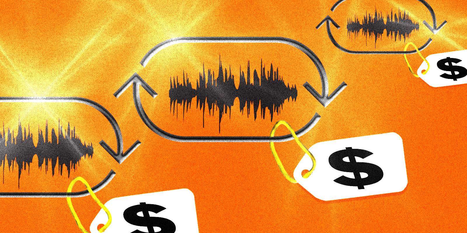
Chapter 4:
Asterisk
Little Constellations
What I do is many things but it is not land art. I like architecture very much, I like urban planning, but most land art is rural, and our projects tend to be urban or rural but always in places where people live. Our projects take into account the scale of homes and the people around them. The projects are involved with those kind of elements. They’re done for humans. We always try to do work in spaces that are highly used by humans. But a vital part of the project is the permitting process. Imagine 4,000 pages of documents written for a work of art that doesn’t yet exist. Do you know any other artist who can say that? The making of the project is the soul of the project. This is why we do not do commissions. We like to generate our own energy.(26)
— Christo
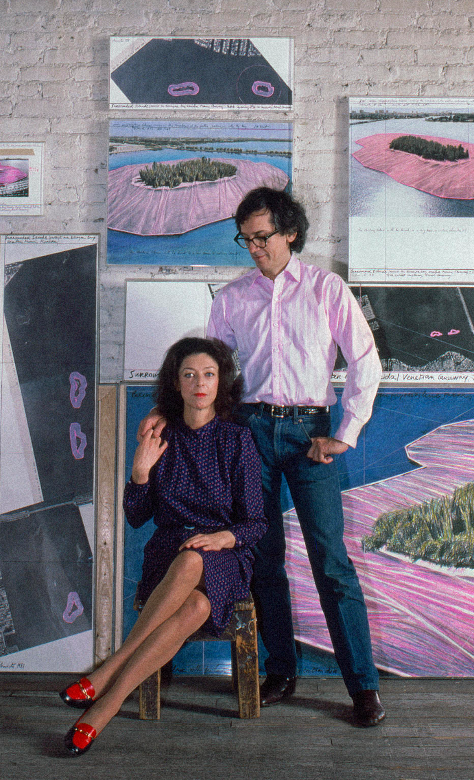
Asterisks Cast a Shadow
From above, the Umbrellas punctuated the California hills.
Christo and Jean Claude had proposed for the installation to last for 18 days. Of course I don’t remember them, but my parents took me in 1991, and we stood under the shadows cast.
Three weeks later, turbulent winds pried loose one of the 485-pound yellow umbrellas, which killed a spectator. Immediately, Christo ordered them to be disassembled, and for the rest of his life, he'd frequently mention them as profound failure.
The Umbrellas, the Gates, the Bridge, the Mastaba—these geometries annotated campaigns, histories,landscapes, and communities. They have a glyphic quality, and they even resemble punctuation. The Umbrellas were like asterisks along a horizon, appending Interstate 5. Christo and Jeanne-Claude approached their practice with a scholarly commitment to their singular texts. Their pursuit was decidedly public; they needed an audience to agree on these pieces to exist.
The documentaries of Albert Maysles captured a bit of this collaborative process. In 1985, Christo, his hair flecked with grey and his eyes pebbled behind thick glasses, explains to a gallerist his intent to wrap the Pont Neuf bridge for 14 days. With long spindly fingers, he insists that the bridge would, for a moment, “become a work of art, and then return to its original state.”
The gallerist smiles awkwardly to the camera, waves with both hands, and backs out of the frame. “I love this bridge the way it is.” The camera cuts away.
Across a table from General Jacques de Guillebon, Jean-Claude’s father, Christo outlines his political gambit. Guillebon, the French war hero who led the Libération during WWII, reclines listening to his son-in-law feverishly explain how he plans to wrap the Pont-Neuf bridge.
Christo: “What about Debré, who’s really important to this Gaullist party?” Guillebon: “Pressure?”
Christo: “Not pressure…”
Guillebon: “Influence.”
Christo’s father owned a textile mill in Gabrovo, Bulgaria, where Christo would sketch the workers and machinery. His brothers called him “Don Quixote” as a child.

Behind the farmers and machinists who modeled for the students at the Sophia Art Academy, a Soviet star loomed, and on weekends, Christo and the other academy students would paint propaganda for the Soviet state.
Years after Christo fled Bulgeria to Vienna to Geneva to Paris, General de Guillebon reminds dinner guests, across a platter of scrod, of Christo’s courage to have escaped.
“Why is everything so political?” Christo complains to Jean-Claude in 1985. Over the television, Jacques Chirac had just sneered at the idea his proposal.
“All I know is I feel the need to wrap the Pont-Neuf.” Christo
replies.
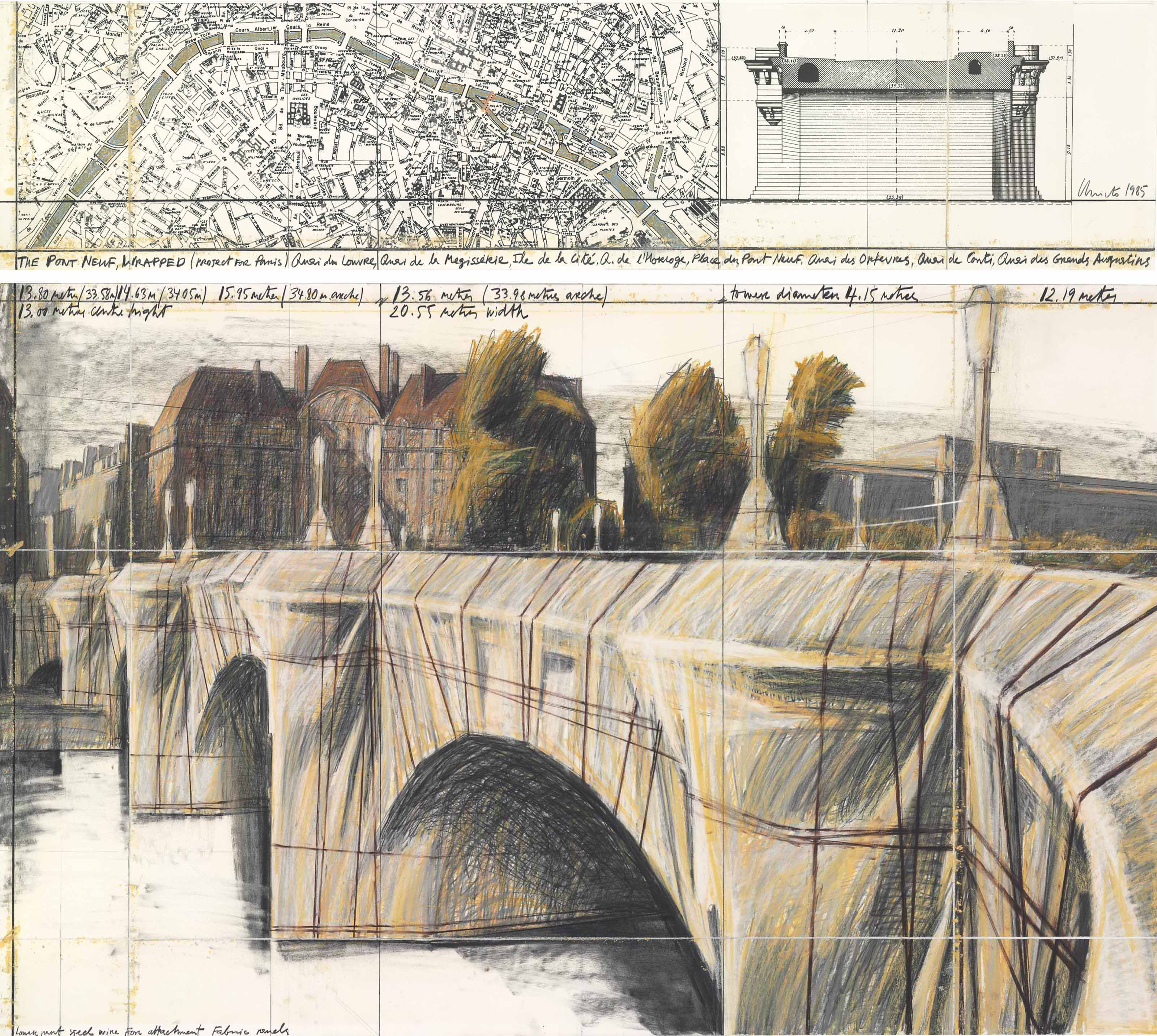
The details of Christo and Jeanne-Claude's lives together eventually become themselves a constellation of asterisks: an asterism (⁂). The two of them walking hand in hand along the Seine, Christo's portrait of Jeanne-Claude's mother, his slashed signature "Javacheff" across the bottom of an oil painting—all these memories and moments append the work itself, lending both humanity and authority to something profoundly public.
There's a tension here between the insider network
that
birthed these installations
and the external expansiveness of their public presence. There's
something sinister about this work, in spite of it's beauty. While
canvassing for the Pont-Neuf bridge, Christo would sit in Parisan
cafés wearing all blue, his long limbs contorted uncomfortably
into booths, onto barstools. He resembled a giant spider threading
his case to gathered men and women, spinning a radiant web.
The Radiant Web
Every reader is an asterisk. Aristarchus of Samos must have known this even in the second century BCE—as he scratched his scalp, dander flaking onto the collections of Homeric texts. The asterisk he used was at the time a novel invention, a mark that his teacher, Aristophanes of Byzantium, had employed as an annotation tool to delineate appended texts from Homer's original.
Before standardization, the asterisk—or ἀστερίσκος, Greek for "little star"— would only serve scholars, sclerotic old men who spent their lives correcting and chronicling histories and epics. This artful shorthand, and indeed all of the Aristarchian symbols,hinted at the democratic potential of punctuation while remaining a tool for the few. Like Gasparinus de Bergamo, Aristarchus, who became the final head librarian of Alexandria, adapted the designed symbols he inherited. Aristarchus, indeed, laid a foundation for the kind of annotative practice that Gasparinus would adopt in the Rennaissance.
We could go even further. The asterisk served a unique role as a technology to reckon with the impossible expanse of knowledge that characterized the Library of Alexandria. By the second century BC, the collection resembled a network, a web, perhaps only comparable to the modern internet. The architect Vitruvius described one of Alexandria’s head librarians as doing "othing other than read[ing] and reread[ing] all the books of the Library, for the whole day, examining...the order in which they were shelved.”
The asterisk, in other words, offered a strategy to curate the plunders of the Ptolemaic Dynasty, and as such, demarcate the role a reader might play in organizing these texts. This "little star" was bound up in the network of empire. That said, beyond its imperial origins, we might acknowledge the asterisk's role in making the library discernable to Euclid, Vitruvius, and Plutarch—those figures foundational to logic, aesthetics, and history.
As Aristarchus drafted the asterisk, he was both complicit and transgressive—building a grammar, a vehicle, to better engage with the past even as he remained firmly in service of the Ptolemaic Empire.
Julius Cesaer would eventually burn the Library of Alexandria in 48 BC. A century later, the Roman historian, Aulus Gellius, suggested that “nearly seven hundred thousand volumes… burned during the sack of the city in our first war in Alexandria.” The flames would have been seen for miles, radiating outwards over the Great Harbor.
Yet, the asterisk would live on, a little star for future readers.
An Asterisk Practice
Mindy Seu's
work
radiates with an understanding of networked space. Her
projects—like the
Cyberfeminist Index, or the
more* Workshop, or her curated are.na channels — artfully gather
a
library of texts, constellating voices across history, discourses,
and practices.
Fittingly, Seu turns to the asterisk as both a
discursive tool and a subject of inquiry. With her collaborator Laura Coombs, she has lectured on the
topic, and she even has an
are.na channel
devoted wholly to the exploration of the form. From my
perspective, she recognizes the asterisk as a tool, figuratively
capturing the gesture to braid together the multiple, the diffuse.
That said, her essay,
On Gathering
interprets this gesture as distinct from the singular authorial
presence of Christo and Jeanne-Claude. She writes:
Gathering is, in this way, not the act of aggregation alone. It is not an automated collection or the formal acquisition of works for an institution, nor is it the plundering or extraction of resources from a neighboring region. It is the tender and thoughtful collection of goods for your kin, and a moment for reunion, for celebration, and for introspection around those goods.
Here, Seu accounts for a practice far more plural, but also far
more intimate, than The Umbrellas or the
Wrapped Bridge. As I've noted above, she is archiving and
aggregating,
but it's with an attention and sensitivity
towards history's of plunder. The web metaphor, in the context of
her work, feels inelegant because it posits Seu as the spider.
Indeed, later in her essay, she encourages the reader to
complicate the definition of gathering,
and in doing so,
encourage a
blurring of container and content [to diminish] any lingering
idea of fixed, solitary authorship.
Seu's asteristic practice feels far more like aligned with a scholarly practice—one that's discursive and conscientious—than Christo and Jeanne-Claude's often imperious model. While there's much to admire in the independence and beauty of The Umbrellas, their tragic narrative suggests an underlying narcissism animating their project. If Seu's work radiates outwards, perhaps we might say that their art, in spite of good intentions, cannot help but contract inwards.

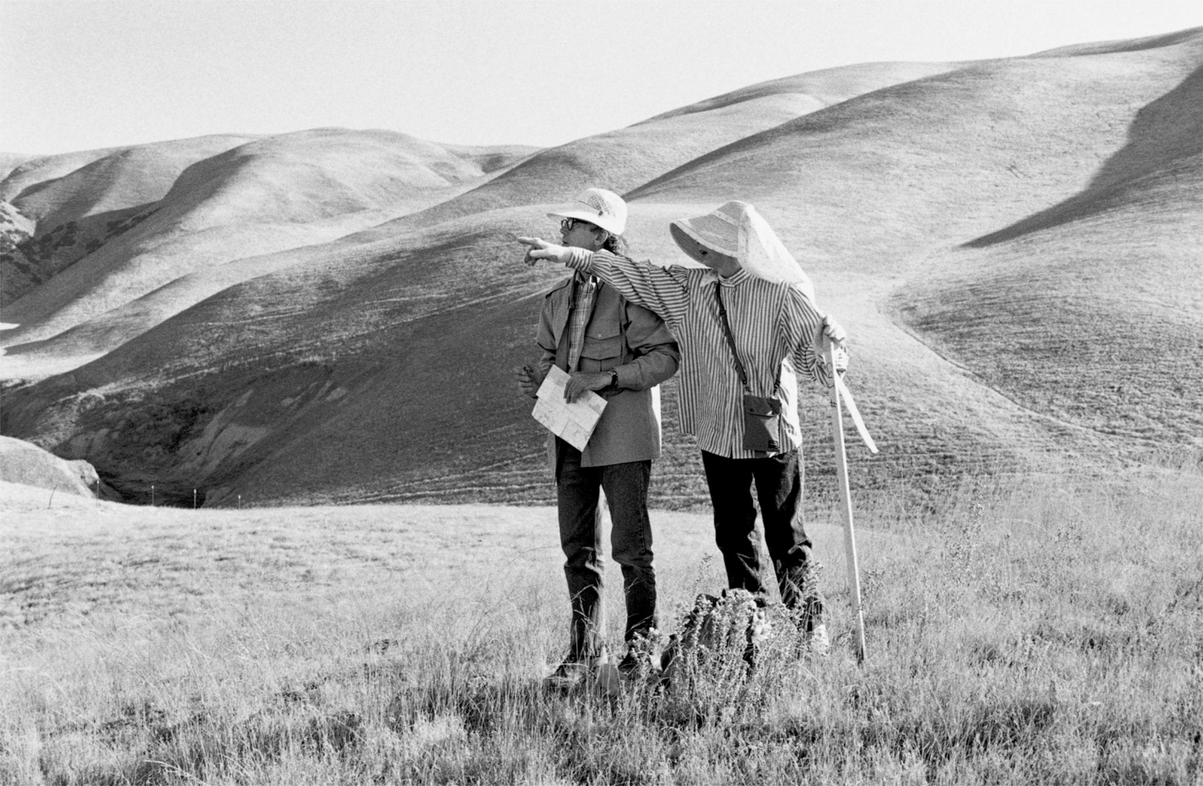
Chapter 4:
Projects
Form Sticker Set

Zenith Typeface


The Discreet Life of the Emoji
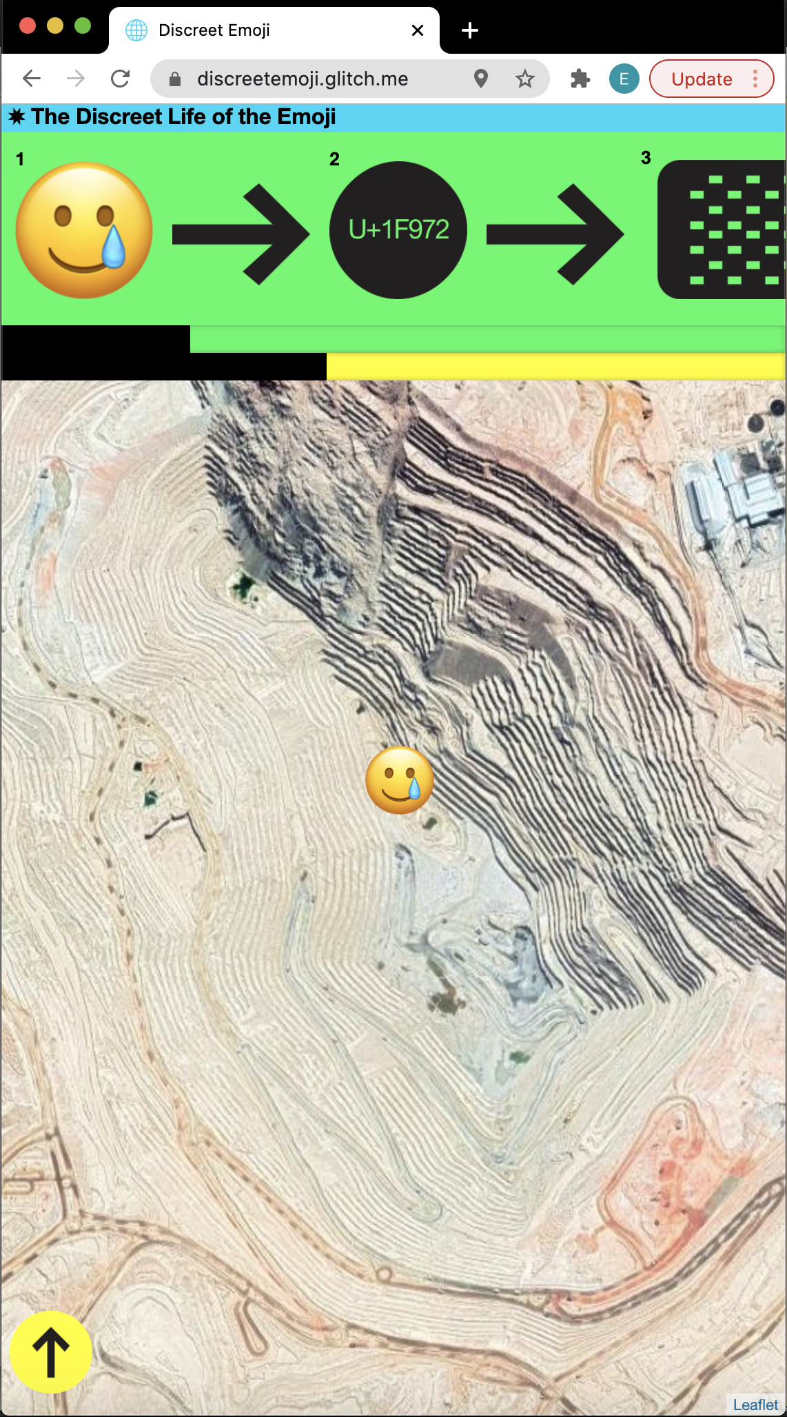
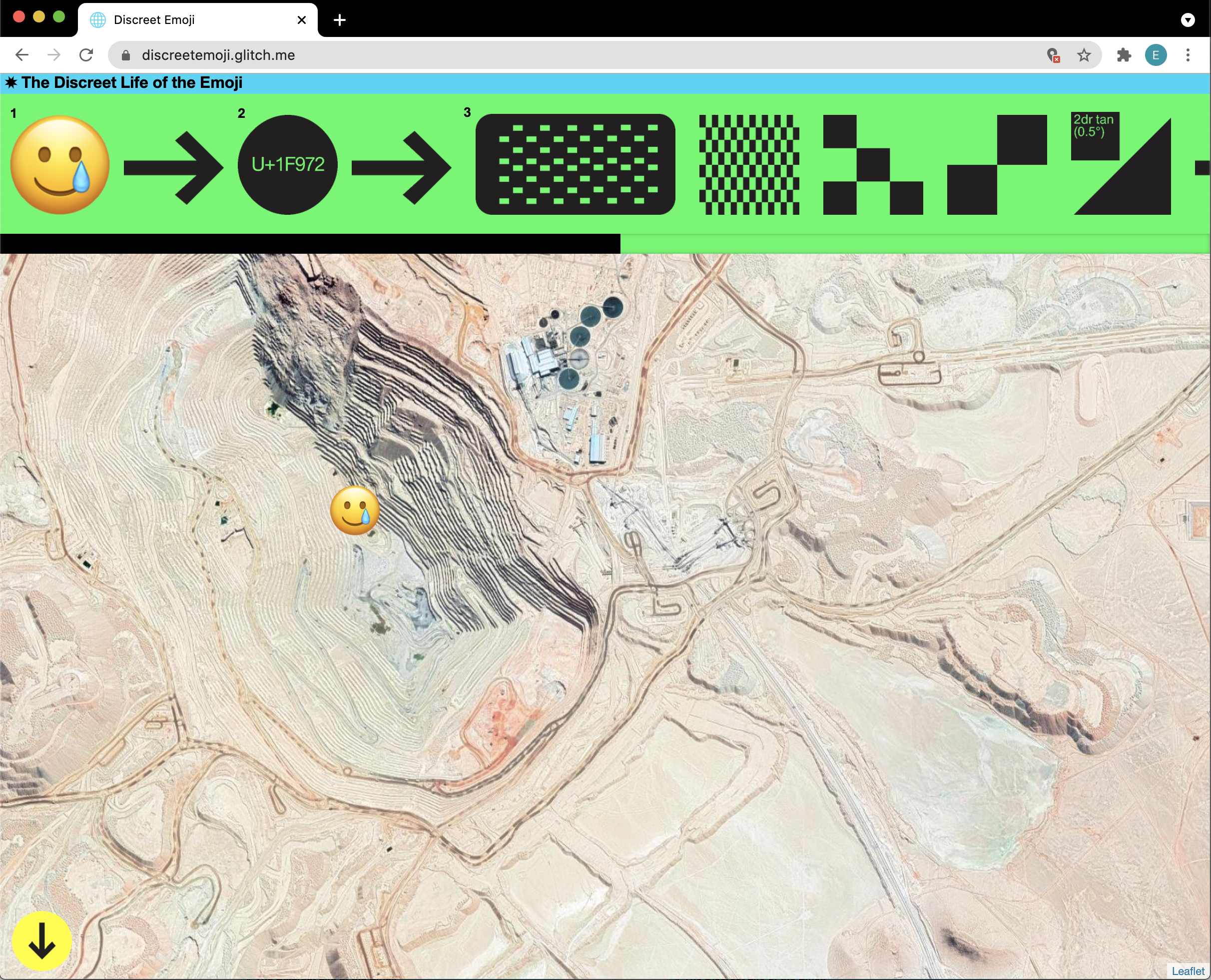
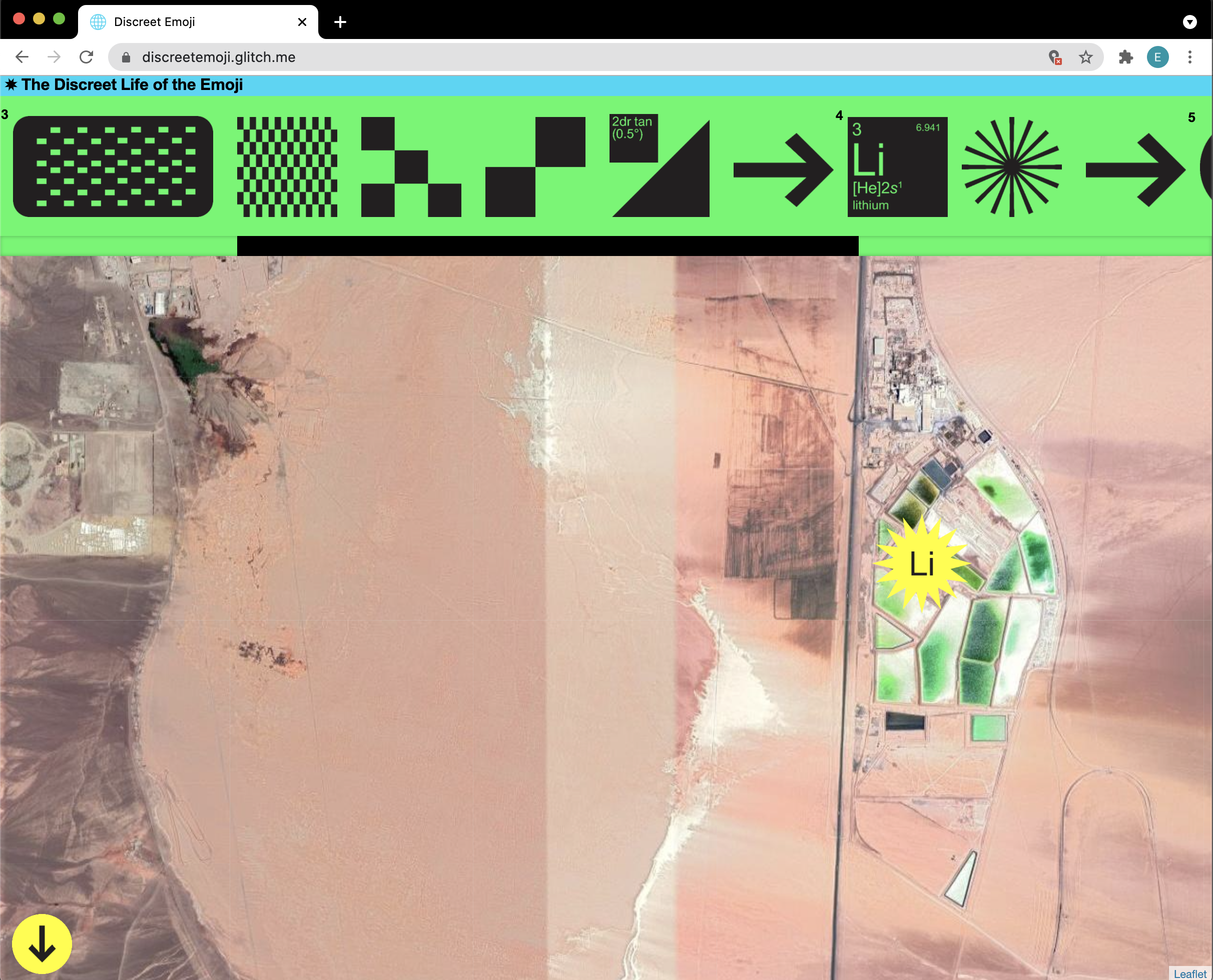
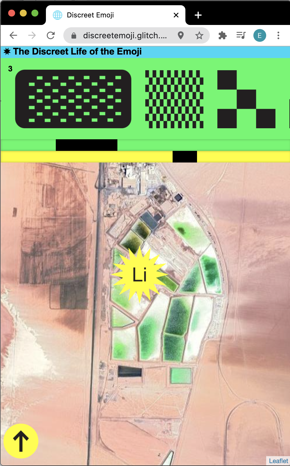
In a Loop
A loop acts uniformly and stupidly, circling and cycling, endless turning in on itself until reaching its proper close, dictated from the outset. They abbreviate, even as they gesture towards some expansive pattern pushing up against the edges of the “canvas,” itself a zone similarly dictated from the outset. This capacity to be both huge and small, visual and textual, profound and dumb, infinite and finite—this make a loop bloated with metaphoric potential.
I like the way that a book of code can take us into the loop—can expose its network—while asking others to fork the code. I want this book to be a contradiction: a closed opening.
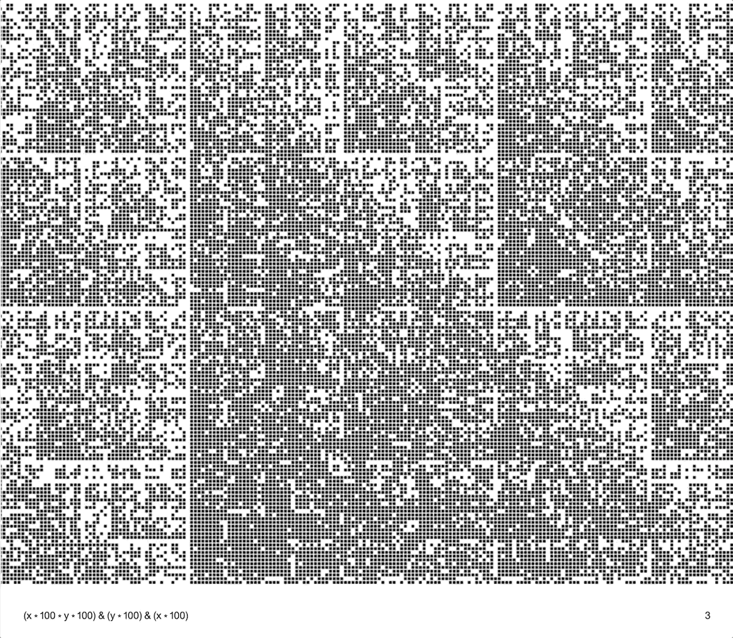
U+273A
U+273A takes a single unicode figure (the 16 point star) and redraws it as a typeface. Each star pulls from a collection of glyphs across the history of art and design. The index traces this narrative.
This project is at once uncomplicated and entangled in a web of emotional connections. Glyphs, like punctuation, take on the associative network that we use to make sense of them. U+273A captures not a singular entity but a cloud of histories and formal attributes.


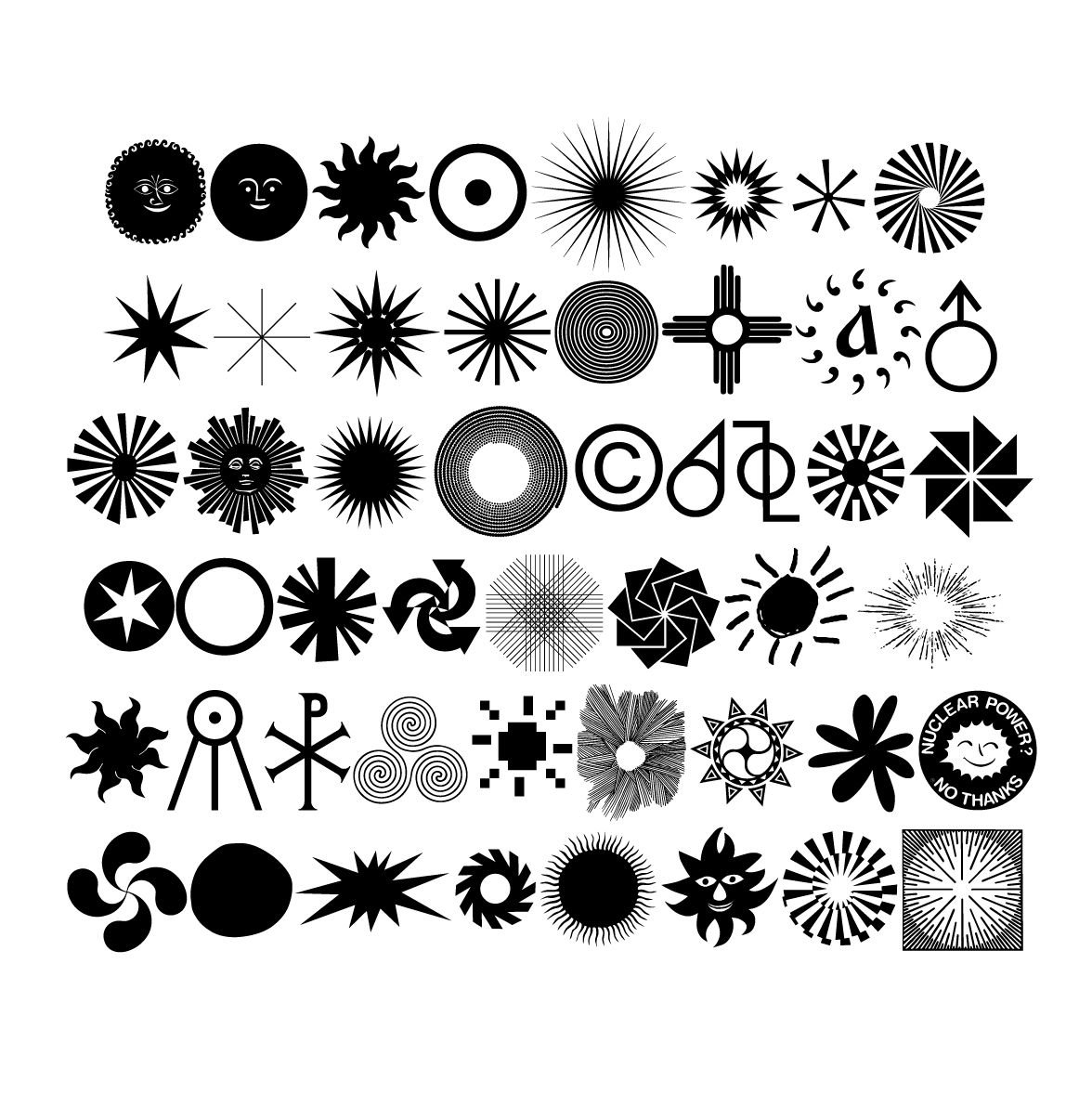
Drop Down Desktop
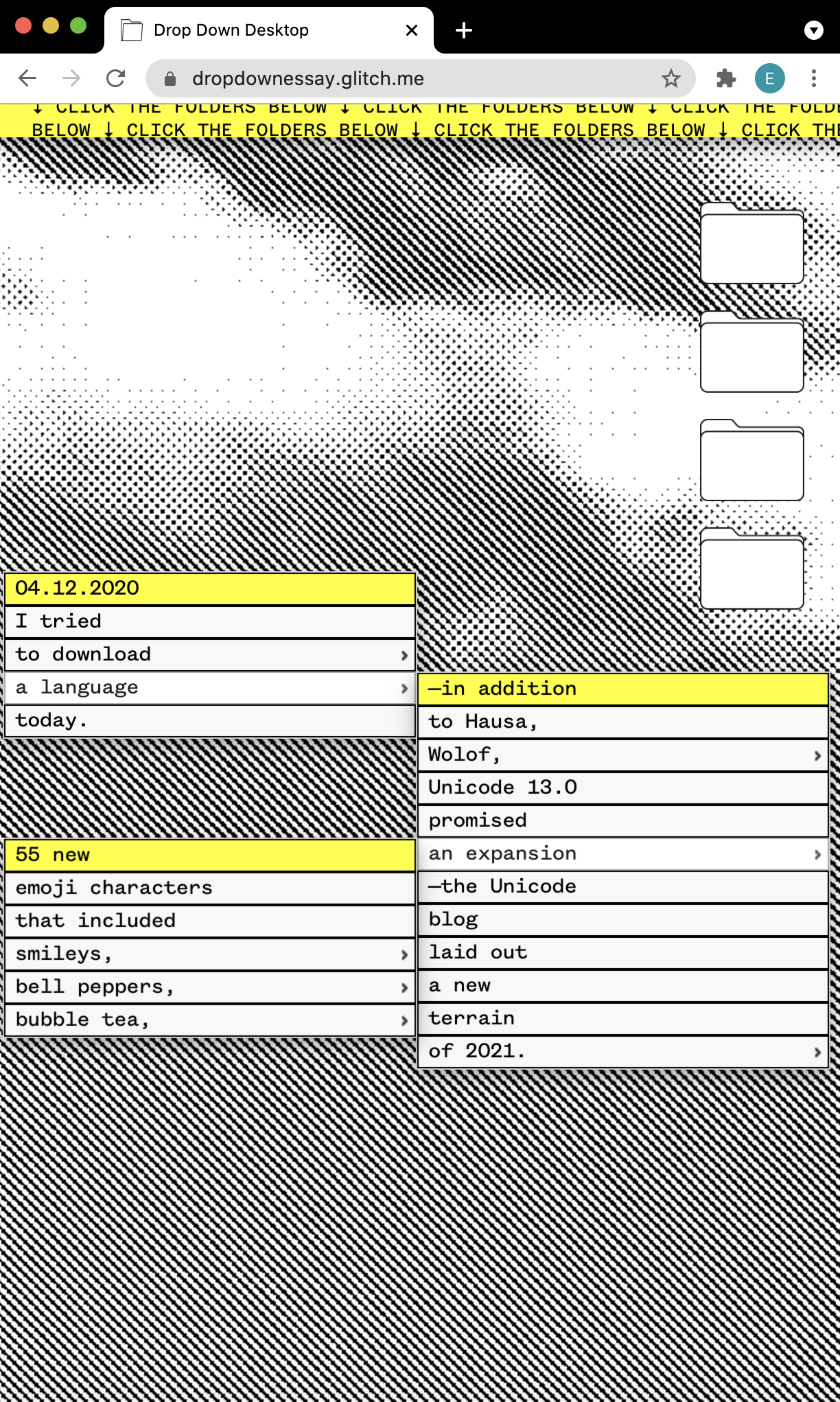
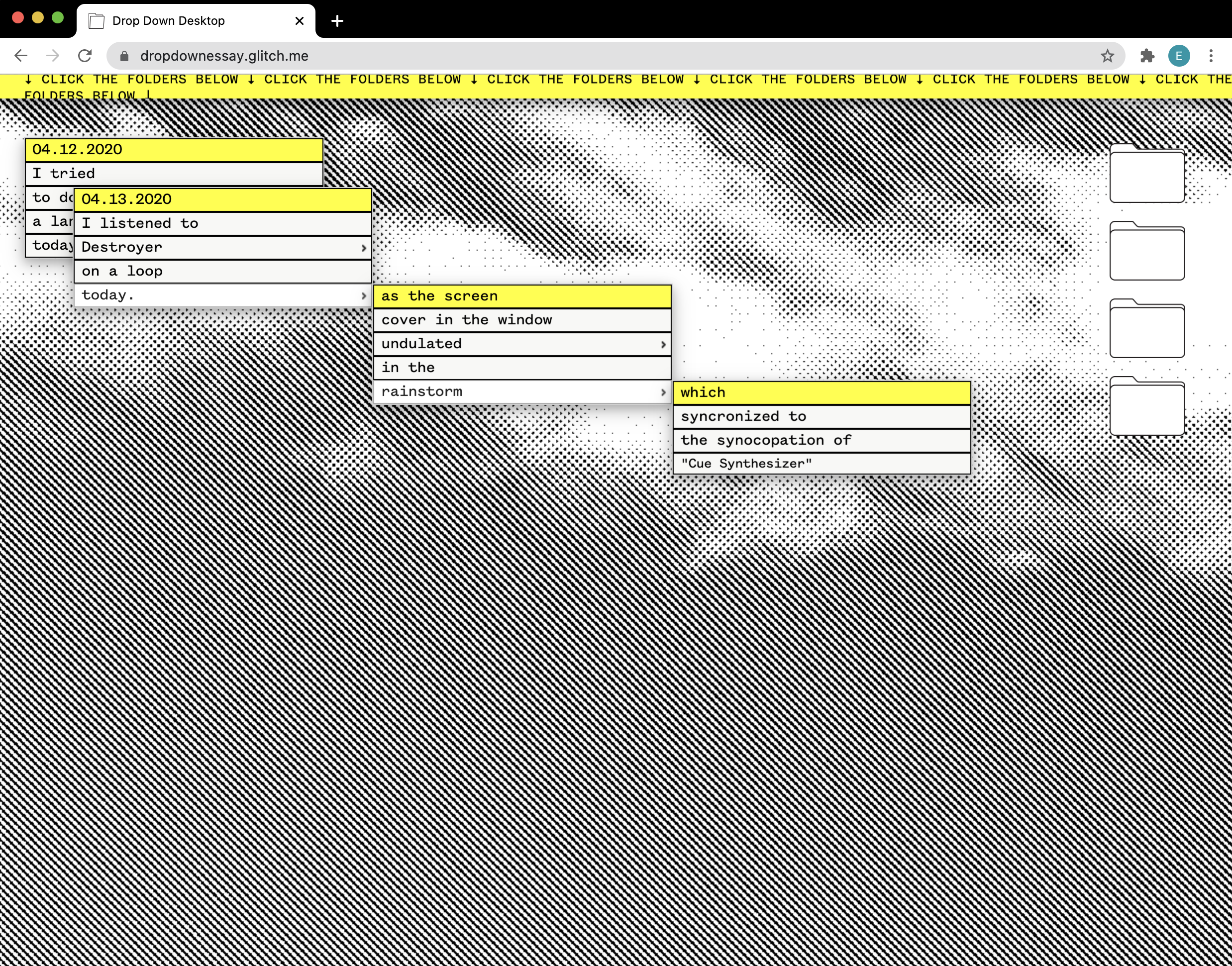
Mastaba
It felt natural to build a typeface to celebrate Christo's work—its bulk, its dimensionality, its drapery. The final variable form includes not only a weight axis, but a perspective axis as well. The web specimen allows the option to explode the cover, to test the dimensional. It also place the bandy regular weight in conversation with the extreme ink traps of the display. In this spaces, I had the letterform fold inwards to evoke the character of Christo's wrapped works.


Interview with Mindy Seu
I have long been a gatherer. Though we rarely hear this word used literally anymore, we do hear its sister gathering, as in gathering people, gathering information, gathering pace. Occasionally—increasingly, through a year of pandemic—we hear of gathering mushrooms and wild-foraged bouquets,1 hobbies for the otherwise domesticated. But the term gatherer we more immediately associate with our origins as hunter-gatherers, nomads foraging food and moving with the seasons for subsistence. We went, we gathered goods, and then we returned home to
our kin, sharing as survival.
— Mindy Seu
Everett Epstein:
I was reading your text
On Gathering
last night, and it helped me realize just that so much of my thesis
and graphic design thesis book is a kind of construction through
gathering. It’s gathering your projects, gathering your resources,
gathering writing. I think it's also not too dissimilar from your
current
On Gathering class. And it’s just so generous, how much of your syllabus you’ve put
out there. I was I was interested in how the gathering class
reflects your current practice?
Mindy Seu:
Yeah, absolutely. I feel like, I feel really lucky to be able to
teach these classes at Yale because I’m an assistant professor at
Rutgers. And I’m teaching some foundations and seminars and studios
there. But I do feel like [with] these Yale classes, I’m really able
to tailor it to my own research and my own interests, where
sometimes if you’re teaching foundations or something more
technical, there are certain parameters that you want to make sure
all students kind of take away.
For the past year, I’ve been thinking about this thing. I’ve
been working on the
Cyber Feminism Index
with Angel Meitzler and Janine Rosen, I’ve been working on the
Scalability Project
exhibition with Roxana Fabius, and Patti Hernandez. And all of these
things are pointing back to like the same references.
► A lot of texts that have these through lines about
storytelling, collecting objects, which can be applied in a
variety of metaphors, or like metaphorical levels.
So when it came time to do this Yale class, at first, I was going to
do a similar one that I had taught last spring. But this was so
present in my mind that I figured I might as well just totally
revamp the whole thing and see how it goes. And also modify it for
zoom and etc. But I think that I was actually working quite
well....Teaching is so much work, and I love doing it,...[and] if
students are also getting these great things out of it, then it’s
like we’re learning from each other. It’s like a cyclical space.
EE: I used to be a high school English teacher before being a designer, and I mean, a big part is asking how can I bring in multiple students within a project? A big part of when I was teaching was adjusting my practice. In response to how I think badly I was taught growing up. There’s this thread of generosity to a lot of your work whether it’s the spreadsheet on residencies or your teaching documentation. I wonder if that was at all our response to something in your education that you felt was missing or needed to be augmented?
MS:
Well, first of all, I agree with you. I think that my education for
lower Ed was very productive, or like very templated, let’s say, and
I was always like a lover of school. I love being in the
environment. I love doing all these things, but I definitely felt
like I don’t even remember a lot that happened during those years,
especially in terms of things that were meant to be foundational.
In terms of
sharing resources, I think that it was almost in retaliation to this safeguarding
effects that you start to experience when you’re in higher
education. But also, when you’re starting to work outside of school,
I feel like people were guarding a lot of their resources and
references, these things weren’t being shared openly, because
somehow, if you found it, you had some ownership over it.
Think about museums. For a long time, a lot of their work was
not online, because they wanted to get you in the doors. And they
wanted to make sure that they were able to kind of keep it in this
walled garden. So if anything, I think a lot of my earlier
inspirations were these people who believed in open source and open
access, like
Aaron Swartz. I also had very, very generous mentors. I also think one of the
first communities I fell into after undergrad was at Are.na, [where]
everything is so open. Of course, you can have closed channels and
private channels, but I think maybe 90% of mine are all public, if
not open.
I also think that even like the residency spreadsheet, and
teaching— these are all records for myself, like I have very poor
memory. So I want to be able to document while it’s happening, or
even think about a self-documenting workshop class. So at the end,
there’s very little work that I actually have to do, it’s already
been preserved in my practice. But because I’m very much in the web
space, I throw a microsite online, and by nature, it’s public! So,
rather than like putting a lock and key on it, I’m like, well, if
it’s public, it’s public. If people want to see it, then great. If
it’s helpful to me, maybe it’ll be helpful to other people. And as
long as they kind of follow this practice of fair use, or
Creative Commons,
you’re welcome to scrape any of it. But please just give credit....I
think just showing these learning trails is kind of a nice act for
everyone.
EE: I think that the idea of credit is especially interesting in relationship to the Asterisk workshop and the Asterisk Are.na channel? How do you see the the Asterix workshop?
MS:
I think that it’s definitely connected to citation. Currently with
CSS, the collective I have with
Laura Coombs
and
Laurel Schwulst,
currently, we’re writing a paper about multi-dimensional citations.
[We're wondering not only] how you might cite the people who
impacted your work, but also how you would like to be cited in the
future. So you see yourself as part of this trail.
In it, we kind of unpack the glyph that we actually use for
CSS, the diagonal dot, dot dot: ⋱ . But for us, this was kind of an
unstable sign. So Sheila Levrant de Bretteville talks about unstable
signs almost as a way of coopting a ubiquitous sign, or symbol or
glyph, and kind of reinserting some sort of provocation or prompt.
So, for example, for her an ellipses, when added to a block of text
was her way of saying,
I know I did not list everyone here, but I want this to be
inclusive. So I want to encourage you to kind of insert yourself
into this or [for instance,] thinking about the female symbol with
the eyebolt .
This is just a piece of hardware that’s typically conveyed as
quite masculine,
She was able to kind of turn it on its head and use it for this
other movement that was consciousness raising.
► So for us, we really thought the asterisk was kind of ripe for
this kind of instability, right? Like, everyone uses it. It’s
typically used for annotations or some sort of personal addition
to a text, right? You asterisk the end of a word and then write
some internal thought about it for the public. But it’s also
used in plan speak now, because we understand it’s meant to be
some sort of agenda, or some sort of omission.
I think also with the rise of AI messaging, Instagram captions, and
a lot of writing that doesn’t allow for styling (like bold and
italics), people start to adopt this idea of markup (even if they
don’t understand its origin) in order to represent emphasis, or
direction, or
paralanguage. So I thought all of this... was really exciting. And we just
wanted to see if this could become a prompt for agency; like, if you
are going to develop an asterisk, what is it for? What is the
action, omission, agenda, etc. and give some examples of how it
might be used, so we can create a document, a co-authored document
that’s all about secondary annotations, but making them primary.
In the end, the Southland Document is very cacophonous.
There’s a lot of colors happening, there’s a lot of excerpts, a lot
of things... people interpreted it in wildly different ways. But for
us, I thought it was a good experiment of figuring out 1) how do you
make a collective online publication in real time? And 2) how do you
co-op these glyphs and use them to think about authorship... how
you’re contributing to a body of text. And just a quick note, that
we kind of hacked a JavaScript library called
hypothesis.js,
with our friend, or primarily by our friend who’s a developer named
Richard Caceres.
He was really, really, really helpful. He did that whole thing in
like, a day and a half. It was exciting. It’s nice having friends
that are programmers.
EE:
It was interesting that you use the term cacophonous
for that
space. In past interviews, you talk about the diffuse
non-scalable
space of the internet. And yet, I’m also curious
about your relationship the
Prof Doc Style
as a kind of beautiful container for these things. What does this
aesthetic represent for you as both a style and a tool?
MS:
So Olia Lialina wrote that text about Prof Doc style, which was kind
of poking fun at these 90s and early aughts, professorial websites
that feel like HTML and CSS. There’s actually a great podcast
created by Laurel Schwulst and our friend Elliot Cos called
HTML Energy. So I think for me it’s two ways. The first is Prof Doc style is
very, very easy. Like if you’re learning how to code, or if you’re
trying to build something quickly, this is a very non-intimidating
way of doing that. And of course, there’s also a lot you can do with
HTML and CSS, or even CSS animations, [such that] for a lot of
things, you don’t really need JavaScript.
[Also], for Cyber Fem Angela and I were thinking about how
websites age; if you look at all of these older websites through Web
Recorder or the
Wayback Machine, a lot of them have degraded pretty quickly 1) because they were
using a lot of new technologies
at the time, [think of]Flash,
think of current JavaScript libraries, or whatever new additions
[are out there]. But, when you look at the websites from the
90s–[which] I was really digging into for the Cyber Fem project—
these projects are made in 97, and use HTML and CSS defaults, and
they're still working fine. They were hard coded... using the
backbones of the internet.
► So without intending it, they’re basically making these
websites that could stand the test of time. Programmatically or
coding wise, it felt pretty durable.
So I think, for those two reasons, I particularly like Prof Doc
style.
From a more cynical perspective, I could also say that I’m
just not a very good coder, and I never really took the time to
learn JavaScript well. I’m pretty comfortable with jQuery, but I
also felt [that] for the sites I need to build, I don’t really need
the bells and whistles. I feel like you can still get a lot of
interaction across without it necessarily being dynamic. But that
said, I’m not building huge, robust websites for institutions. I’m
building sites for me and my community. So I think it really
[depends on] what you and your community needs. And maybe it is
something more robust, but at this point, I haven’t felt like I
needed that.
EE:
I think that my thinking was similar to yours: here’s the set of
projects that I have in mind, and I don’t necessarily need to build
out this robust system for myself. I think the logic of scalability
has been helpful to understand this; I asked myself
How do I want to grow these websites?
In relation to the
Cyber Feminist Catalog, specifically—which is going to be published
in 2022 through Inventory—do you see that publication as a kind of a
culmination or a conclusion? And how might this point relate to
scalability and non-scalability? Do you see like the book as fundamentally scalable, or closed?
MS:
Well, first, I think the project has been one of translation. It’s
taken so many forms over the past couple years, and I think through
each form, it’s had different affordances for what might be
highlighted or what might be possible. And so it was a spreadsheet,
and then a draft catalog, and then this website, and then some
performative reading scattered in there. But it’s not as if I was
working on this day in and day out for the past couple years; it’s
really felt like chapters, I would do a bit, pause on it for a while
and talk about it with a lot of people through class visits or talks
or more informally. It felt like a period of
translate/reflect/translate/reflect over and over and over. ... So
even when the site came out, with the
New Museum, there was a submit button. [From that] we were able to get 200+
submissions, which was great, but since then, I haven’t really
touched the website... But it’s almost been percolating or gestating
until this residency starts at Pioneer Works next week: I was
planning on printing out the entire Index and doing a thorough edit
of this thing... just so we can start the process of creating the
printed catalog.
I don’t necessarily see it as the final chapter. Earlier when
Charles Broskoski
and
Ekene Ijeoma
and I were working on
Print Are.na, and we were going to do a launch with O-R-G, so, with David
Reinfurt, we created this channel called hard copy,
which was
comparing like hard copy and soft copy. So I do think that these
things are pairs: they both allow, based on their medium, different
things to be expressed, but they are [also] complements of each
other. The hardcopy as you might guess, is typically the printed
catalog or some physical manifestation of something, whereas the
soft copy is a flexible, ever changing... digital space.
[Ultimately,] the project for me is one of maintenance, like
an oath of maintenance; the website needs to be maintained, even if
we’ve built it in a way where I hope the site itself will remain
pretty durable....I’m sure I’ll continue to work on it to some
degree. I mean, whatever forever means, but memory workers are
almost like a form of activism because it requires so much invisible
labor to upkeep these things. And I do think this project kind of
falls into that vein.
EE: I love the terminology of this hard copy versus soft copy. It makes me really think about your relationship to reading online. You mentioned that you’re going to print out all of the copy to read through; do you feel a need to, I guess, re-enter that soft space?
MS:
Yeah...I have a very hard time reading online, I think for a short
form essay, it’s fine, or an article, but if I’m trying to read a
longer essay, I will definitely print out the PDF.
I actually have like an internal spreadsheet that I use for
every single PDF I printed and what their respective notes are,
because I have a my personal note taking system. I also think that
when I’m reading it on paper, I can highlight and take notes. I will
[then] transcribe those bits into that note-taking [system], and I
think doing it twice helps me to remember.
Handwriting for me kind of fixes it in my brain more rather
than copying and pasting a quote into Google Docs or something....I
[also] have very poor eyesight, so reading online just gets really
hard for me. Zoom life right now has been very hard on my body, so
as much as possible, I like to print it out, and then annotate
outside or in some part of my house away from screens.
I think it’s just a different way of processing. What do you
do? Do you read everything online?
EE:
Well, it’s interesting. Right now, I’m in a seminar class that’s
called What is Critique?,
and I’ve been running the class
PDFs through an OCR so that I can just take the text and put it on a
website. Then I’m trying something where I’m reading and annotating
it in the markup itself. It’s a very weird way of reading, but it
means I can do more with emphasis tags and easily search through the
text too. It's kind of a game changer, because I can actually make
points clearer in conversation.
MS:
I’m curious do you do know of
Memex, and
some of these earlier, nonlinear, searchable tools, like
Obsidian?
[Memex] was purely a prototype,but it’s kind of become the
influence for a lot of current software, such as Are.na, Obsidian,
and a locally-stored note-taking tool like
Roam. It’s
basically just a software version of what you’re describing. And it
is actually done in markup, but it’s on your actual machine, rather
than in the browser.
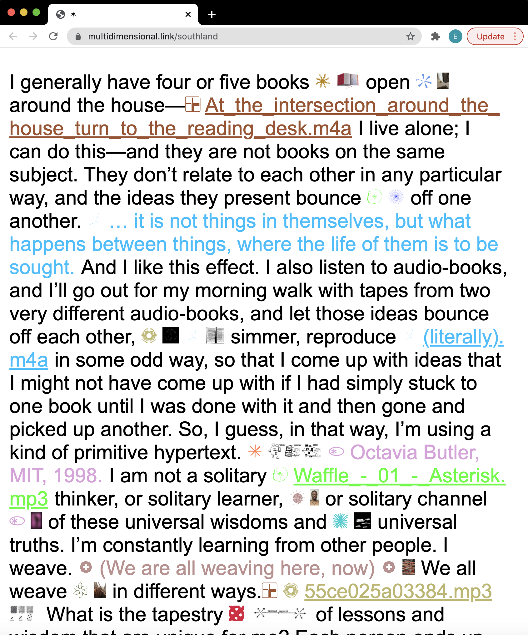
First of all, I just think developing your own note taking system is really exciting, so I hope this continues to work for you because once you have something fluid that works, it does feel liberating in a way, especially without having to deal with all of these other note taking styles that felt kind of cumbersome in the past.
EE:
Turning from the private space of notes, I was wondering how you’re
conceiving of your public as a designer. I recognize that the term
public
is so laden with meaning, but I guess I’m just curious
if you have an ideal audience in mind for these projects? Because I
think that there’s on one hand, anyone who has access to your work,
but there’s also, I think, a very specific voice behind some of the
writing that you’re doing to frame these pieces. And I’m wondering
how how intentional that is?
MS:
► I feel like my friend groups are like constellations; they’re
scattered all over a spectrum.
I think for the Cyber Fem project, it was really for my close
community of Internet activists and art/tech people. It just so
happens that when I put it online, or when we put it online, it
actually seemed like a lot of other people resonated with this
content. So if anything that, for me, was really nice — it didn’t
feel so insular anymore.
I think that something like the asterisk workshop was really
for graphic designers. But we’re using a web-based tool, so
it almost seems a bit disconnected from something perhaps I would
share with my art/tech community.
[Regarding] the writing or the frame behind these things, I
always try to write for people outside of that space, to kind of
provide like an entry point into it, and I think that’s because I’m
like this hyphenate person
who has like multiple titles, I
feel like I’m constantly having to translate these things to
different groups, who use different languages. So if anything, for
me, it’s clarifying to try to write something that anyone could read
and hopefully understand. I actively try not to use an academic
vernacular, or some other [voice] that might prevent people from
accessing it. That said, I’m a very new writer. So I think the
framing that you might be seeing is just me trying to find what my
voice is. They always say, write for your own voice. If you have
trouble writing, just try to read it or say it out loud, record it,
and then edit it. And that’s something that I also do frequently.
I definitely just think that each project seems specific to
different communities, but it’s always surprising that there are
people who are attracted to all of it, like you and some other
people I’ve spoken with. I feel like that’s also quite validating
because sometimes I can’t cleanly fit into a silo. I'm like an
island or something? So maybe it’s just about meeting other islands?
Not sure.
EE: You mention that you’re a new writer; I’m curious what you consider your relationship to punctuation?
MS:
To be honest, I don’t know if I was like actively thinking about
these things. Maybe I started a year or two ago... Cab [Charles
Broskoski of Are.na] and I have talked a long time about the
hashtag. The hashtag being like a town square, an aggregator by
Chris Messina,and now this social media activism symbol.
► I think graphic designers often get attached to these smaller
symbols because I feel like whenever I see something that’s
quite ubiquitous, I’m immediately curious about its origins; who
introduced this thing and how come some punctuation marks have
been able to almost move beyond the test of time, whereas others
are maybe used for a moment and then just disappear.
You should actually look into
Source Type. They have a new public education series that really explores
examinations of different symbols and glyphs and punctuation marks.
Meg Miller
is an editor there, who is also an editor at Are.na and AIGA. She is
writing about the gender star right now, which looks like the
asterisk is in the asterisk channel.
Bryce Wilner
is writing about the list or the simultaneity mark: ⋮, that Samuel
Delaney would use in a science fiction novels.
EE: James Goggin actually put me on to a similarly complex mark: the asterism. It's three asterisks next to each other: ⁂. It has a history similar to the ones that you’re describing: it was a one point heavily used to break up blocks of text, and then it kind of fell out of fashion. So typographers just simply don’t draw it anymore. That's partly what’s so beautiful about Unicode, it's able to be this expansive history of these forgotten marks.
MS: Yeah, definitely. Do you know Jörg Piringer?
EE: I don’t.
MS: Jörg was a net artist, who was making some work about interactive poetry, and he actually has a piece about Unicode....But yeah, I love the idea that you can sponsor a letter from the code library. I don’t know if you’ve purchased a mark, but thinking of the right one to buy is not easy!
EE: I guess this is sort of a weird pivot, but I’ve been watching that new Q Anon documentary, and it made me think about this movement (and by extension, 8 Chan) as a possible non-scalable entity this sort of massive collection of mushrooms, that just keep blooming outwards. But it’s deeply toxic, and yet it's growth is kind of fed by humor, shitposting and and other edgelord stuff. And I guess I’m curious, your relationship to humor online. How do you make sense of non-scalable communities that are toxic? Or do you even see them as non-scalable?
MS:
Well, I think we’ve seen that they are quite scalable, right? Like,
even the fact that people outside of the community are talking about
it, that's a form of scalability or visibility. So regardless of how
large or small those communities are, the fact that it’s hit the
mainstream, I think is a different tier of access,and by giving it
more visibility, you also give more entry points to people who are
not technical, but know how easy it is to join a forum for example.
In terms of humor online, I don’t know if I actively seek out
humor online. I think that because my day to day life is so tied to
my screen, I try to be off screen as much as possible outside of
work....even in terms of social media. Maybe when I first had
Instagram and Twitter, I was more casual about it. But now opening
it makes me feel like so... tense. So I tend to just post something
about work, and then log off. Even then, when I look at my own
profile...[it] isn’t the kind of profile I would be drawn to. It
just doesn’t feel like a glimpse into a person. It feels almost like
a billboard or something.
I actually really admire people who are able to kind of
cultivate that sense online. I just haven’t put that amount of care
into it. It just became a space that was too loud for me. So that
said, I don’t really follow... a lot of those meme blogs. And like,
I don’t go on humor forums; I do a lot of internal chatting, using
discord or slack or even just message threads. But those are
predetermined people that we talk to internally. [That said,] I even
don’t subscribe to any [streaming services]. I don’t even have
Spotify.
So, a lot of our humor comes just from daily life, I think.
I’m not really trolling the internet for those things. Maybe also, I
don’t know where to look.
EE: I had one final question: do you wish people asked you about one project more often?
MS:
That’s an interesting question. I think that a lot of the questions
these days have been about the biggest project, which is the Cyber
Fem Index, but, and I actually do love talking about it. I actually
think it’s quite nice when that’s paired with these smaller
projects, even if they’re not even projects. [For instance,] all of
last year, our internal group of friends were just thinking about
how to make digital gifts for each other in different forms, and we
did some pretty good experiments like zip files and printed URLs, or
using Google Calendar as a memory capsule. All of these things felt
so promising and energizing and, like, lightweight. They were all
fun to do, it did not feel like work.
So if anything, I wonder if this is all something I should
consider when interviewing people; like maybe I should try to push
past the work and what’s promoted as a project, and to really think
about what’s like bringing them a lot of joy in life.
► Maybe it looks like a project in some ways, but in other ways,
it’s a gift, [or] it’s like writing to yourself. It’s like
something that doesn’t necessarily have like a public facing
component, but can still be dissected in quite nice ways. That
said, because these things aren’t public, it would be hard for
you to ask me specifically about them. But perhaps that’s the
question, right? Like, what are the things that you’re doing on
in your private life that is feeding into this public facing
work or something like that?
Chapter 5:
Ellipses
Are You Up for Some Reggae Tonight?
[This time] feels so different. It feels like an opportunity to do something at least personally cathartic, if not, you know, meaningful or that has some kind of density to it based on the craziness of what’s going on. I almost feel like I created the world we live in, back in my early comics. It really feels like the dopiest, most cynical comics I drew back in 1991 have just come to fruition. I don’t know where that leaves me.
— Daniel Clowes
Reggae Cat
Since @reggae_exe joined twitter in 2016, he has posted nearly every Friday an insistent question: "are you guys up for some reggae tonight?” Sometimes he drops the question mark. Other times, he types entirely in Greek script. He has included ascii images of cats dancing, eating, and sleeping to (presumably) reggae. He once staged an emoji car chase framing an allcaps “ARE YOU UP FOR SOME REGGAE TONIGHT.”
He gave the cat abs, once.
Without context, the phrase becomes pliant and unwieldy, like reading the same word over and over again—leaching it of meaning. The nearly 600 entries are now a collection, an ode to absurdity, an endless elliptical design.
I recognized the phrase from somewhere, and its only after
reverse-image searching @reggae_exe’s avi that I remembered. It's
from a a throw-away gag in Terry Zwigoff’s
Ghost World
(2001). Thora Birch’s Enid had just roled her eyes at
like the biggest idiot of all time,
who dimly asks,
“Are you up for some reggae tonight?”
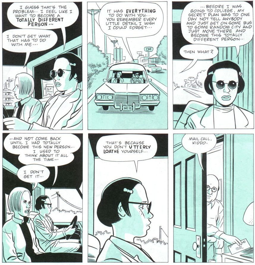
I saw Ghost World on IFC in 2004, on a red Ikea sectional. It was a sad, mean, sunken-eyes movie, animated by a waning nostalgia for the 1950’s, which felt uncannily relevant in the 1990’s. When I watched it again recently, I found myself nostalgic for 2004.
This daisy chain of nostalgia feels baked into the object itself. Zwigoff adapted the film from Clowes’ 1997 comic, which I picked up from a Barnes & Noble in Pentagon Row after seeing the movie. The comic section would have been near a set of windows facing out toward the Pentagon, because I remember the evening light across the comic as I read. Southern California contracted and expanded across each panel; Clowes’ linework was more graphic than expressive. Clowes must have drawn heavily from Jaime Hernandez's Love and Rockets, whose own heroines, Maggie and Hopey, resemble Enid and Rebecca in black and white.
Still, even as pastiche, the Ghost World the comic meant something to me. When I was 14, my twenties seemed as washed out as the comic's blues. The fact that they kept approaching warranted a Clowesian scoff. More than I wanted to be Enid, I wanted to be in 1997, or in Hernandez's 1980s—some time other than 2004.
Barnes & Noble, with its redwood shelving and crummy enormity, felt like the appropriate avatar for culture under the Bush administration: a bank for books. It felt like the internet, or the internet felt like the nineties, or the future felt like an eyeroll. Or maybe the space between the panels. Or maybe the bus stop where Enid waits at Ghost World’s end. Or maybe a punctuation mark.
@reggae_exe wassn’t interested in reggae, or Ghost World, or 2004. He seems committed to only form, invested in the contortions a single sentence into novel geometries, into expressions that did not exist as film or comics. His act of design offers a scrollable adaptation, one that flattens past, present, and future into meaningful openness.
An Elliptical Practice
The earliest ellipsis appeared in an 1588 English edition of the Terence's Andria. Maurice Kyffin wrote the translation, and used not dots but a series of dashes to characterize a break in speech, a hesitation. Printing houses eventually standardized the ellipse in the 18th century as books proliferated across continental Europe. The mark tranformed radically into the form we know now: a repeated period evoking a ticking clocking or the tapping of one's shoe. Here, the singular becomes plural, and like the asterisk or parentheses, a kind of thought is made visible.
I'd argue that this thought feels significantly post-modern, a
graphic mark that might give the impression of both immensity and
the briefest pause. In Punctuation Marks,
Theodor Adorno
characterized this tension behind the ellipse:
The ellipsis, a favorite way of leaving sentences meaningfully open during the period when Impressionism became a commercialized mood, suggests an infinitude of thoughts and associations,...[The writer] must depend on typography to simulate them.
If we go by Adorno's characterization, an elliptical practice must
flatten the infinitude of thoughts and associations
into
something evocative yet simple—a form as brief as an eyeroll and
as plural as 2004.
Memes & Me
I'd argue that @reggae_exe developed a model for an elliptical practice, one that can best be understood in its plurality.
In their 2012 publication,
Can Jokes Bring Down Governments?
,Vinca Kruk and Daniel van der Velden trace the infectious
character of language viruses from Richard Dawkins (who coined the
term meme
) to the weaponization of Rickrolling
to
Tahir Square. In their essay Meme,
Kruk and van der Velden
characterize how an image or text transmutes a
collective memory
(35) into a copiable form. They invoke
the author Douglas Hofstadter to characterize this form:
memes look a lot like self-referential patterns.
(34). This
statement feels similarly true of the ellipses, itself a copy of a
copy of a copy.
For this reason, we might consider the memeable practice to be
fundamentally elliptical. Through feverishly repetition, with
subtle adjustments, @reggae_exe aims to strip
are you guys up for some reggae tonight?
of meaning and
enter some kind of strange loop
(34). Like Seth Brundle in
The Fly, @reggae_exe enters the teleporter, and emerges from the
otherside, reconfigured: a buff cat.
While promoting his 2016 film
HyperNormalization, Adam Curtis briefly described the new memescape
of the
21st century. According to him, the internet resembles less the
digital green of the Matrix and more downtown Detroit in
Robocop: a space populated by signifiers loosed from their signifieds.
Mowhawked punks wandering from rusted factory to rusted factory.
Both a utopian and dystopian future set in 1987.
Like those mohawked punks, the elliptical designer too must wander
this bombed out memescape,
hustling to make a living from
images. Kruk and van der Velden’s further this reading, suggesting
that
Graphic design is now a nameless collective of survivors of the
(self-)destruction of paid labor.
(70). That is to say, we are all trying to get by, and the
internet offers designers a lonely territory for solidarity, a
space where the
inessential
might take
some kind of center-stage.
(72). Where in the
infinitude of thoughts and associations,
we might find some
reggae together.
Tick Tick Tick
I wrote the first draft of this essay on Wednesday March 11th. On twitter, someone posted Sarah Palin dressed like a muppet, singing Sir Mix A Lot on The Masked Singer. Chet Hanks, shirtless and heavily tattooed, recorded a message on Instagram letting us know that his parents, Tom Hanks and Rita Wilson, contracted COVID-19. Joe Biden just defeated Bernie Sanders in Michigan, and wandered out of frame during a virtual town hall meeting.
On Friday March 13th, RISD closed down. COVID-19 escalated into a pandemic, and @reggae_exe posted:
Was I up for some reggae? I couldn't help but hesitate, a thought balloon (💬) appearing above my head. The meme persistently folds another moment into its elliptical surface: Ghost World, and twitter, and the early 2000s, and the late 2010s, and now a pandemic.
Currently, my practice ticks like the reggae clock—a careful barometer of the absurd. How could I not make this work? I’ve been freed from the burden of a client. I don’t have to adhere to any brand guidelines.
I’m making memes
for me.
I came to graphic design through Ezra Pound’s Cantos, through Anne Carson’s Nox, through W.G. Sebald’s The Rings of Saturn. Through Daniel Clowes.
I bought Cantos from that same Barnes & Noble in 2012. The interior hadn't changed at all. It remained endlessly virtual....
Chapter 5:
Projects
Soon(s)
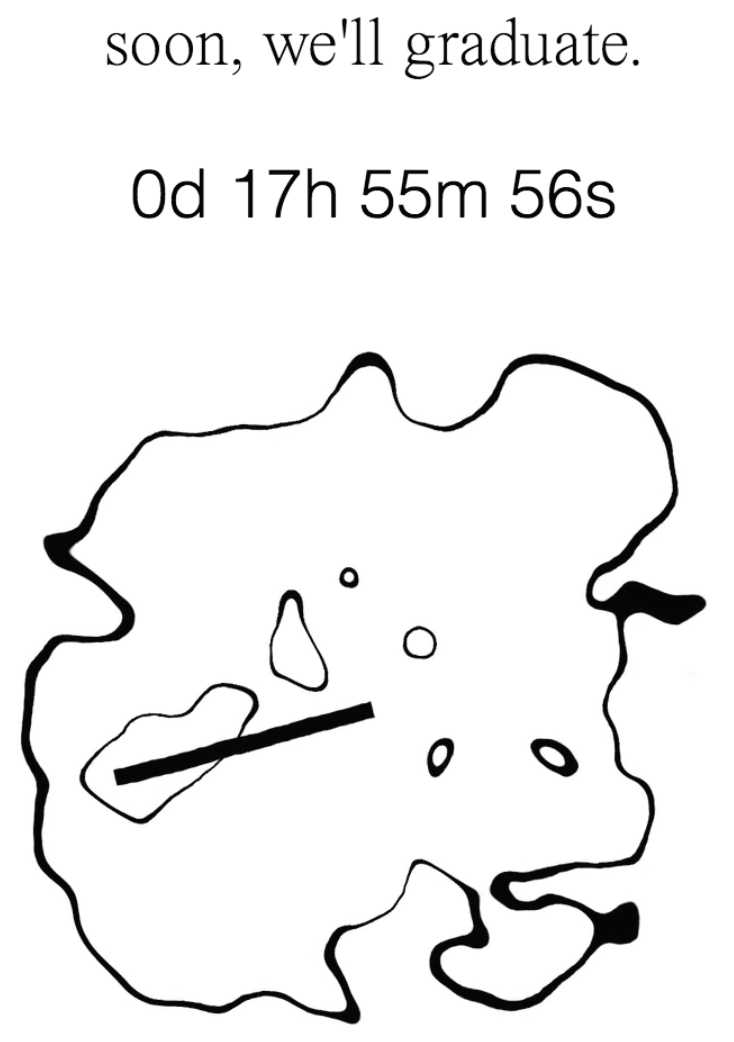
Z-Index
Z-Index contains the entire coursework of
What is Critique?,
a class tracking the complicated
timeline of critical theory. The website annotates historically
significant essays chronologically, building perpetually towards
the present moment.
The book version of the site opens with an essay, framing the text inside and contextualizing the graphic design's conceptual project. The cover abstractly captures the multi-faceted face of the subject itself.
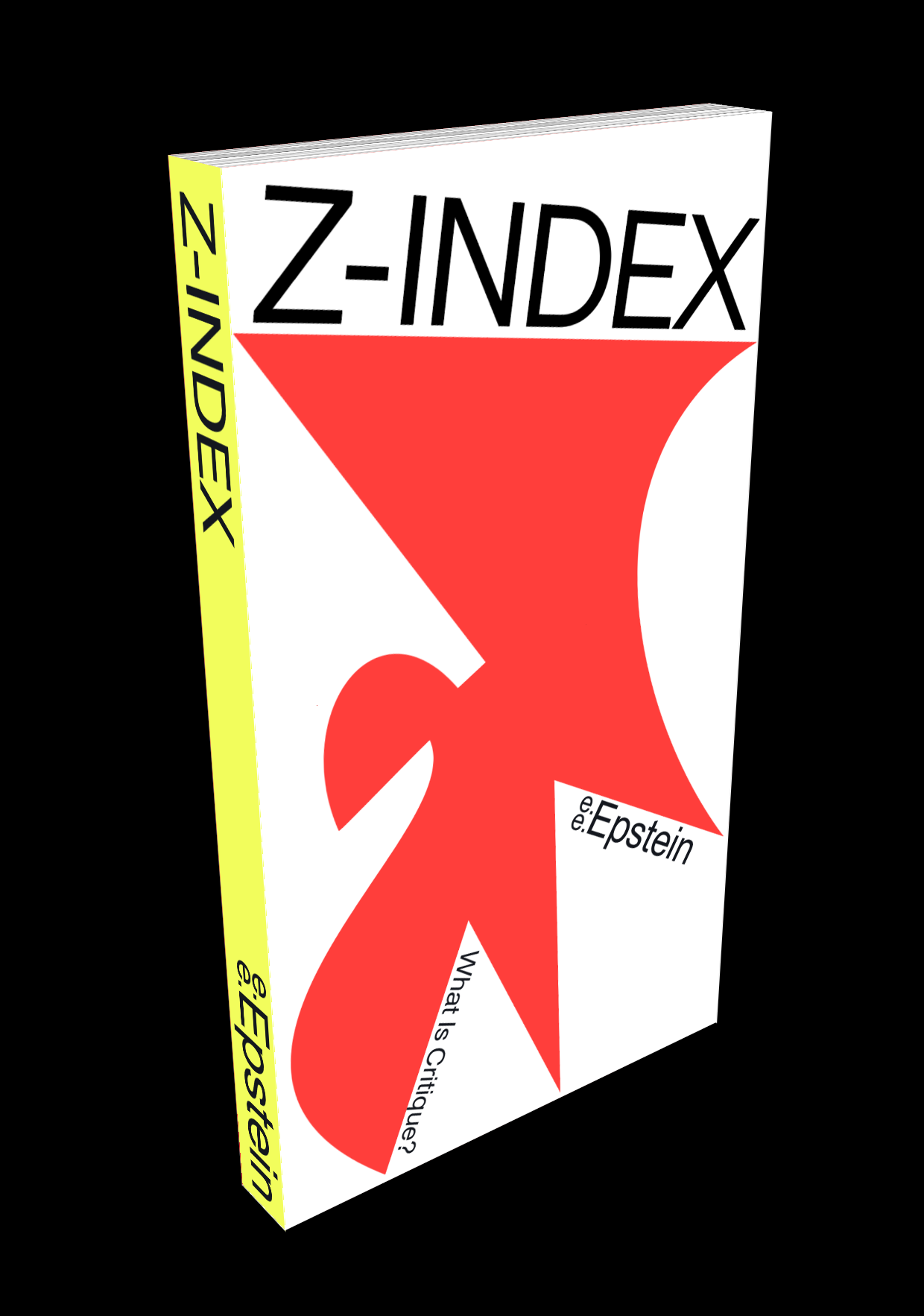
Chroma-Chimera
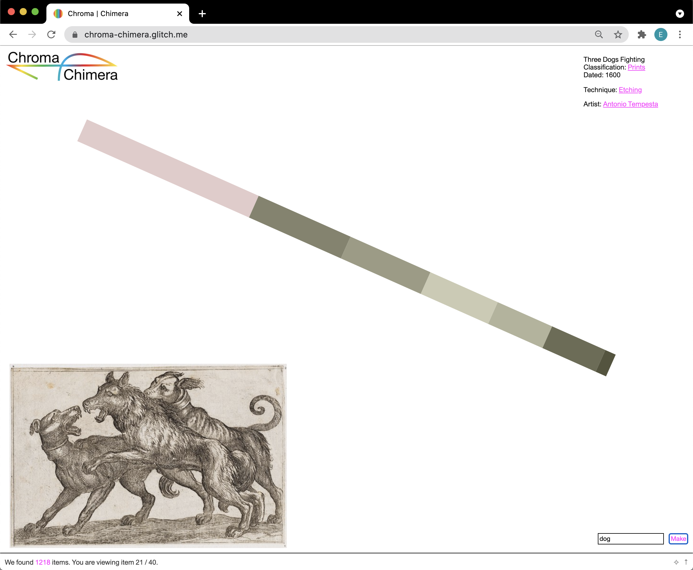
Bead Maze Typeface
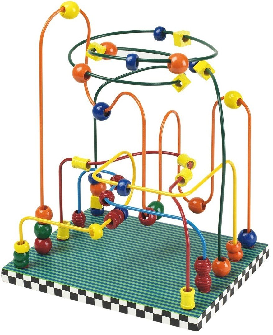
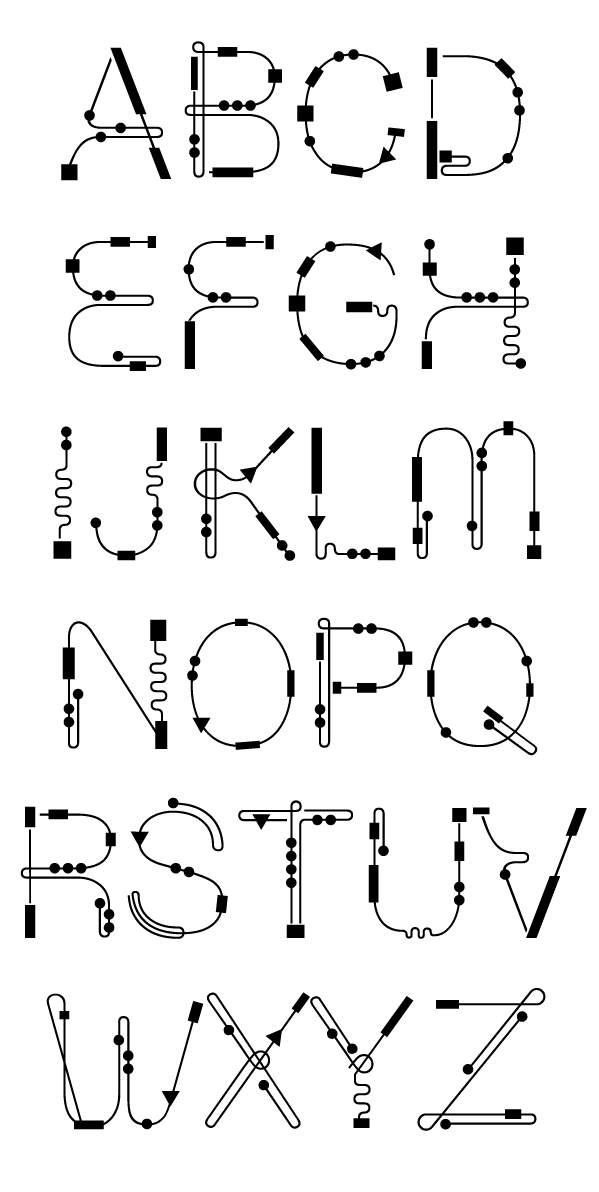
Stocker Ticker Tape
I've tried to picture what a single stock share looks like. A handshake? A handcuff? A signed check? Pulling a ribbon of type from a ticking machine? The vast, whirring financial market is, at its core, glyphic. Numerals and arrows and periods and dashes and euros and dollars–through some arrangement, they summon the actual from the virtual. Indoors, I'm play-acting as a day-trader, manipulating not value but the symbols themselves.
The symbols and mechanics governing their business determine ultimately where I'll live, what my job will be, if I can afford to have children—in short my future. I abstractly know that I made this choice, but I'm not sure how or when I made it. The ease of sending an email, of typing type to acknowledge other type, suddenly recasts the entire sequence in a gauzy unreality. Stock Ticker Tape aims to contain this unreality as a design.
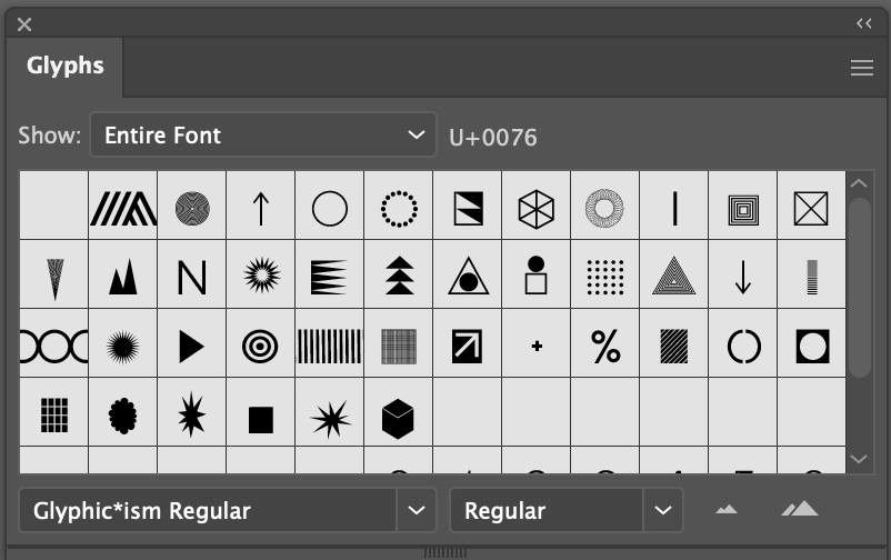
B
O
C
R
E
L
Automatic Teller Machine
Currency is a collectively agreed-on fiction, but that seems uncomplicatedly true. What's far stranger is how little investment Americans have in the craft of that fiction. This seems like a bold claim, but really consider a dollar bill, or an invoice, or a contract—do you really feel anything for their particular arrangements of glyphs on the page? Does the eye of Divine Providence mean anything to you? It means nothing to me. We're living in a post-gold standard world, one tumescent with speculation and symbolism. In its financialized space, the US dollar acts as a fiat cipher, a marker of alienation. And in the age of credit, even that seems like an anachronism, the 8-track tape of transaction.
To take serious a bank note forces one to take seriously its glyphic space (as Oxenaar did). I decided to build my currency virtually, to adopt this antique form as a medium to explore a globalized economy—to make my own Automatic Teller Machine, and circulate bank notes with their own glyphic meaning, time stamp, and value.
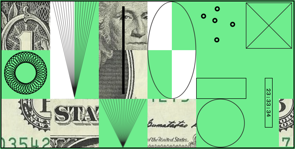
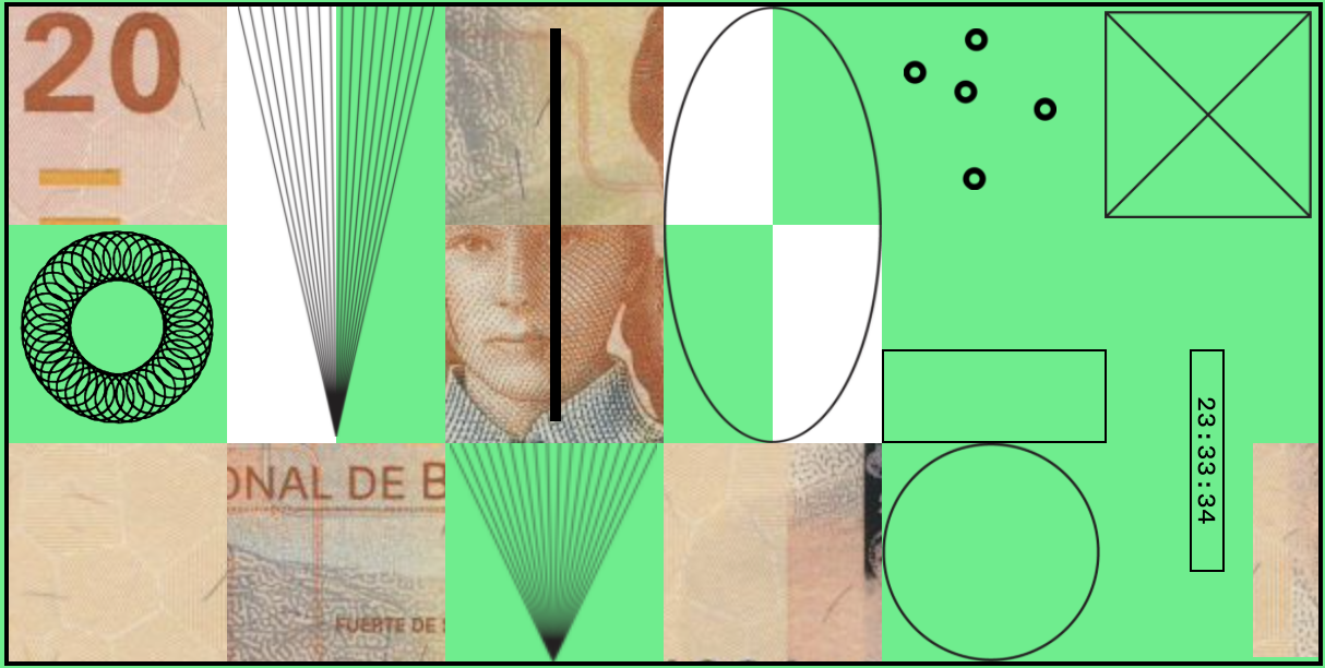
ZZZ
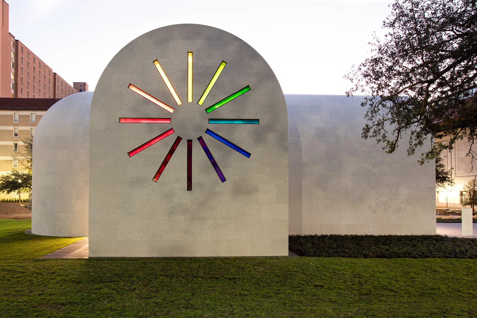
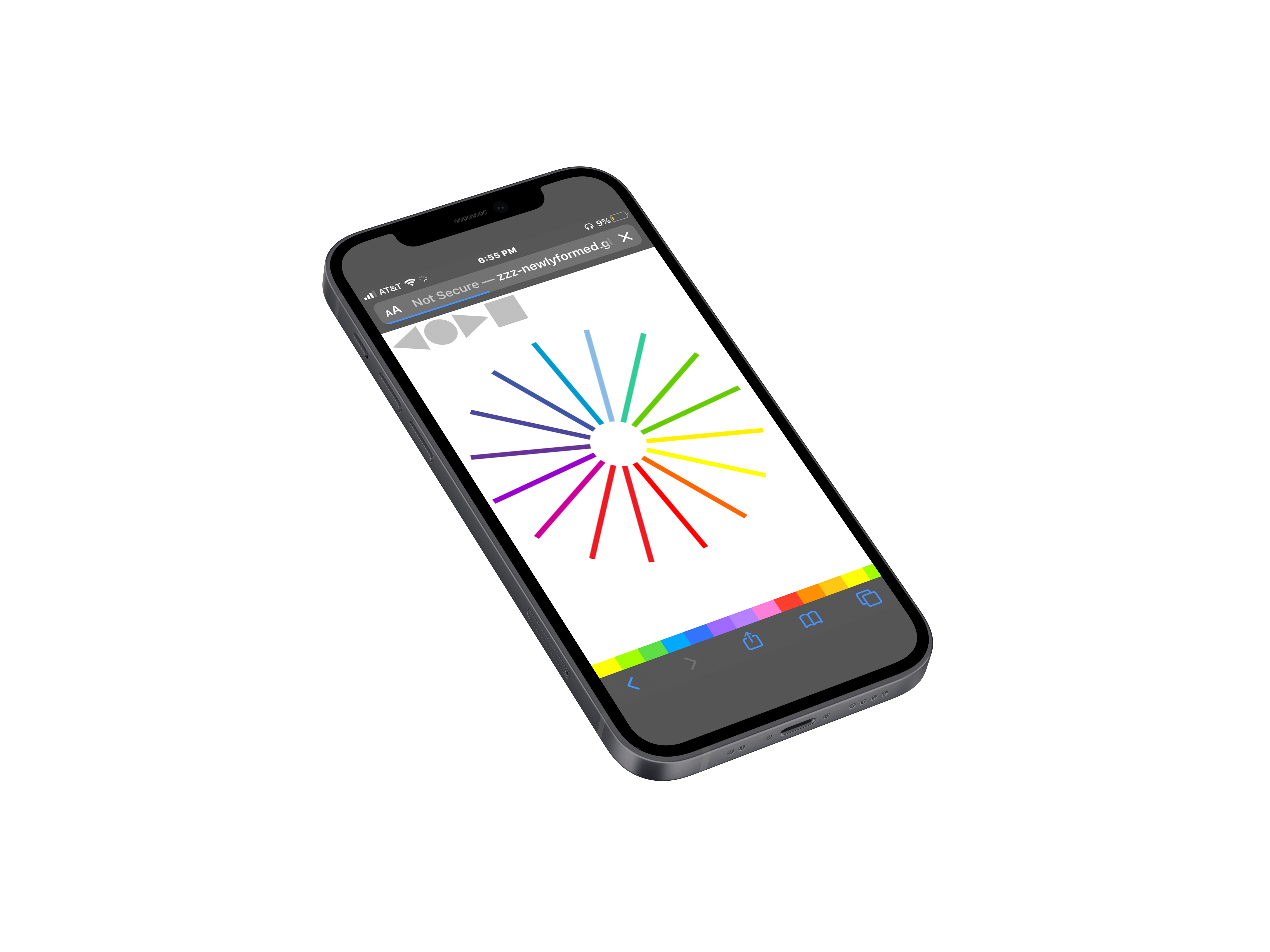
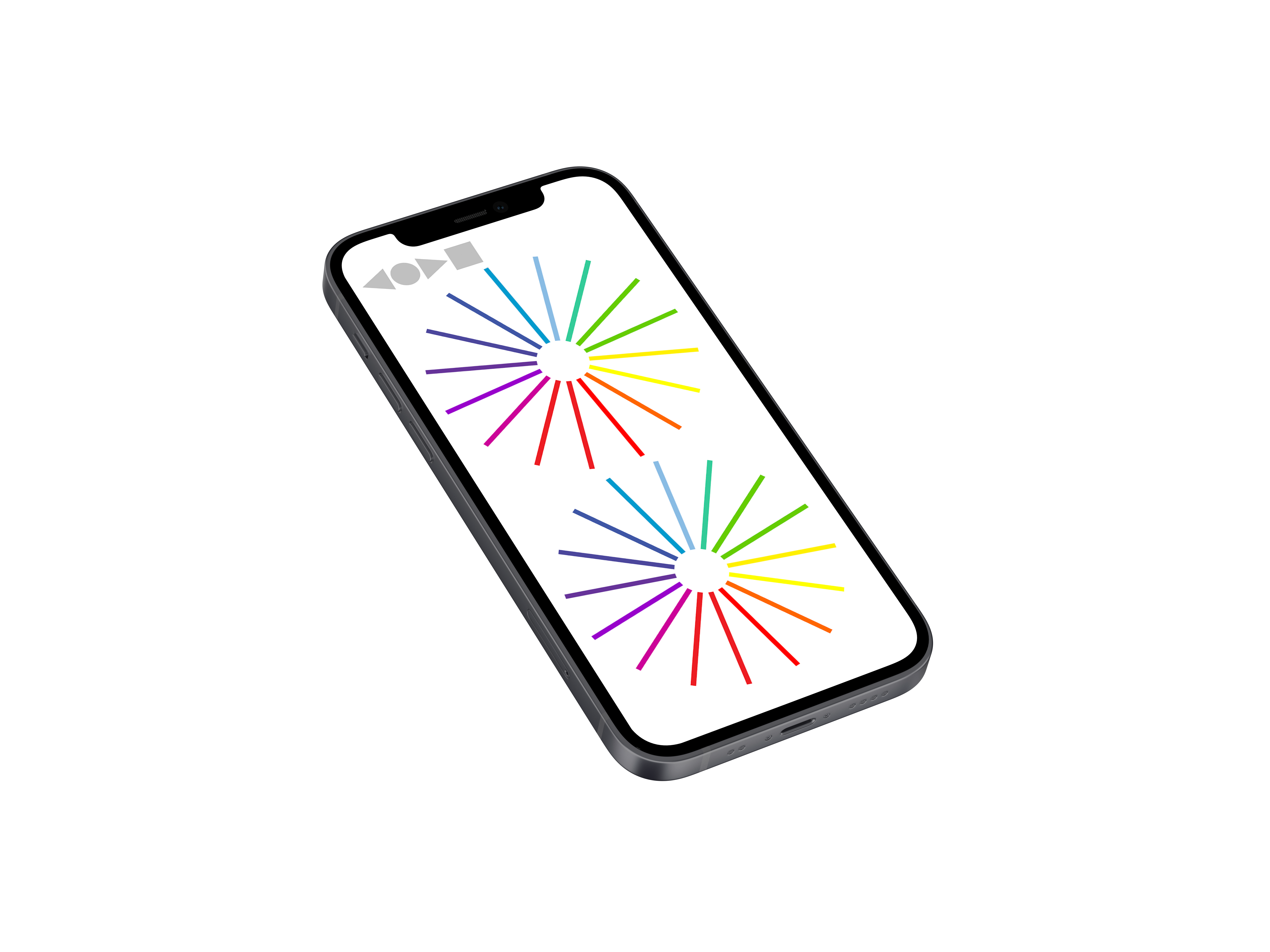
Times New Mono
This typeface is in some ways similar to Silkscreen, in that it
attempts to make newly contemporary a more transitional form.
For Times New Mono, I modified Times New Roman, a widely
percieved default
typeface to a digital context, making
it a monspaced font. This simple gesture suddenly allowed me to
code with an uncanny form, one vaguely recognizable from high
school essays.


Time-Compendium
This collection aimed to collapse a series of writing prompts on the present moment, specifically as the pandemic had forced RISD students into quarantine. Accompanying each mini-essay is a symbol capturing our imperfect measurements of time in an imperfectly measured world.
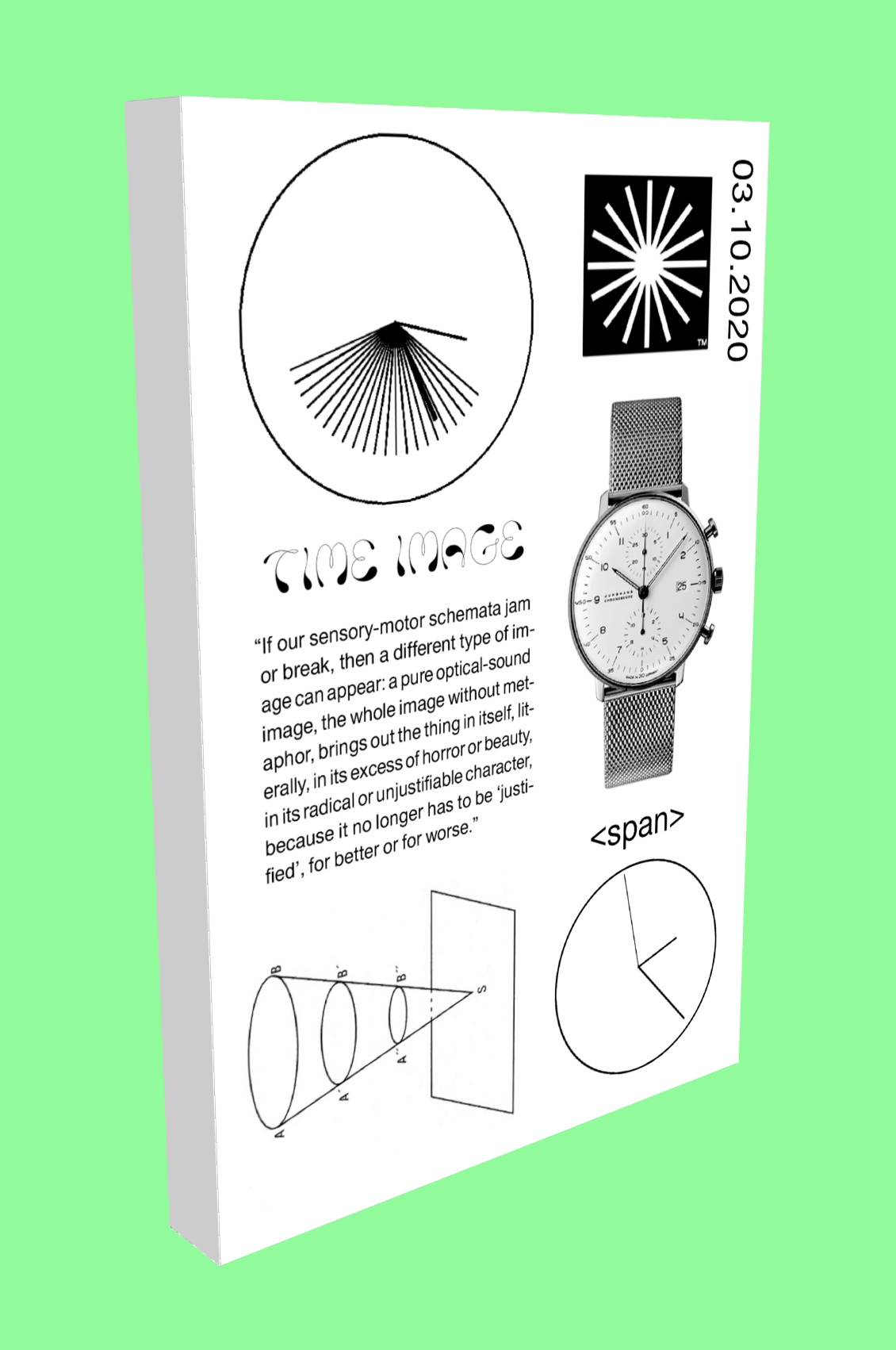
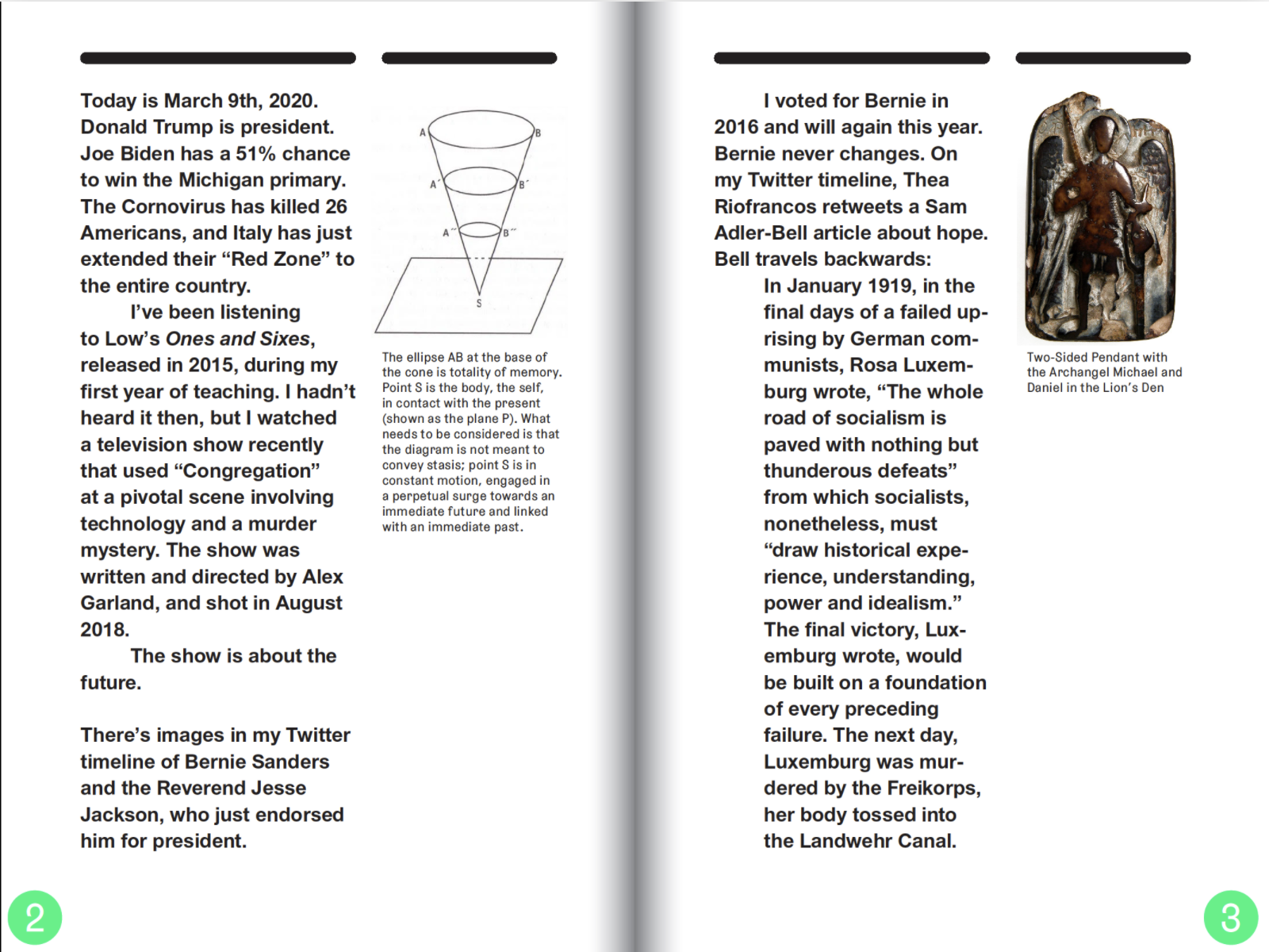
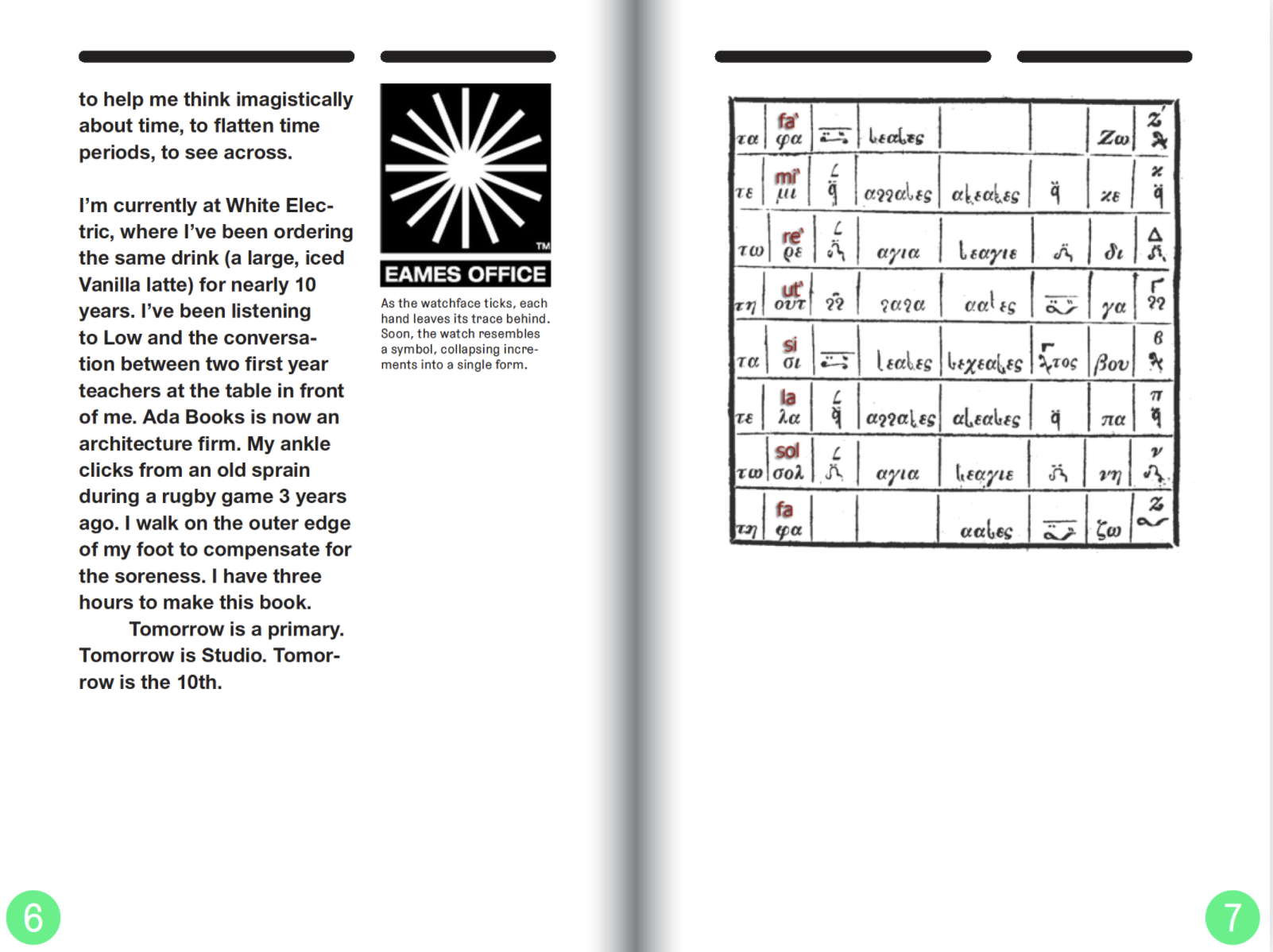
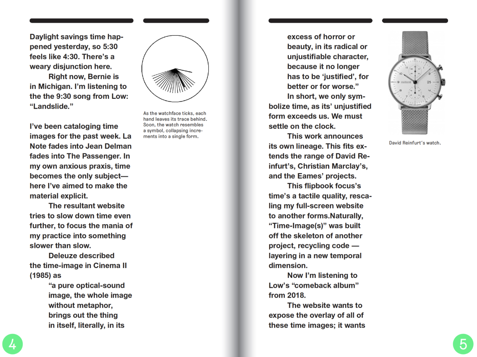
Interview with Kris Sowersby
We stand, it is often said, on the shoulders of giants. This is especially true in contemporary typeface design — and it’s a reminder of the importance of looking backwards before forging on. It’s relatively easy to construct a timeline of typefaces over five centuries, yet I find it difficult to imagine the culture and worldview of typeface designers from the 1930s, 1730s, 1530s. It’s difficult to assess the typographic historicity. Looking at digital scans of typeface specimens somehow equalises them. Their specific temporality and regionality fade away, while their forms become more present. It feels like the past is a singular thing, collapsed and flattened. The relentless updating of the internet both exacerbates and normalises this feeling.
— Kris Sowersby
Everett Epstein: I was curious about where/how your research begins and ends with typefaces. You’ve recommended The Encyclopaedia of Typefaces, and you dip into a well of digital type collections (I’m thinking of the fairly recent exploration of the Will & Schumacher specimen book through the Ghent University library). How do you direct your research process? What does your “foraging” look like? Do you consult experts (like Pierre Pané-Farré) or research librarians as part of your search? For instance, In the story of Will & Schumacher (and ultimately, Mānuka), I was wondering where your scope/interest as a researcher ended. The specimen book, although incomplete and a bit mysterious, invites a relatively linear history: the rise and eventual liquidation of Sachs and Co. A.G… To reconstruct that history, I imagine that there are paths that you chose to not go down; did you feel the need to reexamine the broader historical frame—like the economic or political conditions in 1860s-1870s Germany—or did that feel like a distraction from your main pursuit?
Kris Sowersby: It might be best to think of my research as a cumulative, constant process, not discrete and per-typeface. Each specific part is like a tributary of a main river. All the tributaries can be revisited at a later date and new things can be discovered. All my typeface research is for a specific end: to make a new typeface. It finishes when the typeface feels finished or confident enough to be its own thing. Sometimes it happens simultaneously, sometimes it happens after like Mānuka / Will & Schumacher. In that case I had pretty well finished Mānuka, but the poorly digitised specimen remained an enigma. I wanted closure and clarity, so hired Pierre to uncover as much as he could. This sort of thing is important, paying professional researchers to do their thing. It benefits the wider type community and adds to Pierre’s own river. And it’s important to remember: “you cannot step into the same river twice.”
EE: Your essays do a wonderful job balancing a description of your process and an often poetic language around aesthetics. I’m thinking specifically of your description of Hendrik van den Keere’s lowercase “a” or the forest metaphors in your Mānuka essay. What is your relationship to metaphor as a writer, reader, and/or designer?
KS: I don’t think I have a “relationship to metaphor”. I simply use it to either explain or romanticise a typographic concept.
EE: The Untitled Sans/Serif project feels deeply relevant to the work of graphic designers, whose task is often to operate parenthetically, or tangentially, to the content. I love how you liken the typeface to not recognizing your face in the mirror, and it made me wonder how you deal with ego as a designer. As you’ve grown in your career, do you find yourself more willing to concede or assert your voice? In other words, do you recognize your “fist” more often in more recent work (like “Signifier” for instance)?
KS: There are no ego-less typefaces, every single typeface designer has decided that their work, their typeface, is good or different enough to exist. I am no different. But I don’t set out to make typefaces that are recognisably mine, that’s just a natural outcome of drawing a shape in whatever way I thought was good at the time.
EE: It’s interesting that you say “good at the time.” I really appreciate how you revisit and rethink your own typefaces. I know you’ve said in past interviews that it’s hard to determine when you’re “done” with a typeface, but I’m curious how you determine which forms you’re ready to revisit. With National 2, it seems like you saw immediate fixes for the full redraw, but are there typefaces that you have an itch to redraw, but are ok with as is?
KS: I’d love to redraw Feijoa, but it doesn’t sell well enough to justify the investment. Also, I worry it will drift into George Lucas / CGI Sarlacc territory. The other option, which I’m fond of, is to revisit the source and ideas behind my old work. For example, Söhne is essentially a re-visit of National source, Signifier of Heldane, Epicene* of Newzald, The Future* of Geograph/Karbon. The benefit of dipping into the same well is I’m older, better at drawing and better at seeing the good bits in the old stuff. I guess this relates to the ego question too: the first visit was concerned with ego and “originality”, the second visit is more concerned with the essence of the material itself.
EE: You’ve often returned to Rudy Vanderlans’ quote on “In-fillism,” and I appreciate both your argument and your inclusion of Vanderlans’ rebuttal. I’m curious how you felt about his reply. Did it convince you of his side at all?
KS: I wasn’t convinced or surprised by his reply at all. He’s a businessman, if you read all his essays there is a hard-nosed streak of business acumen. Yes, Emigre were once the critical vanguard of typeface design, all modern type foundries owe them a debt of gratitude. But his infillism article was boring and somewhat hypocritical. I get it, Emigre have achieved so much, they can’t be expected to keep going hard at the coalface. We all have to bow out and step aside at some point.
EE: I know you’ve said in the past that you’re less assured in calligraphy, and that you draw directly on the computer (as opposed to your earlier sketchbooks). For the more elaborate swashes of Domaine Sans, which has those beautiful script-like features, were you similarly working on the screen first? Do you have any sense of what makes for a good calligrapher vs. a good type designer?
KS: I can’t remember if the Domaine Sans swashes were screen first. I must have quickly sketched them out, they’re too fiddly to draw direct without an idea of where I’m going. I assume there are very similar things common to good calligraphers & type designers: respect for language, knowledge of history, awareness of contemporary aesthetic, mastery of tools, sense of space, balance and rhythm.
EE: It’s so interesting to hear you explain your research as a “cumulative, constant process,” and at this point, I imagine it’s difficult to draw any typefaces without that swimming in that river. I am wondering though if you recognize a lack of research in other typeface foundries—or maybe failed attempts to be ahistorical. In other words, granting that an accentless typeface is impossible, I’m curious what a “poorly researched” typeface might look like?
KS: I don’t know if you can see if a typeface is poorly researched, but I can tell if it’s ungrounded in history, floating in the trendy zeitgeist. I can also tell if it’s badly drawn and spaced.
EE: In following up on the Domain Sans question, your connection to tools (be it the bezier point, the punch, the wooden block) makes me consider how much the technology around type-making has shifted across your career. Recognizing the enormous value of being able to interpolate, are there softwares (or even analog tools) that you miss as a designer? I don’t mean this sentimentally, but rather are there tools that did something that more streamlined updates have overlooked?
KS: Dude… how old do you think I am? 😂 I’m 100% digital, I have no experience in any other type-making technology. Type design software has only gotten incrementally better over the 20 or so years I’ve been using it.
EE: Sorry, Kris! I didn’t mean to imply that you were carving punches or something, and I know that you’ve long designed with Open Type features in mind. I’m more just aware of the rise of variable fonts in the type market since 2016, and I imagine that most type foundries (like Grilitype with GT Flexa or GT Alpina) have begun to contend with this opening in the market. With the Signifier essay, you noted that interpolation has been around since Ikarus in 1972, so it’s not as if variability is new, but I wonder how you feel about the (perhaps perceived) popularity of variable fonts. Maybe this is overthinking on my end, but it felt like your Signifier essay portended an exploration of variability in the same way the Will & Schumacher research led you to Mānuka.
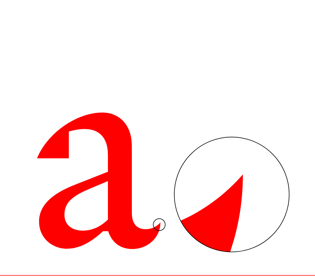
KS:
VF is a font format, made specifically so big tech (Microsoft,
Google, Apple) might save some bytes serving fonts. I recommend
Butterick’s good essay on it. In short, it offers nothing new to the
typeface designer, and only something new-ish to designers being
Multiple Master part two. Foundries respond to market demand. Let’s
compare to webfonts, which became mainstream about 2012. We got
customer requests daily. It didn’t take long for foundries to start
selling webfonts due to customer demand. Now, in almost 5 years
since the VF spec was introduced, we’ve had about 8 enquiries. The
amount of VF available across the spectrum is probably a fraction of
a percent. I just don’t think people want, or care for it. Customers
barely understand or want to use OpenType features, let alone want
to make micro-adjustments to the weight of a font. It’s like buying
a new TV: you get seduced by the features and have a remote with 50
buttons, but you only really use 5 of them. VF seems to add a layer
of complexity, and is still essentially a beta tech across browsers,
OS and apps. Adobe helped invent the bloody thing, but still hasn’t
properly implemented it in InDesign/Illo. Why not? Maybe there is
simply no demand.
VF offers nothing new in the realm of design space or style,
because we’re still using vector outlines. We’re still dealing
primarily with shape.
Signifier does respond to the underlying concept of
variability/interpolation, in the extrapolation of the Thin weights
as a starting point for style. It’s important to remember that VF is
simply a font format, not a new way of thinking or designing.
EE: To follow up on the previous question, it was interesting to read in the Signifier essay that you take feedback from designers (like Bethany Heck) as you’re developing the family, testing the market for this type. I guess I’m curious how you continue to reckon with what will be popular (but still persist beyond the “trendy”) vs. what will just float by in the “zeitgeist.”
KS: I try not to engage directly with what is on-trend because my process is slow, and it’s hard to know what will stay viable after a few years. I mean, I could easily smash out some variable family with massive spindly serifs that all join up, chuck in some extravagant swashes, or ink-trap the fuck out of a boring sans. But they’ll feel trite, especially coming from a type designer pushing 40. Playing the fashion game demands fast-fonts and fast work. It gets exhausting. For me, fonts are a longer-term proposition. It’s not without irony I note we’re corresponding in Arial in G-docs. 😏 How old is Arial? Calibre is 10 years old, and sales are still going up. I imagine I could reasonably expect 15 years out of it, before sales start to decline. I like where I’ve ended up, making fonts that aren’t trendy but seem to be popular for certain types of design. Also, nobody knows what will sell and be popular! Nobody can predict the market. I see fonts come out and think damn, that’s bloody good, I bet that will sell. And then it just sorta disappears. Like anything I suppose.
EE: It’s refreshing (and funny) to hear you name some of these “on-trend” moves, and I also appreciate how you thoughtfully place the zeitgeist in context. Like, I don’t hear judgment, but rather an acknowledgement that the “fashion game” has different values—and a different business strategy— than your model. I also imagine that the current ink-trap craze or variable type families feel perhaps similar to the Art-Deco forms of the 1930’s. Maybe with less staying power. It’s something I’ve admired about your practice; you often reckon with hubris, pretension, and dishonesty in design. As you note, even the typefaces that designers think will take off “just sorta disappear.”
KS: You can see it in reverse as well, the “anti-fashion” type designers who are very trad focussed, steeped in the craft and history. They seem to resent modern design work and aesthetic, and pursue a dedicated line of nostalgia. This is understandable, in a LARPing kind of way. The type design field seems to accommodate all sorts.
EE: Reading your response in relation to your essay on Geograph got me wondering if dealing with “typographic historicity”—or the way that “regionality fades away”—makes you consider “preservation” as part of your work. I know that you avoid the term “revival” (and the loftiness that implies), but several of your typefaces (like Pure Pākati or Hokotehi or Bula) point towards a respect for indigenious traditions and/or using type as a way to support a cause (like the Hokotehi Moriori Trust). Do you have a particular rule of thumb for remaining ethically grounded as a type designer (or business owner)? Does the term “preservation” feel presumptuous; does it suffer from the same issue you brought up about “revival”?
KS: Preservation would entail actual responsibility, much like an archive or a museum. I don’t mean pretend archives, like someone’s personal collection or a website of images, but real archives by professionals. These people are trained in the art and science of preservation, they have a mandate to preserve things for decades for future generations. So no, I’m not preserving type in an archival sense. But maybe more the spirit of type history in a small way? “Tradition is the preservation of fire, not the worship of ashes” sorta thing. I basically take what I like from history and try and make it work for now. It’s a very selfish, capitalist sort of preservation, really. I think Matthew Carter said something about revivals once, along the lines of “you’ve got to respect the original material” to do it properly. Which sounds good, doesn’t it? But you can have the utmost respect for historical typefaces and still make an awful revival. So what’s the right path, the ethical path? Hard to say.
EE: Your interest in potentially writing a book (as mentioned in the North & South interview) made me wonder whether a single lesson (or word from the wise) springs to mind that you’d like to tell the “you of 20 years ago.” Have you thought more about this project since speaking with Ashleigh Young?
KS: No, this is a trap of a question! The idea that one small word of wisdom or a lesson would make any difference is dangerous. It’s a fictional situation, and people seem to love a relatable takeaway or whatever. It’s just one long hard graft, year after year. The work is the work, you only get experience from doing it. Imagine future you, 20 years older, coming back and telling current you that you’re not going to make good work for at least 12 years. Would you still persist? Would you be willing to grind it out, day after day to get to that point?
EE:
It’s a point well taken; even looking back 10 years ago, I’d have a
hard time convincing myself of anything, much less the way I should
work. And, as you’ve noted in your essay on inspiration, keeping
yourself open to the world, while remaining motivated (by some set
of parameters) feels far more useful than a couple bon mots or
lessons.
Strange transition, but I wanted to return to what you said
about variable fonts and big tech. So, with my thesis, I challenged
myself to not use inDesign to design the book, and instead use css,
bindery.js and a couple of additional libraries. Essentially, this
approach came from the type designer Agyei Archer, who does all of
his design work in Drawbot and Petr van Blokland, who built out
Pagebot partially as an alternative to the Adobe-licensed world. I
have nothing personal against these companies, but I’m hoping to
build a practice that can be somewhat independent—or that won’t
collapse if I don’t pay Adobe. I know you’ve made a considered
choice not to just sell all your typefaces to Google Fonts or
Typekits, and I admire that decision. Could you speak to that
choice, and what you’ve described on Australian Design Radio as the
“flattening effect” of seeing your type bundled within a cloud of
other typefaces? Now with an established career, how do you continue
to cultivate independence?
KS:
My decision to stay off those platforms was always instinctual, and
it seems to have paid off. I initially simply didn’t want to be on
those platforms, I suspected my fonts would just become more product
fodder or ‘content’ for their pipelines.
Amazon, Spotify, Netflix etc have taught us that the real money
is owning the pipes. What flows through them is almost
irrelevant.
I was also lucky enough to get into fonts during the second wave of
digital, we were all becoming comfortable with buying and selling
stuff on websites. I managed to build up enough of a following and
customer base to maintain a steady profit and business from
klim.co.nz. I also
suspected that if the same font was available across multiple
platforms, the customer ends up nickel and diming across several
browser tabs, and the traffic gets fragmented. So if someone
searches for “National font” then I’ll get the majority of the
traffic. I get to control how my fonts are presented, which is very
important to me. The other font sites, like any ‘content platform’,
have a tendency to flatten all their content. How often have you
scrolled through Netflix, those pixel acres of thumbnails all just
kinda merging into nothing? It’s the same with fonts.
There is also no guarantee these platforms will survive or
their terms stay the same. For example, several webfont platforms
are now dead. Typekit is now owned by Adobe, FontFont/FontShop is
now owned by Monotype. Myfonts royalties have plummeted. And on it
goes. None of these players really have the type designer’s best
interest at heart. Their support of type designers is almost
non-existent. It sometimes feels like I’ve dodged a bullet.
As for continuing, it gets easier in some ways, harder in
others. But it’s been like this for so long that I don’t know
anything else.
EE:
Regarding my interest in punctuation: so I was a high school English
teacher before RISD, and I think that’s why I’ve been thinking about
parentheses, asterisks, and ellipses as allegories graphic design
labor. These marks each operate distinctly to make meaning coherent,
and I think they provide a path to understand my own (and maybe
others) practice. Not to get too in the weeds, but I’m approaching
the ellipse, for instance, as a kind of “temperament” that a
designer might take up—a mode of making that engages with time
spans, ellison, and history. Keller Easterling’s “Medium Design” and
Jacques Derrida’s “parergon” set up the basis for this reasoning,
but I’d like to bring a consideration of labor and capital back to
the fore.
I find that Signifier, specifically, speaks to an elliptical
approach. The typeface ties together so many threads—the Fell Types,
Matthew Carter, “infinite sharpness”—and makes it all look
effortless, but the thing that really sticks with me is that embrace
of “immateriality.” Signifier, to me, rhymes with an ellipse; they
both actively “mediate” a range of elements in a seemingly invisible
way. I’m searching for a question here… 🙃, I guess I’m curious how
you reached this awareness that “that searching for the essential
materiality of digital fonts was misguided;” whether this was truly
an epilogue to Signifier or a gradual understanding across all of
your type design?
KS: It was both. Each typeface teaches me something new, they are all tributaries in my river. I spend a lot of time drawing letters, thinking about them, reading things tangential to or separate from type design. This far deep in the game I don’t get many, if any, new ideas about type design from type design or even graphic design writing. New ideas come from outside. I don’t think type design will ever understand itself through itself, it’s a closed loop. I think I once tried to maybe understand other things through type design. It didn’t work, and it wasn’t nourishing for my practice. Only looking outside am I able to find… reassurance? Fertiliser? Clarity? I don’t know. Like you’re using ()*… — something outside design — to understand a design practice. But Signifier certainly pulled a lot of threads together for me. I could quit and be satisfied.

Epilogue
Inventions in Space-Time
Anyone can speak to anybody else, a filmmaker can speak to a person of science, a person of science can have something to say to a philosopher, and vice versa, only in terms of and according to their own creative activity.... If I lined up all the disciplines that define themselves through creative activity, I would say that they have a common limit. The limit common to all of these series of inventions-inventions of functions, inventions of blocks of duration/movement, inventions of concepts-is space-time. All of these disciplines communicate at the level of something that never emerges for its own sake, but is engaged in every creative disci-
pline: the formation of space-times.
— Gilles Deleuze
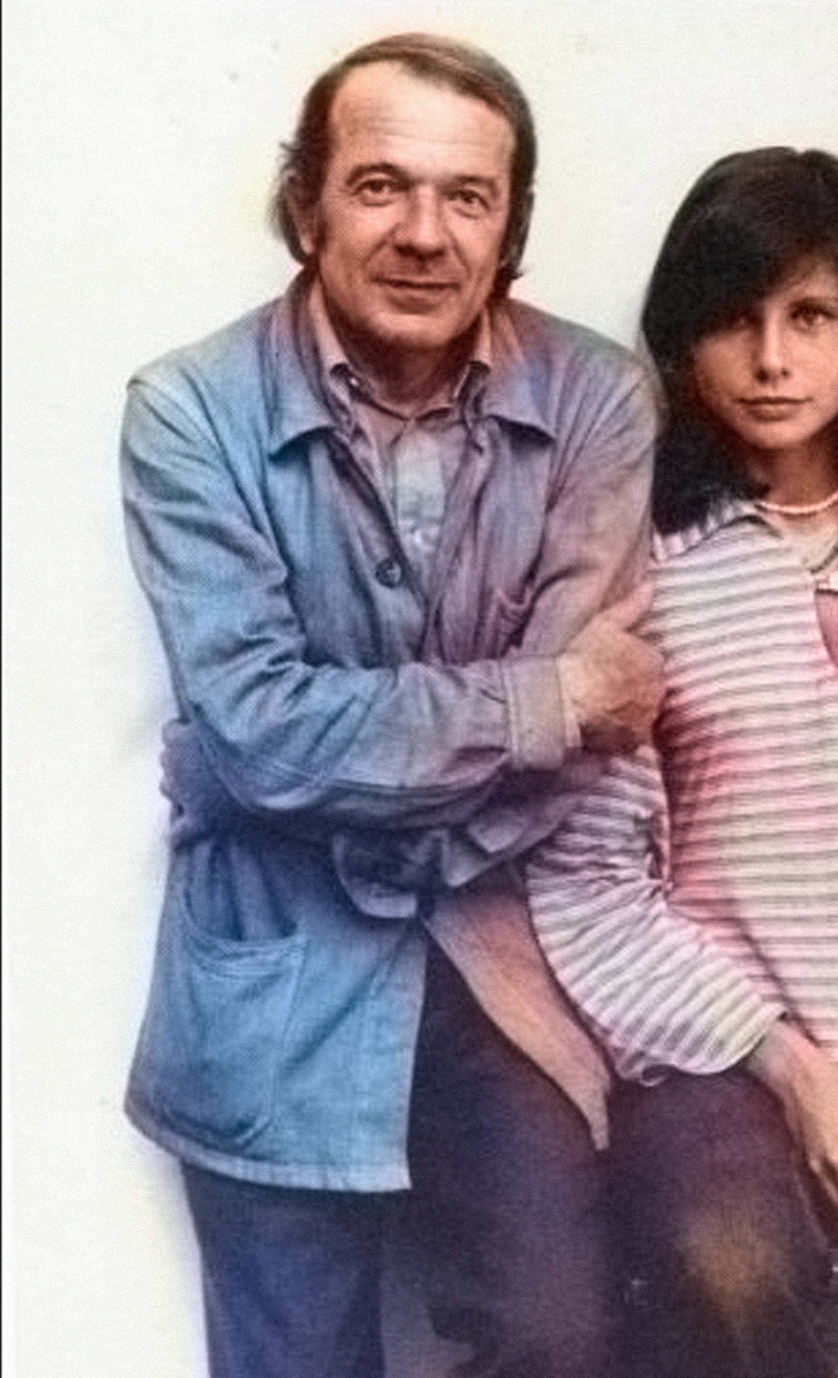
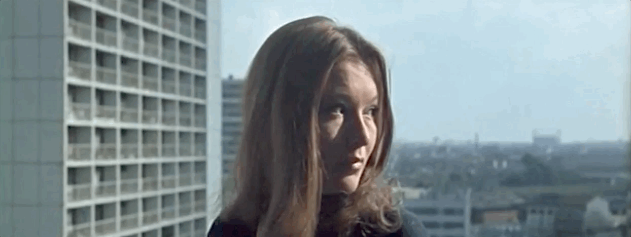
Near the end of Jean-Luc Godard’s 2 or 3 Things I Know About Her, the voiceover and the visuals suddenly bifurcate, and we’re left with sound and image moving along in different directions. Against a 45 foot wide screen, you can imagine an audience seeing the swirl of coffee, bubbles constellating, as the disembodied voice of Roger Montsore “rise[s] into the air” (Delueze, 319). Here, in the “dissociation of seeing and speaking,” we witness a “cinematographic idea” (319) and ultimately a refiguring of space-time. Godard’s invention fits neatly into Delueze’s proposal in “What is a Creative Act?”: that all creative disciplines form blocs of space-times (315).
In this thesis, I've expounded on what each punctuation
“position” might entail for these blocs
. But let’s take a step back for a second. As
I write this coda, I realize that these
marks operate simultaneously. I’m moving through time (ellipses),
while filling this book (parentheses) by constellating a series of
essays and projects from across my time at RISD (asterisk). There is
no such thing as a work that doesn’t employ all three of these
positions, just as Eve Sedgewick noted, “it is sometimes the most
paranoid-tending people who are able to… disseminate the richest
reparative practices.” (Sedgwick, 150). Like Godard or Deleuze, graphic
designers do not invent in exclusively one
direction, they radiate outwards. I could see Robert Davidson as both
parenthesizing and spanning; creative acts need not be exclusive
pursuits. These chapters are suggestions, not destinations.
For this book-form, I wanted to try to “invent” something new,
formulating my thoughts through an online space, where I might
better be able to fetch and parse data. This gesture, although
operating in the parentheses of the browser, feels fundamentally
like an asterisk, radiating towards a single nexus. In doing so, I
found a new way to both annotate and catalogue work across these
three years. I say all of this hoping to speak to a future
me
or a future you
(the reader).
We'll never meet like this again, across the bridge of the ellipses. Right now in 2021, we are coming out of the pandemic, listening to Black Midi, watching Mare of Easttown, readying for a summer spent with other people. We are punctuating something new, we are making new meaning. We are inventing.
I hope you're inventing too. 🙂
Index Of Terms
- abstraction
- Actor-Network Theory
- Adobe
- Andrew LeClair
- Andy Pressman
- Asterisk
- Atacama Desert
- Bernie Sanders
- Bezier Points
- Bruno Munari
- capital
- Chile
- Christo
- Coronavirus
- currency
- CyberFeminist Index
- Derrida
- Drew Litowitz
- ellipses
- Ellsworth Kelly
- emoji
- glyph
- ideograms
- internet
- Jeanne-Claude
- Keller Easterling
- Kris Sowersby
- Martin Arboleda
- Medium Designer
- meme
- mineral
- Mindy Seu
- Muriel Cooper
- network
- parentheses
- punctuation
- process
- responsive
- Richard Rorty
- Robert Davidson
- Signifier
- Spencertown
- typeface
- Unicode
A
B
C
D
E
G
I
J
K
M
M
P
R
S
T
U
Bibliography
- Arboleda Martín. Planetary Mine: Territories of Extraction Under Late Capitalism. Verso, 2020.
- Caserta, John, editor. For/with/in: Graphic Design for, with, and in the Browser. 2014.
- Christo, et al. Christo and Jeanne-Claude. Taschen, 2019.
- Clowes, Daniel. Ghost World. Fantagraphics, 1997.
- Davidson, Robert, et al. Robert Davidson: The Abstract Edge. Museum of Anthropology at the University of British Columbia in Association with the National Gallery of Canada, 2004.
- Deleuze, Gilles “What Is the Creative Act?” 1987, www.youtube.com/watch?v=a_hifamdISs.
- Easterling, Keller. Medium Design: Knowing How to Work on the World. Verso, 2021.
- Graeber, David. Debt: The First 5000 Years. Melville House, 2014.
- Graeber, David. The Utopia of Rules: On Technology, Stupidity, and the Secret Joys of Bureaucracy. Melville House, 2016.
- Hernandez, Jaime. Angels and Magpies: A Love and Rockets Book. Fantagraphics Books, 2017.
- Jameson, Fredric, et al. The Jameson Reader. Blackwell, 2004.
- Jones, Owen. The Grammar of Ornament. London: B. Quaritch, 1928.
- Latour, Bruno. Reassembling the Social: An Introduction to Actor-Network-Theory. Oxford University Press, 2005.
- Metahaven. Can Jokes Bring Down Governments?: Memes, Design and Politics. Strekla Press, 2014.
- Notley, Alice. For the Ride. Penguin Books, 2020.
- Paik, Tricia Y., et al. Ellsworth Kelly. Phaidon Press Limited, 2018.
- Reinfurt, David. A "New" Program for Graphic Design. Inventory Press, 2019.
- Reinfurt, David, and Robert Wiesenberger. Muriel Cooper. The MIT Press, 2017.
- Seu, Mindy. Cyberfeminism Index, 2020, cyberfeminismindex.com/.
- Seu, Mindy. On Gathering, Shift Space, 7 May 2021, www.shiftspace.pub/on-gathering-mindy-seu.
- “The Scalability Project*.” The Scalability Project, 30 Nov. 2020, scalabilityproject.org/.
- Toner, Anne. Ellipsis in English Literature: Signs of Omission. Cambridge University Press, 2017.
Acknowledgments
- Thank you Mom and Dad for making my life so joyful and rich, and for making a career in design seem like a worthwhile pursuit. I'm lucky to have had you both so close these past three years.
- Thank you Emily for all your support, patience, and love. I honestly cannot imagine this experience (or life in general) without your humor or kindness. I hope in the next chapter of our lives to be as considerate a partner to you as you've been to me.
- Thank you John, Carol, Thomas, and Kate. How wonderful to have been able to grow up with you in Providence; I'm so grateful for you friendship and Saturday dinners all of these years.
- Thank you Pat and Oodie. I feel enormously proud that you're my grandparents, and I attribute any kind of work ethic I have to you both. Much love!
- Thank you Dice, for being a cat who is also a little sir.
- Thank you Vanessa, Tim, Alex, and Shaun for your friendships, Friday night movies, and Zoom calls.
- Thank you Micah. Someday, hoggies will ride.
- Thank you Dave, Jared, and the entire PBC family. This past year and a half— you all kept me sane and dense as a dying star.
- Thank you my Rhode Island family. Jose, Olivo, Nicole, Lorena—you made this journey imaginable.
- Thank you class of 2021. I feel so lucky to have known you all. How we made it through this...I'll never know.
- Thank you 3⁄1 crew! Maddie, for being a such generous friend. If you were a color, you'd be #CE7DA5. Kit, for your intelligence and curiosity. Learning with you made me a much better designer and thinker. Laura, for your high standards and grace. I feel really fortunate to recieve your honesty and always considered feedback. Georgie, for reminding me that this program and design are supposed to be fun! I hope that someday we can see each other in person again. Matt, for always asking questions and for your sincerity.
-
Thank you 2⁄1 crew—Ryan, Lai, Daphne, Will, Sophia, Romik—for
reminding me that design is for people. I am so grateful for your
joy, keen eyes, and endless experimentation. Whenever I felt
completely flattened by the world and this program, you all were
there to share the weight and propose a more joyful vision of what
this experience could be. When the pandemic (!) finally ends, we'll
get a drink together and cheers to never being on Zoom again!
- Thank you class of 2020: Hilary, Emily, Seyong, Elena, Mukul, Calle, Aleks, Lizzie, Sophie, Fabian, Yoon, Caroline, Weixi, Vai, and Bobby Joe. I don't think you'll ever realize how much your writing, work, and kindness has impacted me. You made this year imaginable.
- Thank you class of 2019: Chris, Olivia, Elaine, Ji, Eury, Joel, Robert, Mo, Angela, Annaka, Marcus, Wei-Hao, June, and Amy. You set such a high standard, and I'll continue to look to you all for inspiration. I hope, someday, we'll meet again.
- Thank you class of 2022: Forough, Katie, Adam, Zengqi, Sabrina, Qiwen, Nick, Ilhee, Louis, Ingrid, & Asta. Can't wait to see what you do!
- Thank you class of 2023: Mina, Sun Ho, Moritz, Jenni, Zoë, Zach & Jack . You're going to kill it!
- Thank you Derek Schusterbauer, Brendan Campbell, Jeremy Radtke, Carson Evans, and the entire RISD Museum community. You all modeled what a kind, professional graphic design office could look like. I hope to find a job as supportive and educational as this one was.
- Thank you Meredith and Jen. A&L made me a better listener and reminded me to think outside myself. I feel tremendously grateful to have tutored so many people of the past three years.
- Thank you Paul Soulellis. Watching you continually push your practice forward is such an inspiration for anyone asking more from art and design.
- Thank you Nora Khan. RISD is so lucky to have your insight and criticality.
- Thank you Lucy Hitchcock. It always meant so much to me to recieve your words of encouragement!
- Thank you Kelsey Elder. I cannot believe how much I grew from your class. It reminded me why I wanted to go back to school: to learn!
- Thank you Keetra. Your class has meant so much to me, and I find myself continuing to return to the mental muscles you helped me develop. I'm enormously grateful for your commitment to your students and your willingness to model joy.
- Thank you James Goggin for your generosity as a critic and teacher. I feel like my interests in design have been directly shaped by your rich web of references—RISD would have been literally unthinkable without you.
-
Thank you Chris Novello, Minkyoung, and Marie. You made coding
knowable, and without your teaching, my entire RISD experience would
not have been nearly as rewarding. I'm also so grateful that you all
pushed me to imagine the web as
real;
that kernel of an idea will continue to shape my critical engagement with design. - Thank you John Caserta for your guidance and always welcome advice. It's been so much fun to get to work with you this past year.
- Thank you Cem. What a joy that my favorite graphic designer would also be a kind and supportive advisor!
- Thank you Anther. Your goodness and insight made this thesis a bit easier to think and write .
- Thank you to all of the people who agreed to be interviewed by me: Andrew, Andy, Drew, Mindy, and Kris. You all gave me so much of your time and energy; I feel so inspired by not only your practices, but your kindness as well.
- Thank you to my teachers Tom Wedell, Nancy Skolkos, Marie Otsuka, Aki Nurosi, Alan Rapp, Anter Kiley, James Goggin, Doug Scott, Cyrus Highsmith, Minkyoung Kim, Rafael Attias, Kelsey Elder, Paul Soulellis, Chris Novello, Chris and Kathleen Sleboda, Ken Berger, Ryan Waller, and Keetra Dean Dixon. Every single one of you have inspired me with your careers and commitment to your students.
- Thank you Alicia Cheng for the honesty and insight.
- Thank you Doug Scott for your generosity, enthusiasm, and inspiration. You made me believe I could be a graphic designer, and I know I'd never have pursued this dream without your advice. Whenever I use yellow, I'll think of you.
- Thank you Anne West for your support and friendship. I feel so lucky to have worked with you, and I cannot imagine the past 3 years without your mentorship and kindness.
- Thank you Eva Laporte, for all of your efforts to make RISD GD MFA a community.
- Finally, Thank you Bethany Johns for continually setting the bar high as a teacher, leader, and mentor. I feel so lucky that you accepted me into this program.
Colophon
Last updated:
This book was made with Bindery.js, a web-to-print framework developed by Evan Brooks.
Union by Radim Pesko.
Signifier by Kris Sowersby.
Courier Sans Mono by James Goggin.
Website and book designed and developed by Everett Epstein with assistance from John Caserta.
This thesis is created for academic purposes only. Image use is for educational purposes only. Unless otherwise noted, all images were reproduced without permission. If there are objections to the use of any images, I will be happy to remove from further editions.